KAAITA IDENTITY REFRESH
The initial Kaaita visual identity that I designed some 10 years ago, no longer represented the entity that the company has become over the years.
While the core values didn’t change, the areas of activities did. Once mainly a creative services provider, encouraging and supporting local and regional companies to run environmentally friendly businesses, Kaaita of today is an international design brand and a creative manufacturer targeting global markets and selling its products primarily on Kaaita web shop (they’d say “they’ve grown up”).
To represent the changes being made within the company we opted for giving the visual identity an overhaul. The aim was not to stray far from the original design, but simply giving it a refreshed, cleaner and more web friendly look.
By removing the tree shaped symbol, keeping just the initial wordmark and changing the colour from soil brown to black, the logotype depicts the firm’s new energy and brings more focus on the company name.


KAAITA SHOP
A new system was required to replace the outdated and difficult to update web site and shop. We wanted an easy setup, an efficient support and a powerful e-commerce system in the background.
Shopify platform fulfilled all the requirements, hence one of their templates was customized according to Kaaita needs.

PRODUCT CATALOGUE
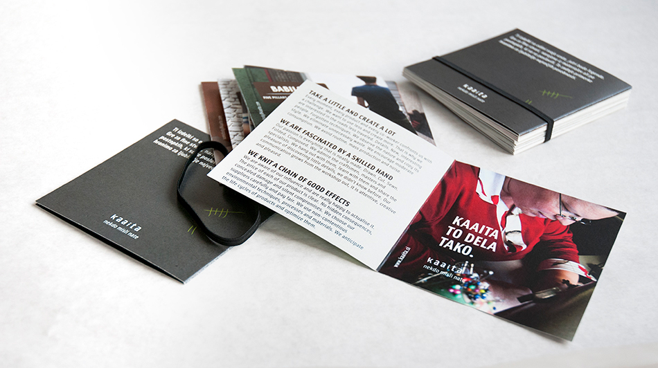
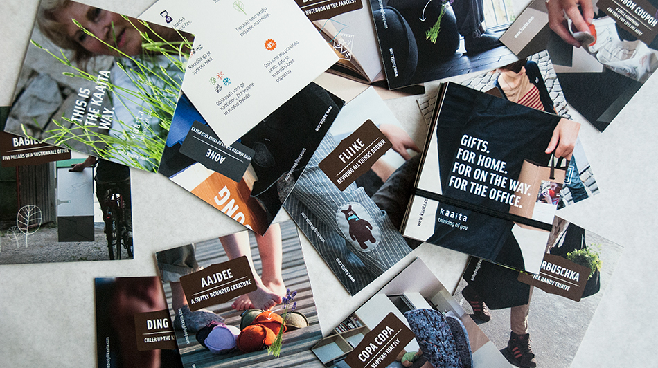
Kaaita “takes a little and creates a lot”; their catalogue is no exception.
One product, one leaflet. The leaflets are bounded together with a black fabric elastic band. This modular catalogue could be composed from three up to as many leaflets as the occasion requires.
Kaaita “takes a little and creates a lot”; their catalogue is no exception.
One product, one leaflet. The leaflets are bounded together with a black fabric elastic band. This modular catalogue could be composed from three up to as many leaflets as the occasion requires.