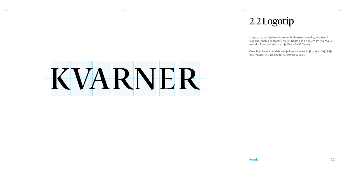
KVARNER
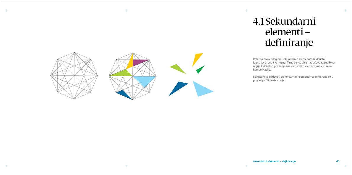
Throughout history, Kvarner has been known as an intersection of four transport routes. The very name Kvarner evokes this quadrant, navigational spatial orientation. This is why the source of this visual identity proposal begins with the familiar symbol of the wind rose, which also includes references to navigation, four-sided spatial orientation and wind direction.
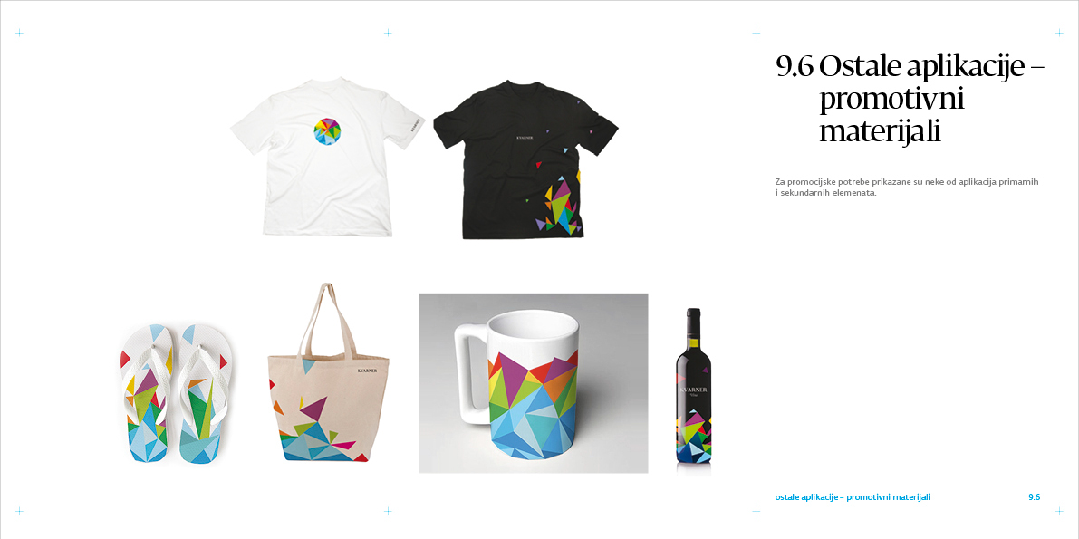
This motif is then divided into simple geometrical visual elements, their simple forms and colors creating a sort of a toolbox for further development of the visual identity of the Kvarner region and each one of its individual parts.
The idea for further development of this visual identity is to make it individual as much as possible. Each potential tourist could fill in an online survey and its answers would generate a unique Kvarner visual identity for each person, by using his individual preferences for an ideal vacation in Kvarner. So each tourist could have his own Kvarner sign and apply it to different personal belongings.


Bruketa&Žinić OM / Davor Bruketa, Nikola Žinić (Creative Directors), Neven Crljenak, Imelda Ramović, Mirel Hadžijusufović (Art Directors, Designers), Thomas Bauer (copywriter), Lana Borić (Account Executive), Marko Ostrež (DTP), Radovan Radičević (DTP)


