KOOKOO SNOWBOARDS
B.A IN GRAPHIC DESIGN
ABOUT SNOWBOARD
Snowboard is a new sport with only 40 years of history. The first idea about this sport was born in 1964 when a young surfer who was dreaming how to surf during the winter at the snowy slopes, created the first surf board for snow. Nowadays, snowboard has created a lot of fans, it is all about the young people and has created a new fashion in music and clothing.
WHY THIS SUBJECT
I decided to work with this subject, as, firstly I am a fan of the sport, and as, secondly, in the specific area, graphics play a very significant role in the boards as well as in the rest of the equipment.
NAME OF THE BRAND
To begin, in my work I aim to create a virtual snowboard company where the first thing I had to do was to find the name of it. I ended up to decide “KOOKOO” which means in the urban language of the snowboarders “doing something crazy but also entertaining”.
BRANDING
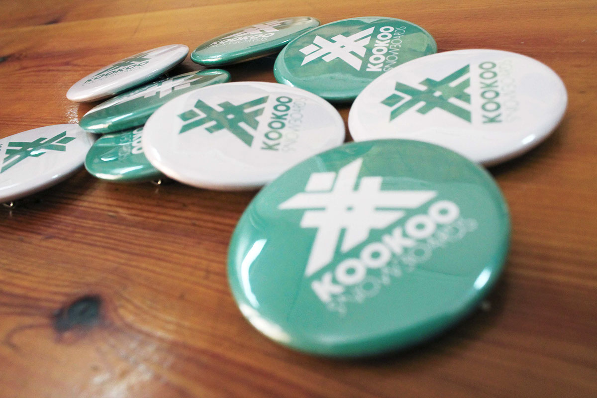
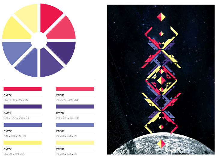
Afterwards I designed the logo of the company, a totally linear and simple motif which shows intensity and power , and the branding of the company based on the logo and the company’s color which is a mixing of blue and yellow, giving a result common to the colors of the ice. About the branding, I designed card, envelope, letterhead, stickers, pins, t-shirts, paper bag and little card for the clothes that has two sides, a one with the price and the other with the logo which can be used as a sticker too. At all the branding it is used as a background the company’s color and the logo sign in white color, or the opposed way.
SNOWBOARDS
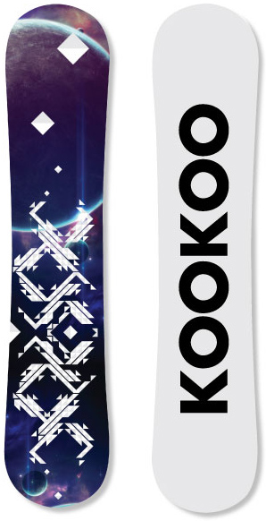
My next step was to design the boards. My purpose was to find a theme and design five boards based on it, which ones would have similarity between them and at the same time uniqueness. My final decision was to create a series of theme the Space. In each board I used a different space photo and in the top of it I designed the five different graphics with different colors. Finally, I designed yet a board in black – white as the collective board of the series.
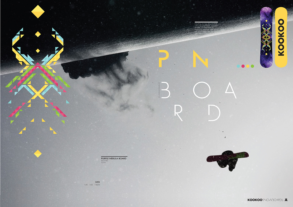
KOOKOO OUT OF SPACE
The name I gave to the board series is “KOOKOO OUT OF SPACE” and for the promotion of it were designed ads, boxes for the boots and the bindings, the little card for the clothes, and all of that designed around a specific thinking of a space background and on top of it a logo in white color.Additionally, a promoting form was designed , which shows each one of the boards of the series as well as inserted flyers (6 equal to the boards) about the packaging of the boards, which ones give information about the specific characteristics of each board.
LIMITED EDITION BOARD
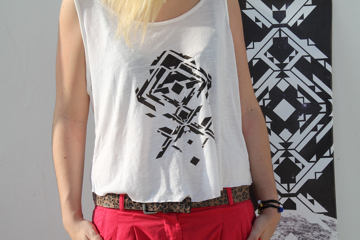
In the end, it was designed a t-shirt about the limited edition board, for female and male too, as well as the collective stickers that in addition to the flyer and the promoting form will be send to the costumer.
LOGO


BRANDING


BOARDS


LIMITED EDITION BOARD


LIMITED EDITION T-SHIRT

FLYERS
SPECIFICATIONS FOR EACH BOARD


BROCHURE


PACKAGING
BINDINGS&BOOTS


ADS


THE BOOK


TYPERFACES
PARACHUTE FONTS
PRINT
IGGLESIS-DROGOUDIS
AKTO
(HONOURS) DEGREE IN GRAPHIC DESIGN
ATHENS 2012
THANKS
TO MY FRIENDS & FAMILY!


