KITSUNE
UNEARTHLY JAPANESE RESTAURANT
THE BRAND
'Kitsune' is the Japanese word forfox. Folklore stories depict them as intelligent beings and possessing magicalabilities that increase with their age and wisdom. Foremost among these, is theability to assume human form, whilst also being portrayed as faithfulguardians, friends, lovers and wives.
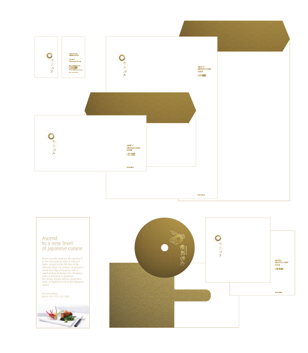
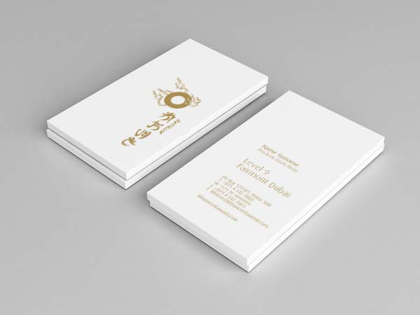
The logo represents the spirit of the Kitsune. The icon is thepearl often depicted floating on the tail/s of the Kitsune. The pearl is oftenassociated with the Kitsune and Inari. Pearls are said to hold the soul of theKitsune, along with its magical powers. Being a symbol related to Inari, thisbrand is closely affiliated to the ideas of rice and agriculture - thefoundation of Japanese cuisine.
The logotype, even though appears to be written in Kanji (the Chinese characters used in Japanese writing)it is in fact the term KITSUNE in English.


THE CAMPAIGN
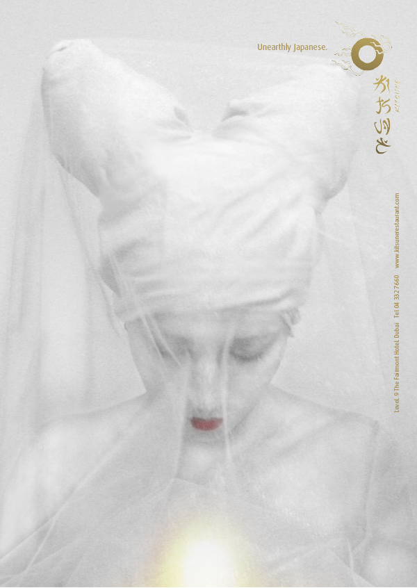
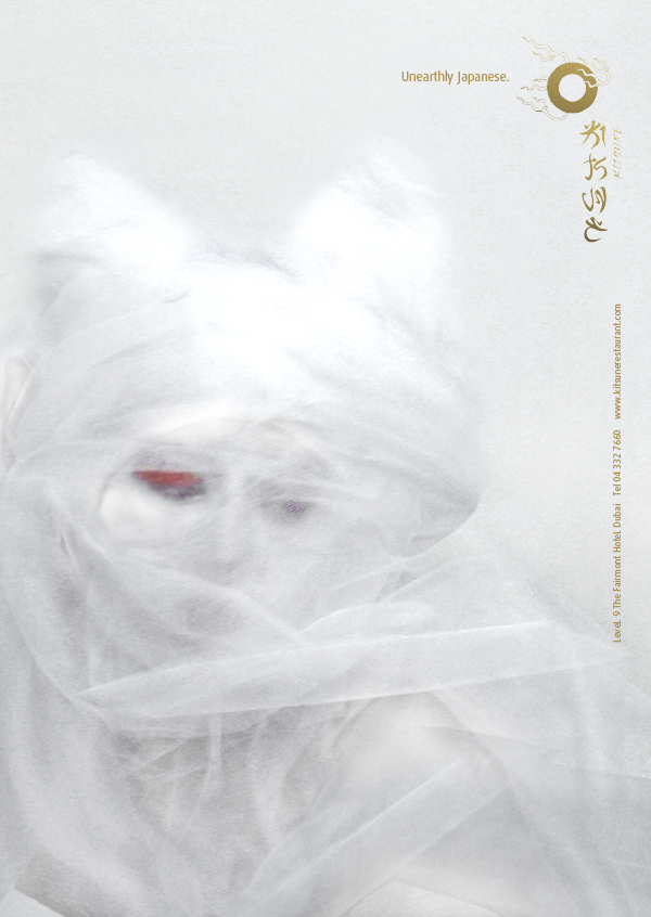
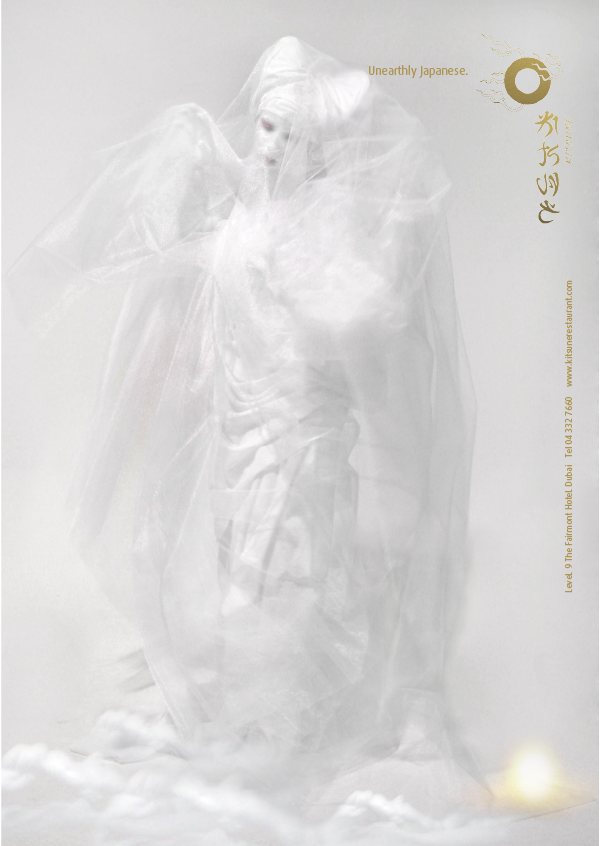
The ad campaign focused on bringing themystical, magical, fairy like atmosphere of the Kitsune concept, emphasizing onthe attributes usually associated with the Kitsune in human form.
CREDITS the campaign was a collaborative work with multitalented colleagues, Muhyi Sadek, Charles Moussa & Serge Lutfi


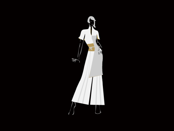
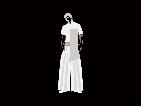
THE STAFF UNIFORMS
Inspired by the kimono, the uniformsare elegant, stylish and above all practical. The uniform highlights the Japanesetraditional details in a modern package.