


This is my final project for Visual Communications II at PrattMWP - conceptualise and brand a fictional company or product. This is Kazoku (Japanese for 'family') of Hokkaido, an organic soba noodle house that serves food made only with wholesome, healthy ingredients sourced from family-owned farms in Hokkaido. Menu is seasonal and crafted according to what is available every season, thus the quartet of logos. Each logo also corresponds with a famous matsuri (festival) or tradition that is normally associated with each season.
Note: The kanji (Chinese characters) used in the logo, 「華族」, are not the usual characters used, which are 「家族」. The characters I used are, separately, "flower" and "family," which together translate to both "family" and "noble."

Black and white logos

Seasonal logos - winter and spring
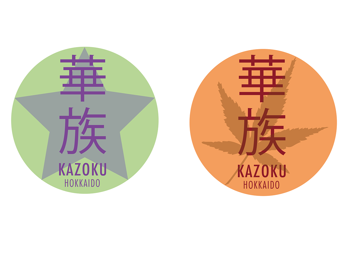
Seasonal logos- summer and autumn

Spring menu


Summer menu


Promotional items - postcards


Promotional items - autumn and summer pins

Promotional items- spring and winter pins

Sample advertisement - winter version


