Juxtapoz Magazine Redesign
Editorial redesign
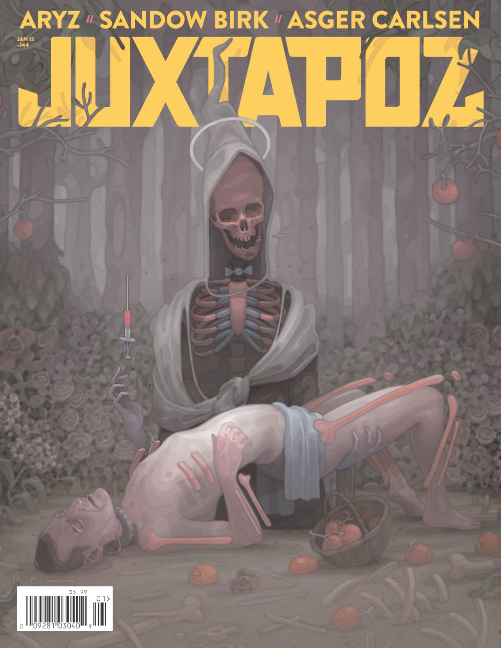
A change of editor, content, and future objectives fueled Juxtapoz magazines 2013 redesign to be friendlier and more engaging. I used urban retro art deco typefaces and graphics, a warmer and more playful color palette, full bleed images, and dynamic and adjustable layouts to give Juxtapoz a style that appeals to our hip, urban readership.
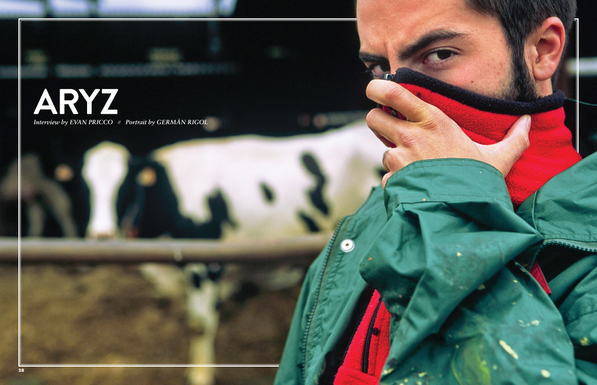
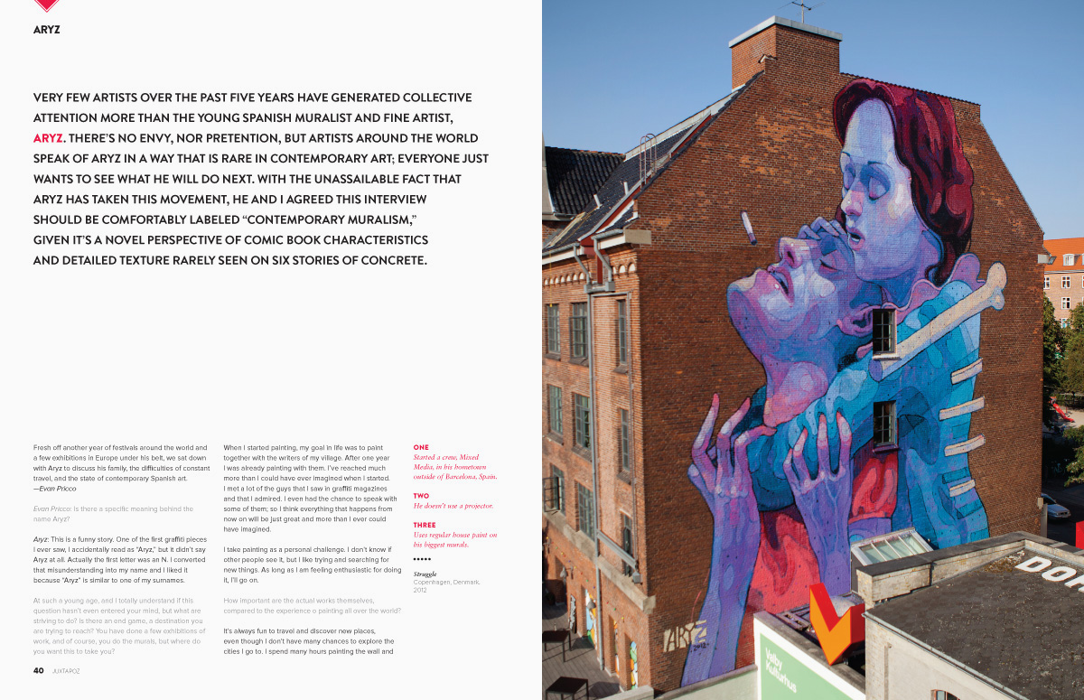
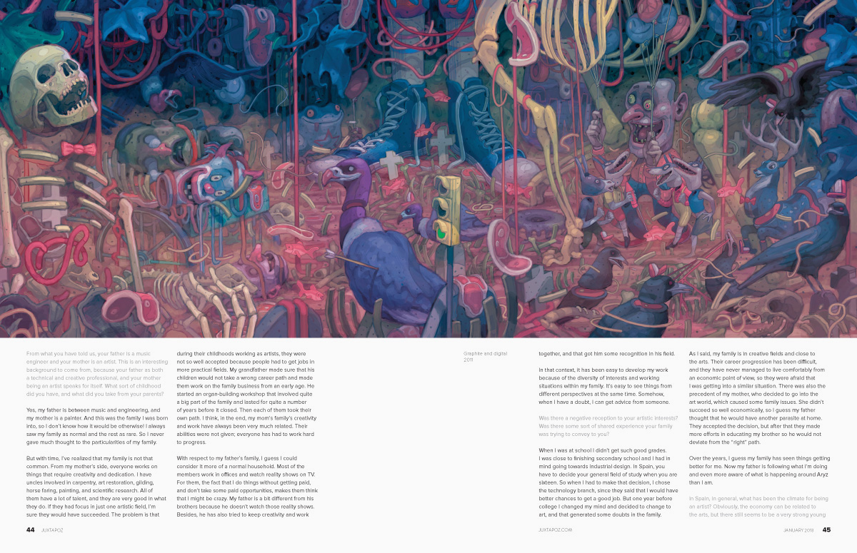
New feature design maintaining striking opening portraits but with more flexibility and dynamic negative space for layout options


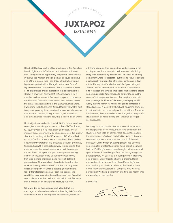
A new bold design for the editor's bold introductions

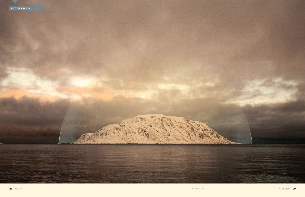
Picture Book, along with the other departments, got a more open design and art deco-style graphics and typefaces
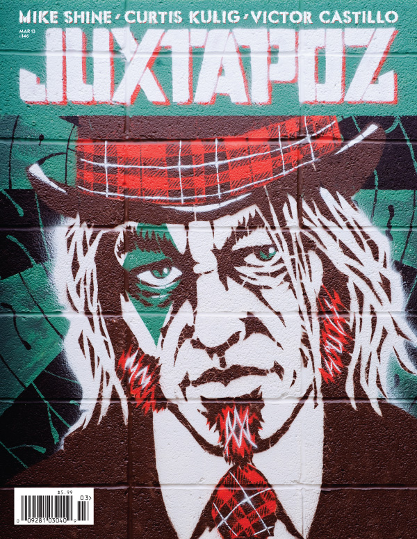
SF artist and entertainer, Mike Shine, made a custom stencil typeface for us to use for our featured artists... himself included
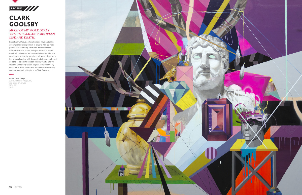
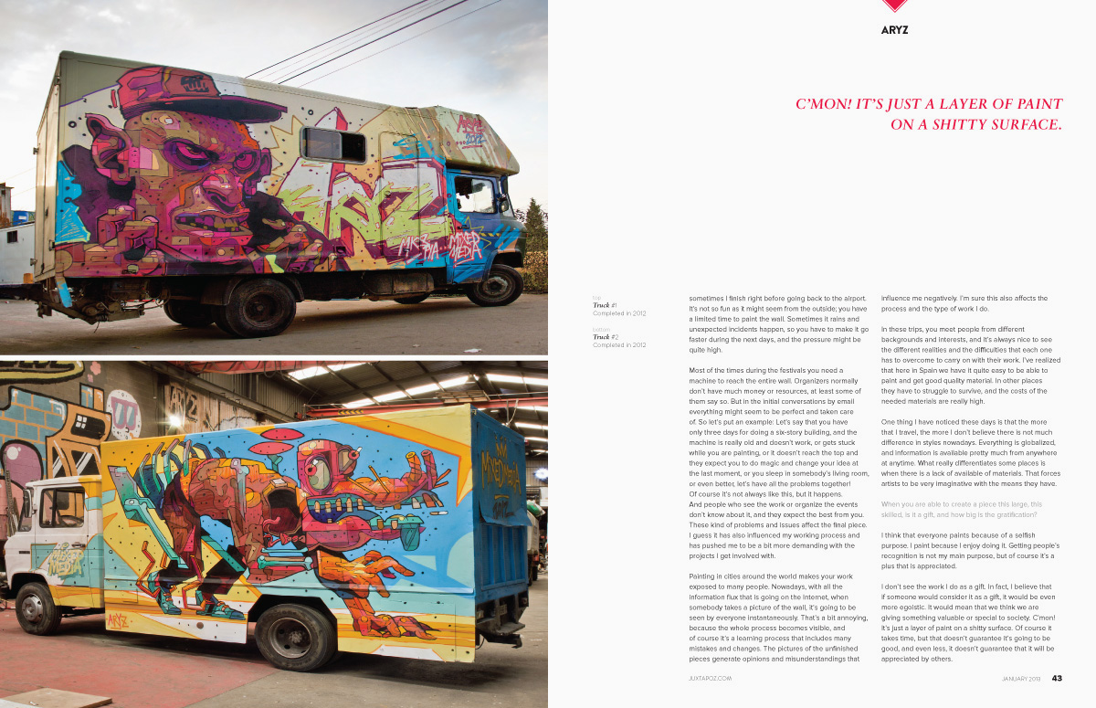
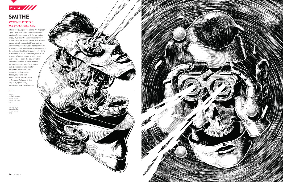
Profiles go to full spreads to make the most of their striking up-and-comer art

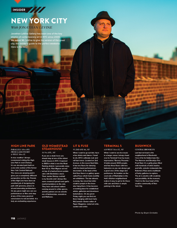
New department, Insider, is for the jet-set road warriors who just can't stay in one place and need the inside track to scenes all over the globe

Review showcases great reading material and the redesign lets you reach out and grab 'em off the page
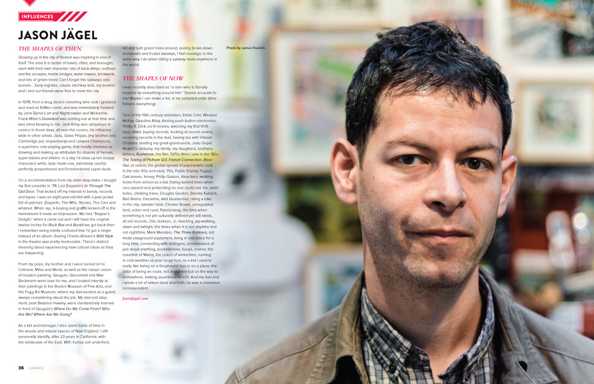
New department, Influences, lets readers and subjects connect on what makes their creative juices flow
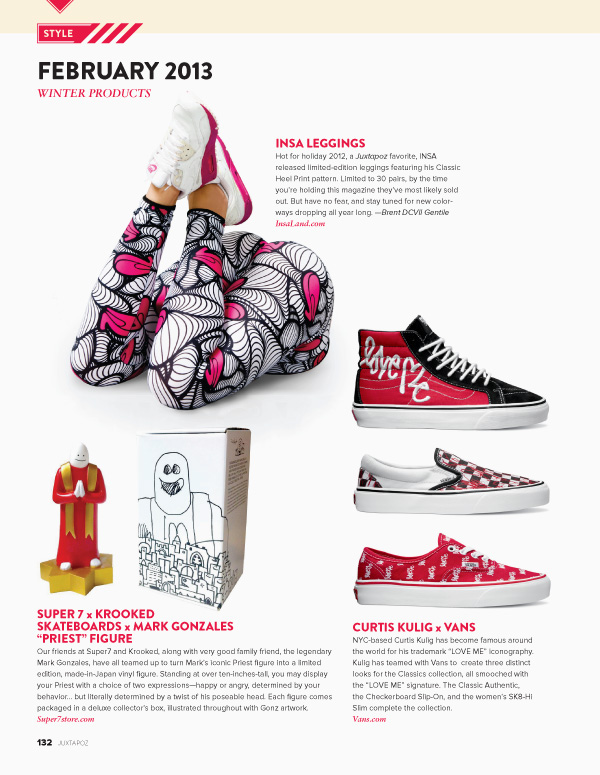
Our new Style department showcases selected cool products out there
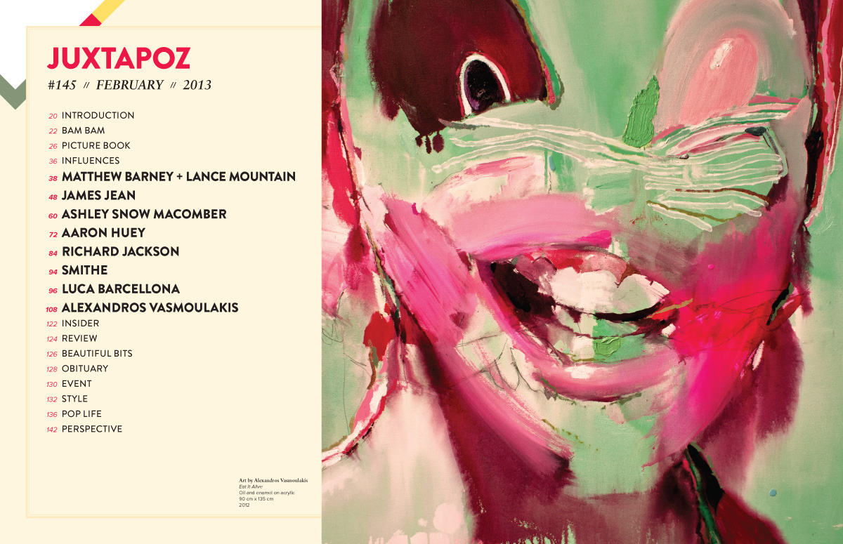
Table of Contents goes wider for another splashy introduction to issues content
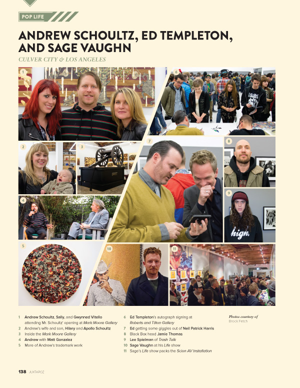
Pop Life gets more streamlined and dynamic with a slash divider and "punch-cut" numbering
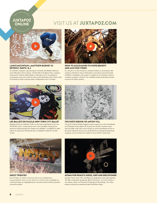
New department, Online, gives our print fans a taste of what is going on online


