Package Design Two, Spring 2010
Jilbert’s is a staple in every home in the Upper Peninsula of Michigan. From their milk to their
ice cream, people know to ask for it by name.
When the family run company was purchased by a larger corporation, there was concern that the roots of the company would begin to fade away and it would become a more corporate operation. Facebook groups were even created, protesting any changes to the brand they grew up with.
This special edition packaging is first meant to mark the anniversary of the company. But the underlying message serves as a reminder of the company’s, and an assurance that it will retain its traditional values.
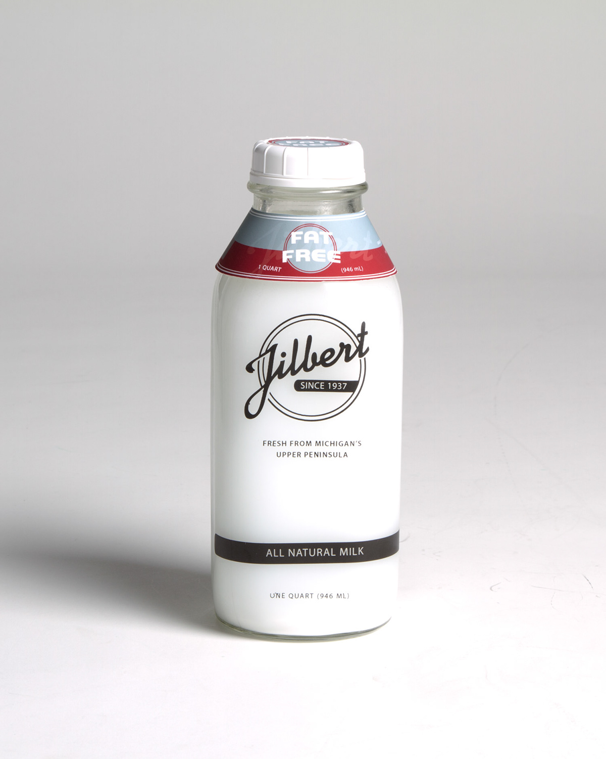
The glass bottles and retro logo were inspired by what the company had done in the past and are meant to inspire hope in the product’s future.
ice cream, people know to ask for it by name.
When the family run company was purchased by a larger corporation, there was concern that the roots of the company would begin to fade away and it would become a more corporate operation. Facebook groups were even created, protesting any changes to the brand they grew up with.
This special edition packaging is first meant to mark the anniversary of the company. But the underlying message serves as a reminder of the company’s, and an assurance that it will retain its traditional values.
The glass bottles and retro logo were inspired by what the company had done in the past and are meant to inspire hope in the product’s future.