Jenny Wren Branding
Bespoke Jewllery Shop Re-brand
Bespoke Jewllery Shop Re-brand
Jenny Wren is a stylish bespoke jeweller situated in my local area. I chose Jenny Wren as the subject of my university branding brief, which challenged me to re-brand an existing business in order to prove what a difference design makes.
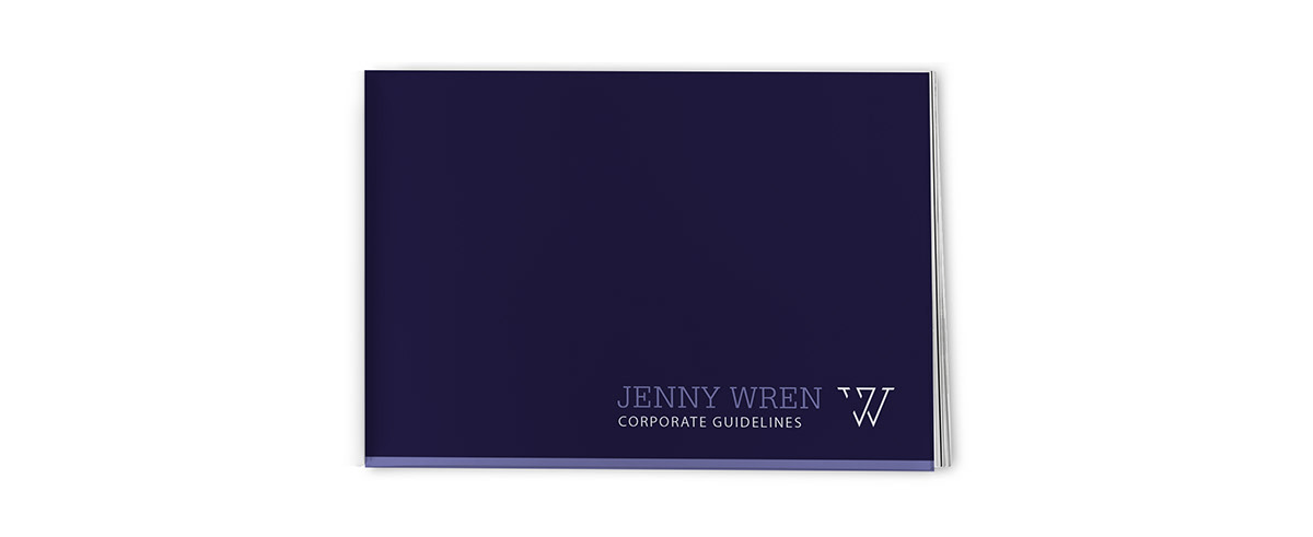
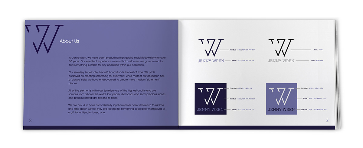
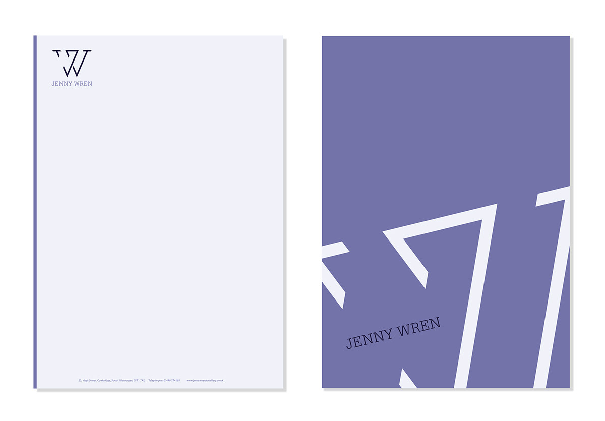
The chic products Jenny Wren crafts, needed to be reflected in a stylish brand, something it had previously lacked. I wanted to incorporate and manipulate the initials ‘J’ and ‘W’ into a bold mark that was angular to reflect the gem cutting process. I emphasised this further by making cuts of my own, removing segments of the letters, which not only adds balance but also creates the suggestive form of a diamond in the centre. The Serif typeface 'Serifa BT' was used to reflect the elegance and heritage of the business, but its angular nature implies a more edgy, modern feel, relevant to their bespoke designs of today. The balance of purple shades was used to evoke the luxurious nature of the brand and the delicacy of the products on offer.
The chic products Jenny Wren crafts, needed to be reflected in a stylish brand, something it had previously lacked. I wanted to incorporate and manipulate the initials ‘J’ and ‘W’ into a bold mark that was angular to reflect the gem cutting process. I emphasised this further by making cuts of my own, removing segments of the letters, which not only adds balance but also creates the suggestive form of a diamond in the centre. The Serif typeface 'Serifa BT' was used to reflect the elegance and heritage of the business, but its angular nature implies a more edgy, modern feel, relevant to their bespoke designs of today. The balance of purple shades was used to evoke the luxurious nature of the brand and the delicacy of the products on offer.


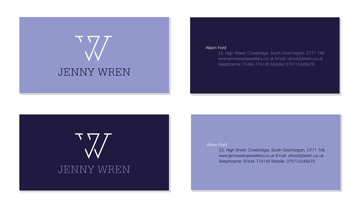

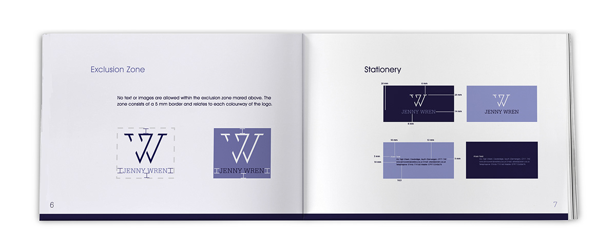
Corporate Guidelines