To be responsible to the brand, we needed to approach the redesign with an eye toward the future, while carefully considering 140 years of equity and history.
Jack believed that a unique product deserved unique presentation, so he chose to sell his whiskey in a square bottle with a fluted neck. True to the original, the new bottle has distinctly chiseled, masculine features – a square footprint, square shoulders and beveled corners.
Jack believed that a unique product deserved unique presentation, so he chose to sell his whiskey in a square bottle with a fluted neck. True to the original, the new bottle has distinctly chiseled, masculine features – a square footprint, square shoulders and beveled corners.
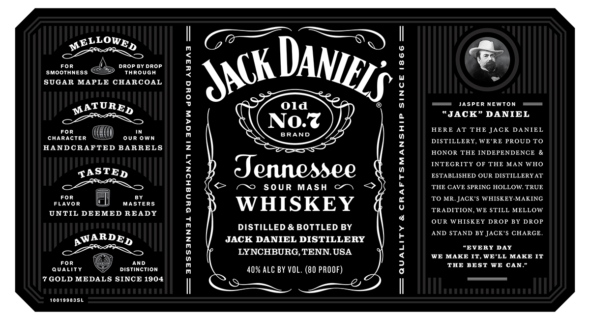
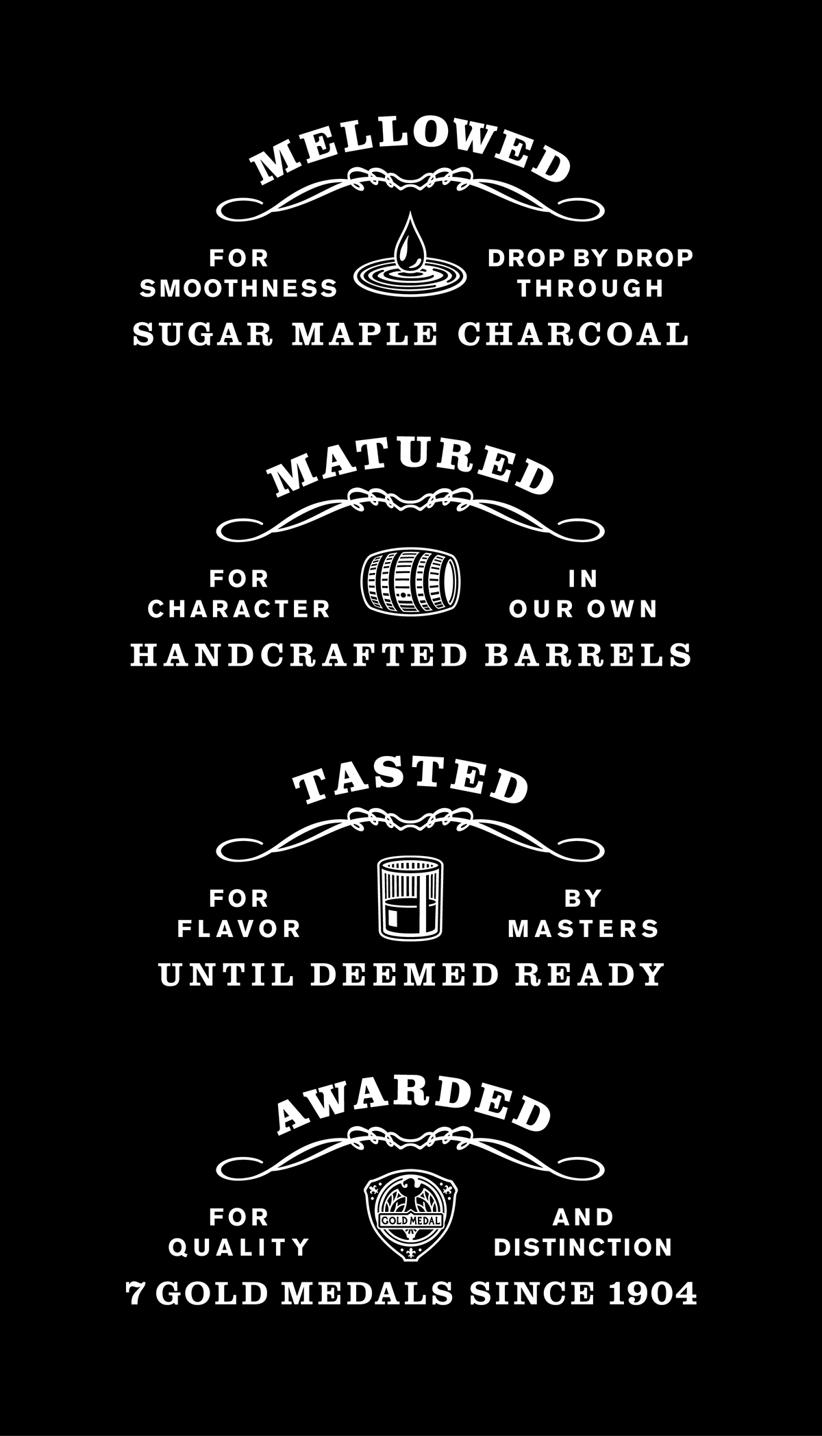
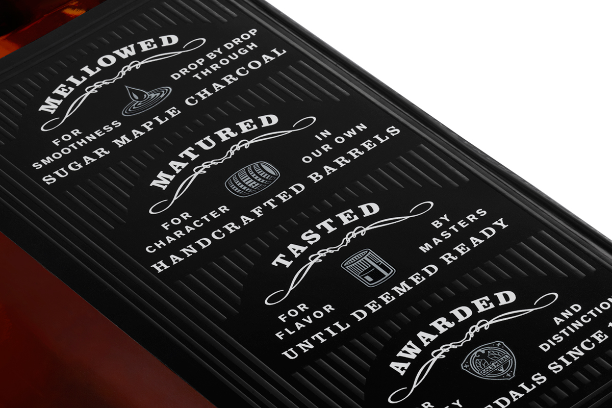
The iconic Jack Daniel’s label stands for uncompromising quality and craftsmanship. The new label maintains a balance of filigree, iconography, and special typographic elements, in black and white with a touch of silver.