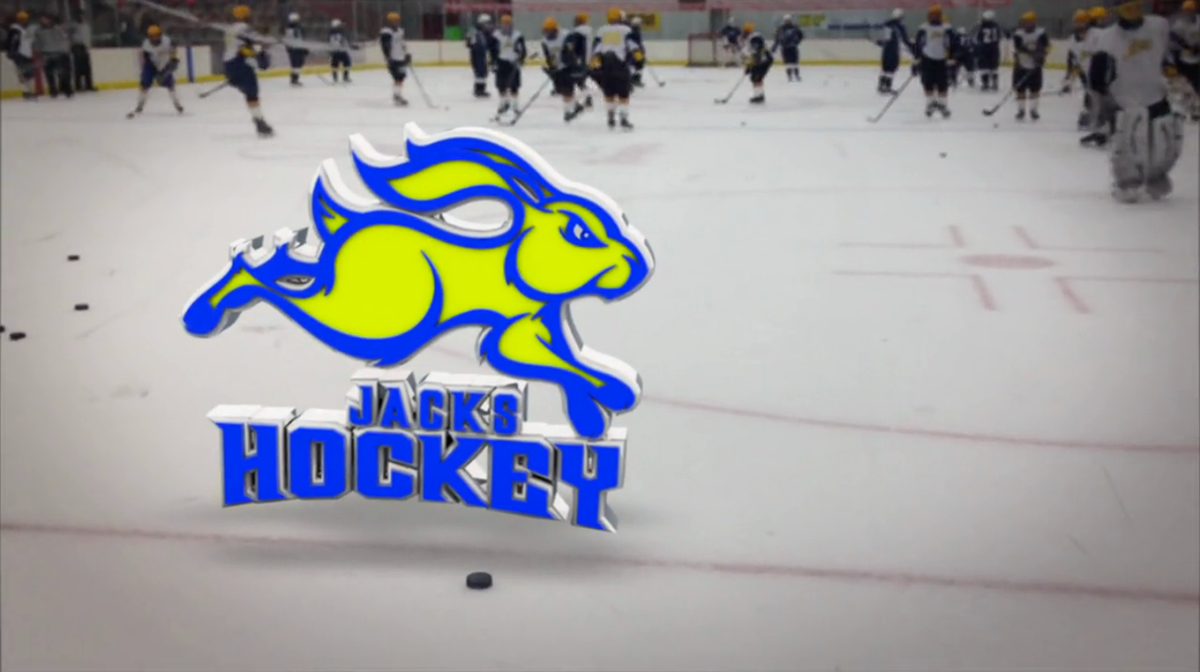
In 2011 the South Dakota State University Hockey Team was looking to purchase new uniforms for the upcoming season. Being a club sport, they soon realized that they wanted a logo that was their own and would help separate them from the other athletic organizations of SDSU.
The challenge was trying to create a logo that would accomplish two things, be noticeably different from the official SDSU Jackrabbit graphic, yet still remain similar enough that it would have the same feel. These two goals, which seemed to contradict each other, made this project a challenge. The colors remained the same as the official logo, but the pose and style of the logo are completely different.
The final design is able to share qualities with the official Jackrabbit, while allowing these qualities to not overpower the design, leaving it to have a life of it’s own, and distinguishing it as the hockey team’s own identity. Proof of this comes when people in the area see the logo and actually stop the players to ask about it.

“Going out wearing Dan’s custom made Jacks Hockey gear sure gets a lot of eyes. I have had quite of few people stop and ask where to get shirts like these.”
-Matt George
Jacks Hockey Team Captain
-Matt George
Jacks Hockey Team Captain