Typographic Manipulation
Accolade
The Illinois Institute of Art-Chicago Society of Typographic Arts:
Student Chapter October Exhibition 2011 Award Winner.
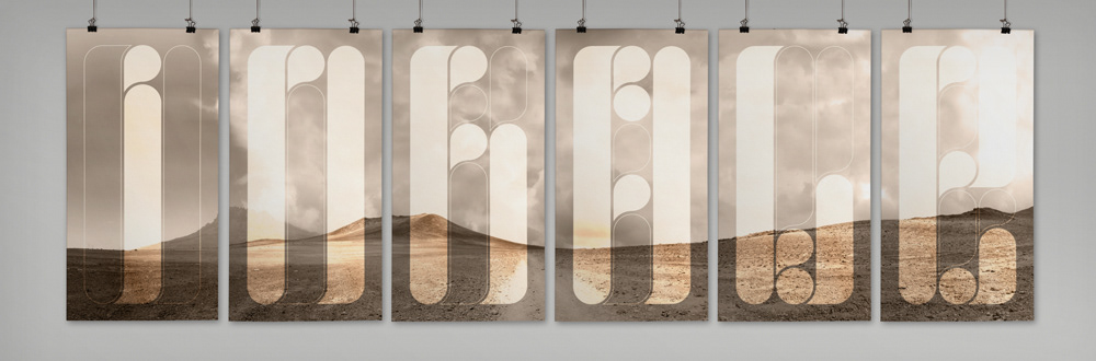
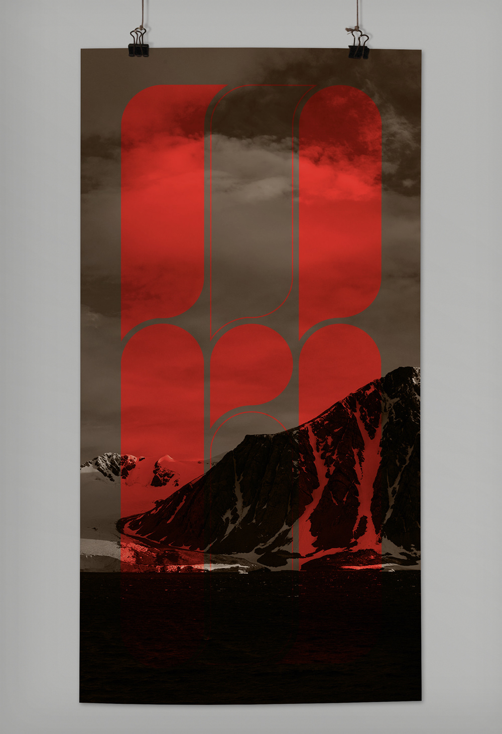
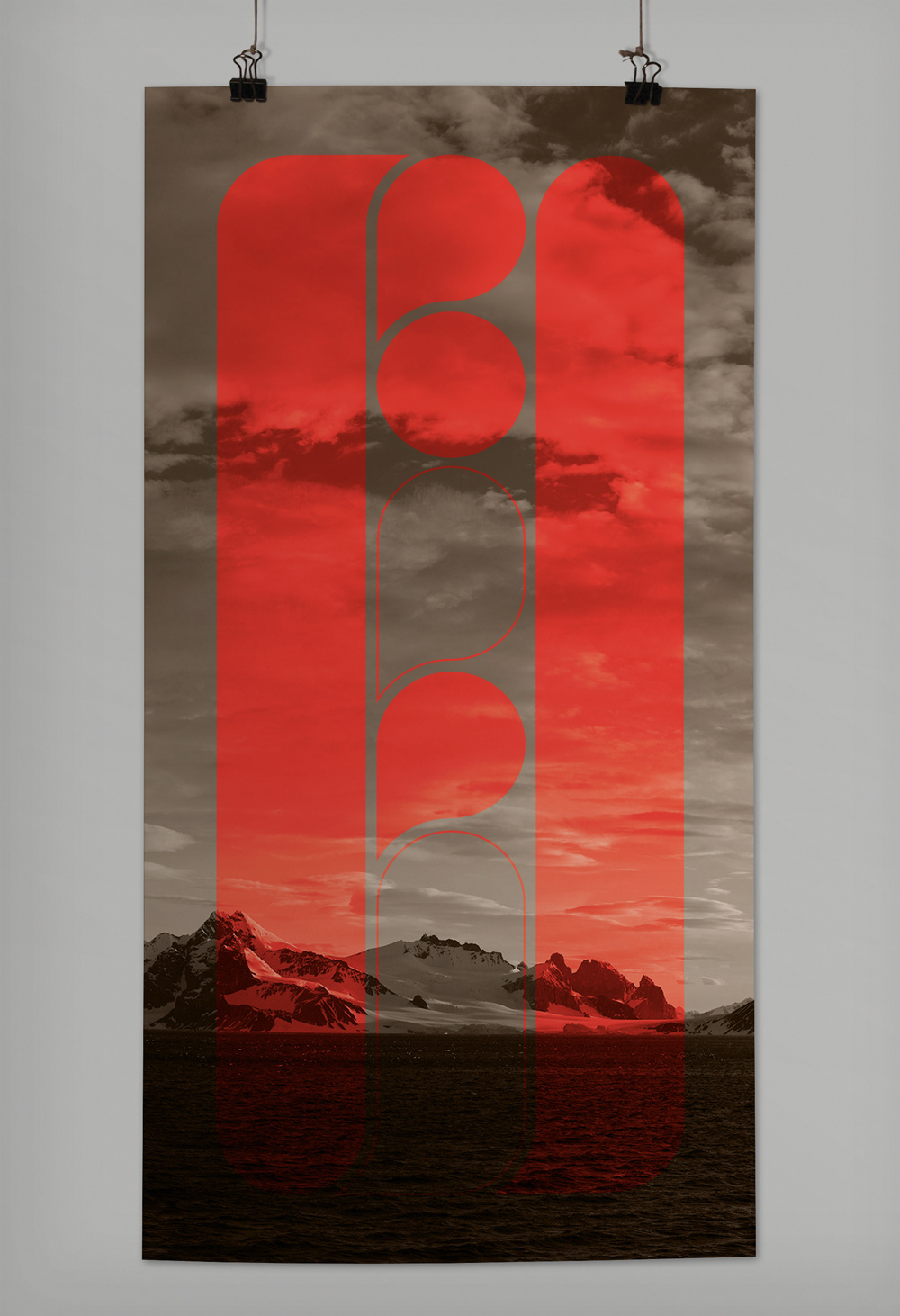
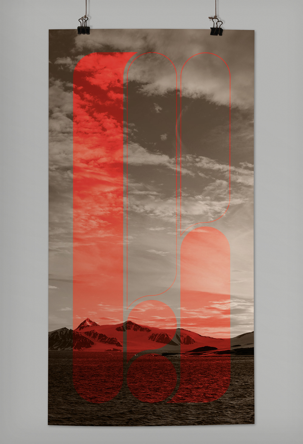
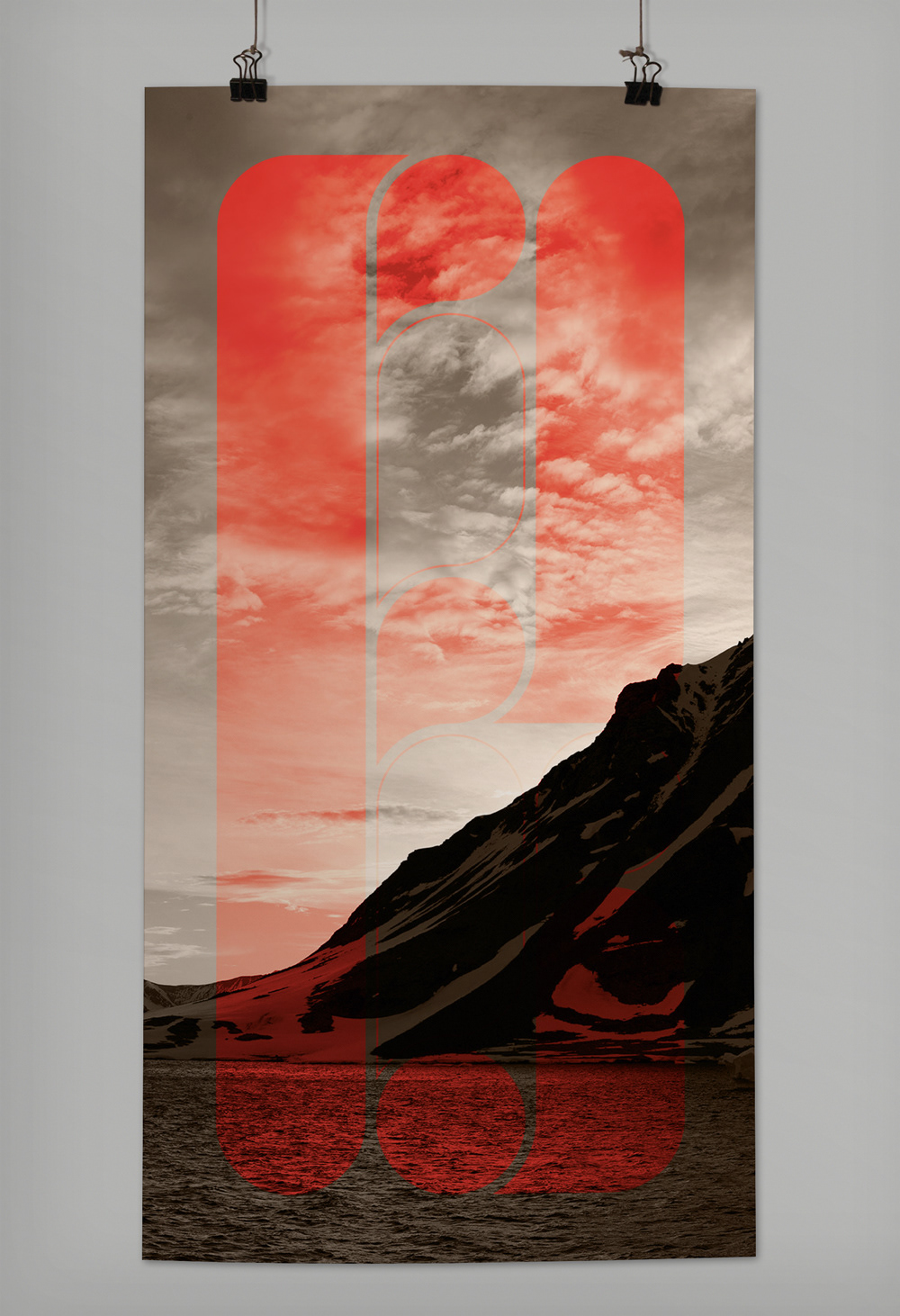
This is a typography piece done for the STA Chicago Student Chapter "Letterform, Ligature, Number, Punctuation" Design Contest. The restrictions were you could only use one of those four typographic
elements on a page, and poster size had to be 13" x 19" or larger. Each poster is 13" x 25.5" printed
on Red River 66lb. Arctic Polar Satin paper. The posters are spaced with 0.5" between them. The
Inhale posters sit above the Exhale posters with a spacing of 1". The installation is around 6' x 4.5'.
Graphic Concept
Graphic Concept
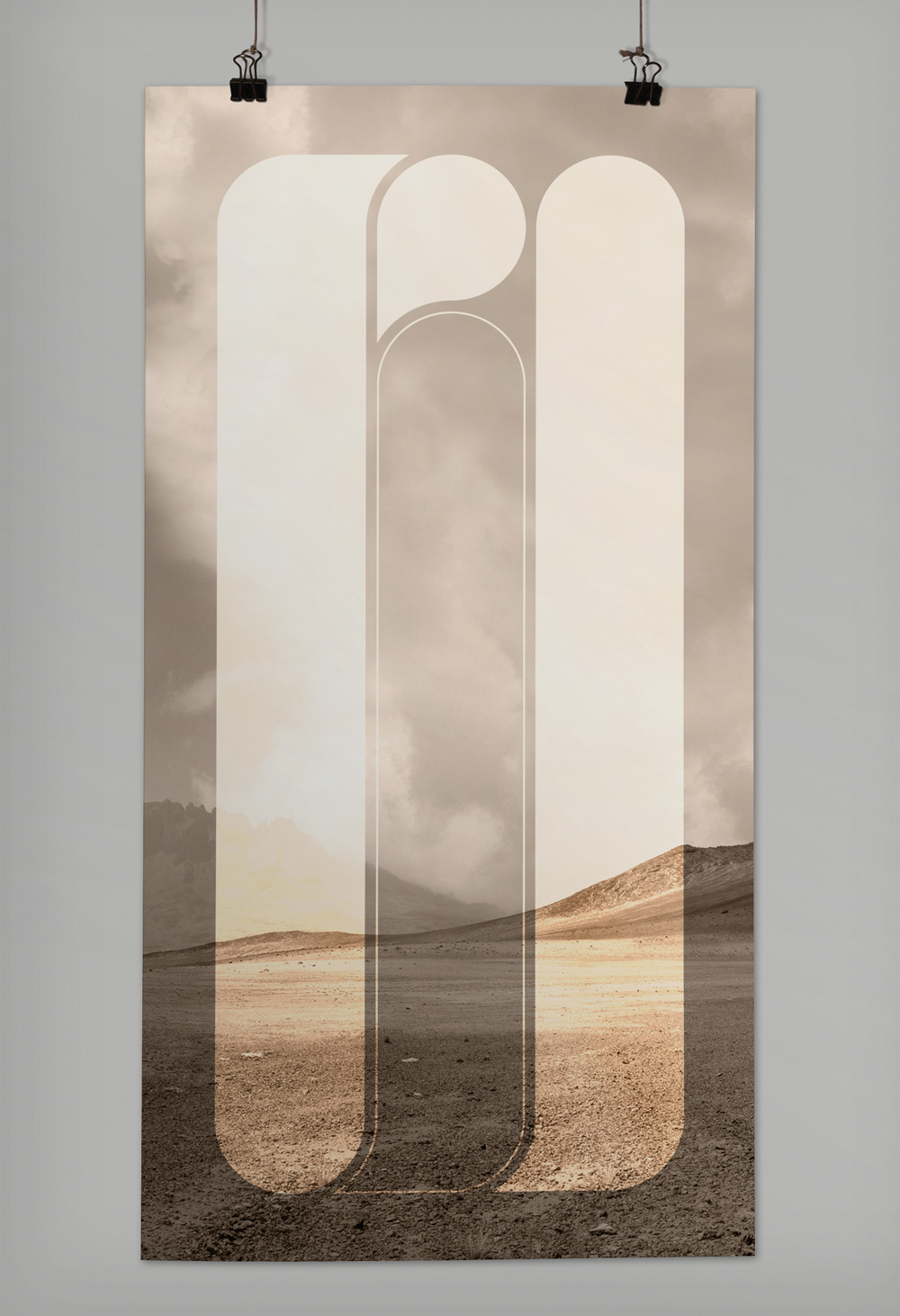
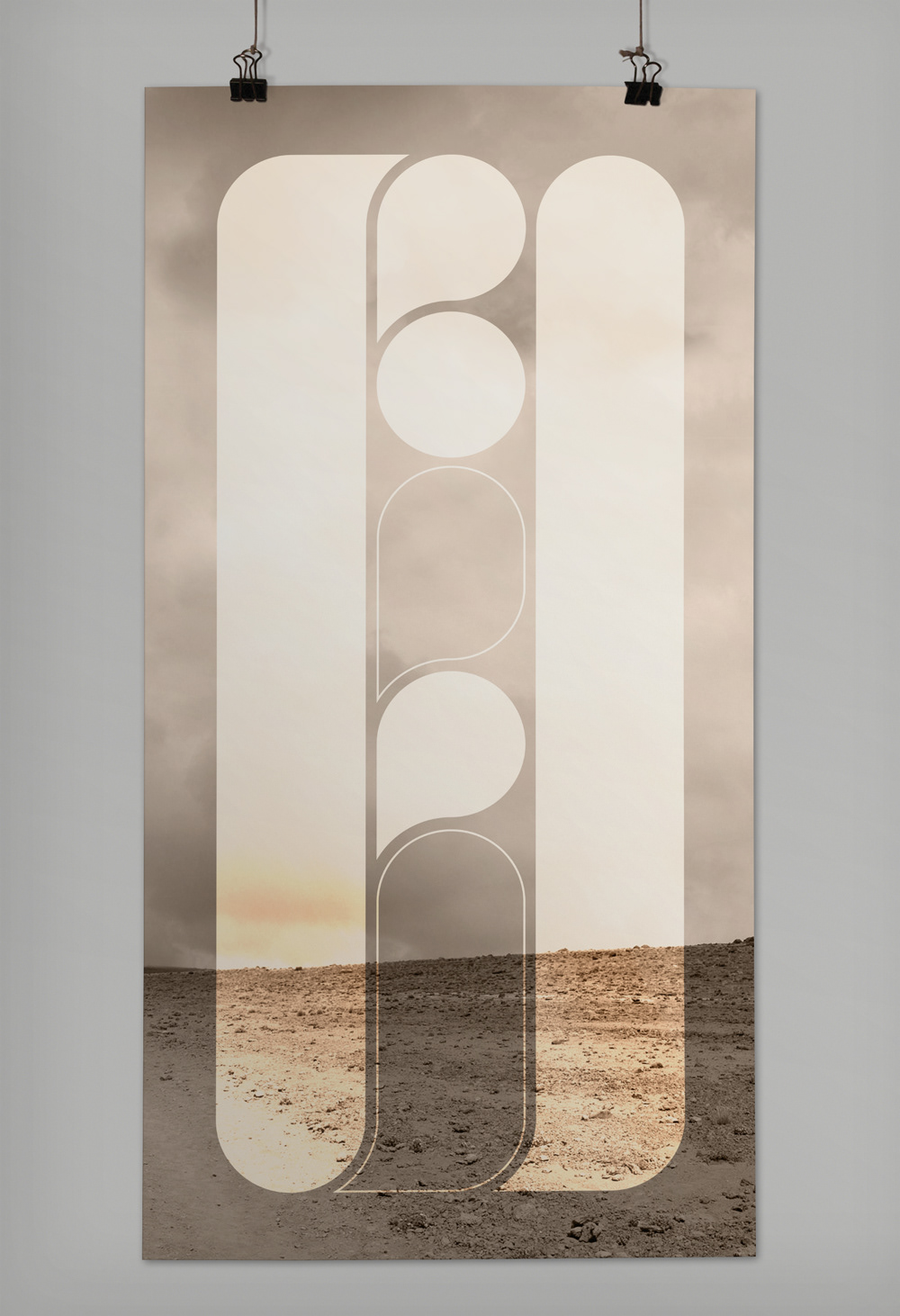
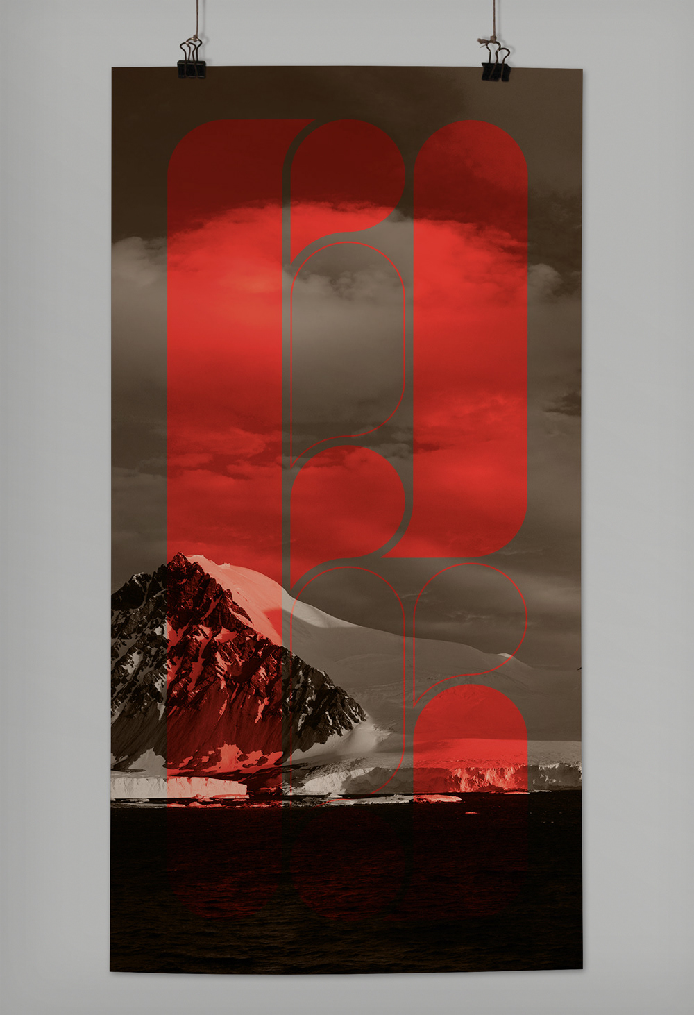
This is an exploration of the shapes that make up a letterform. It breaks down each letterform into
basic shapes and lines. It's meant to be clear from far away, but the closer you get the more abstract
it becomes. When we're standing at a distance the eye will naturally fill the gaps between the shapes
and cancel out the lines. This will make the letters legible. When viewed up close the gaps and lines
become noticeable, making the shapes pop as separate entities. The panoramic landscapes for both backgrounds are apart of the bigger picture. The Inhale background is baron because we breathe in
the life from that scene leaving it empty. The Exhale background represents the exhalation of the life
we breathed in, so the scene is vibrant and full of life. The letterform is a living, breathing creation.
Accolade
The Illinois Institute of Art-Chicago Society of Typographic Arts:
Student Chapter October Exhibition 2011 Award Winner.