Ann Huang Design Studio
Identity
2013
The project is to design identity for our imaginary Design Studio.
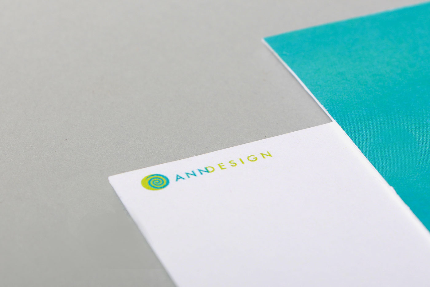
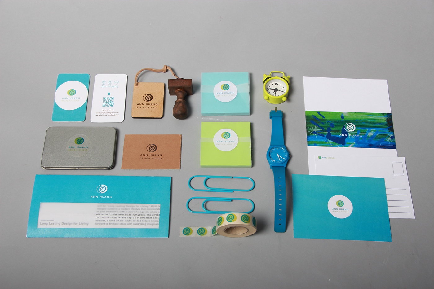
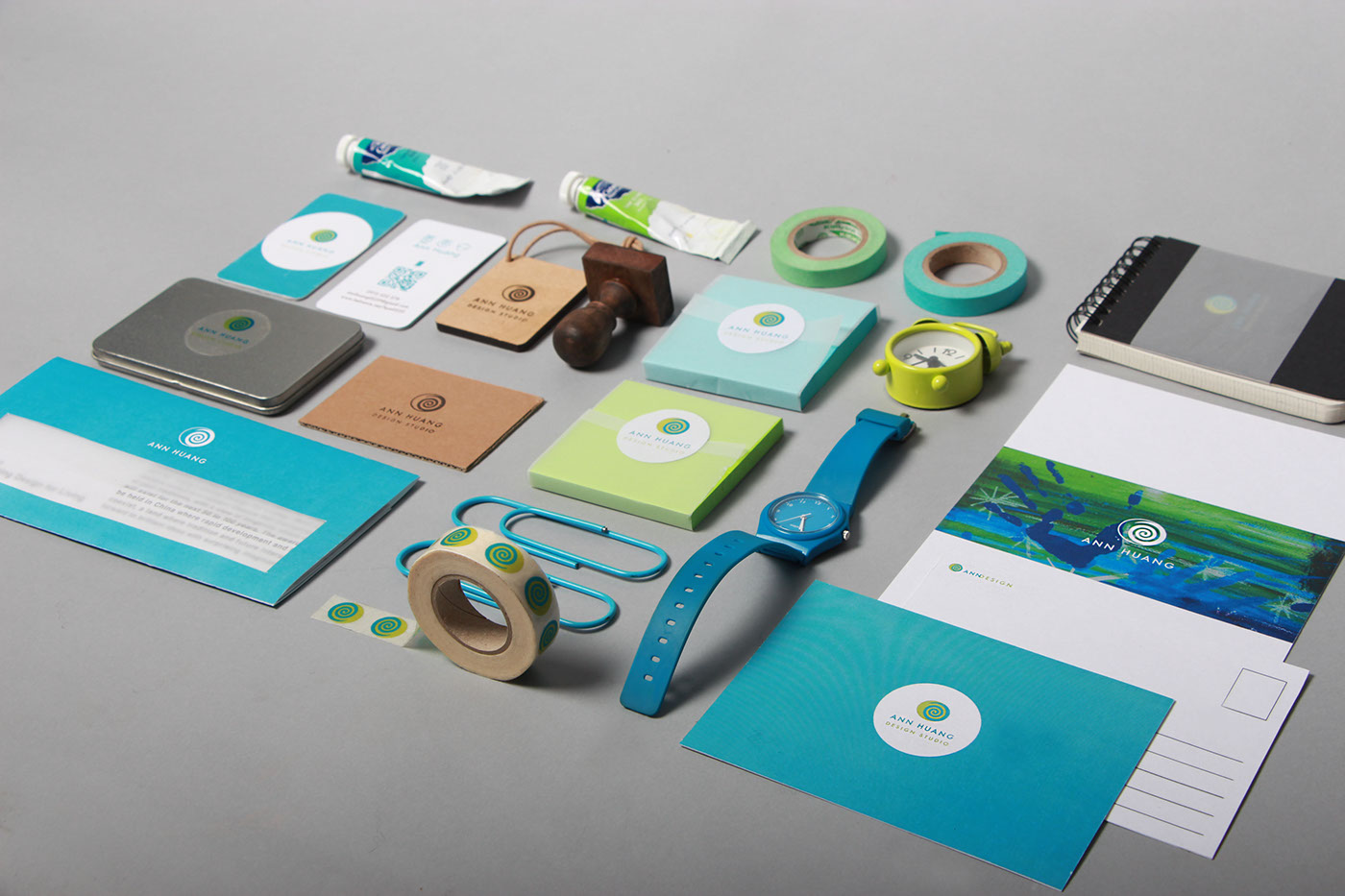
The idea behind the logo is the image of a coffee-mate stir in the coffee. Because coffee makes me think of relaxing, and my goal is to create a cozy and unrestrained workplace. The main colors of the Logo are blue and green. The reasons are blue represents ocean and sky, green represent the forest. Both colors will make people feel fresh and ease, and that is the exact feeling I want to present.
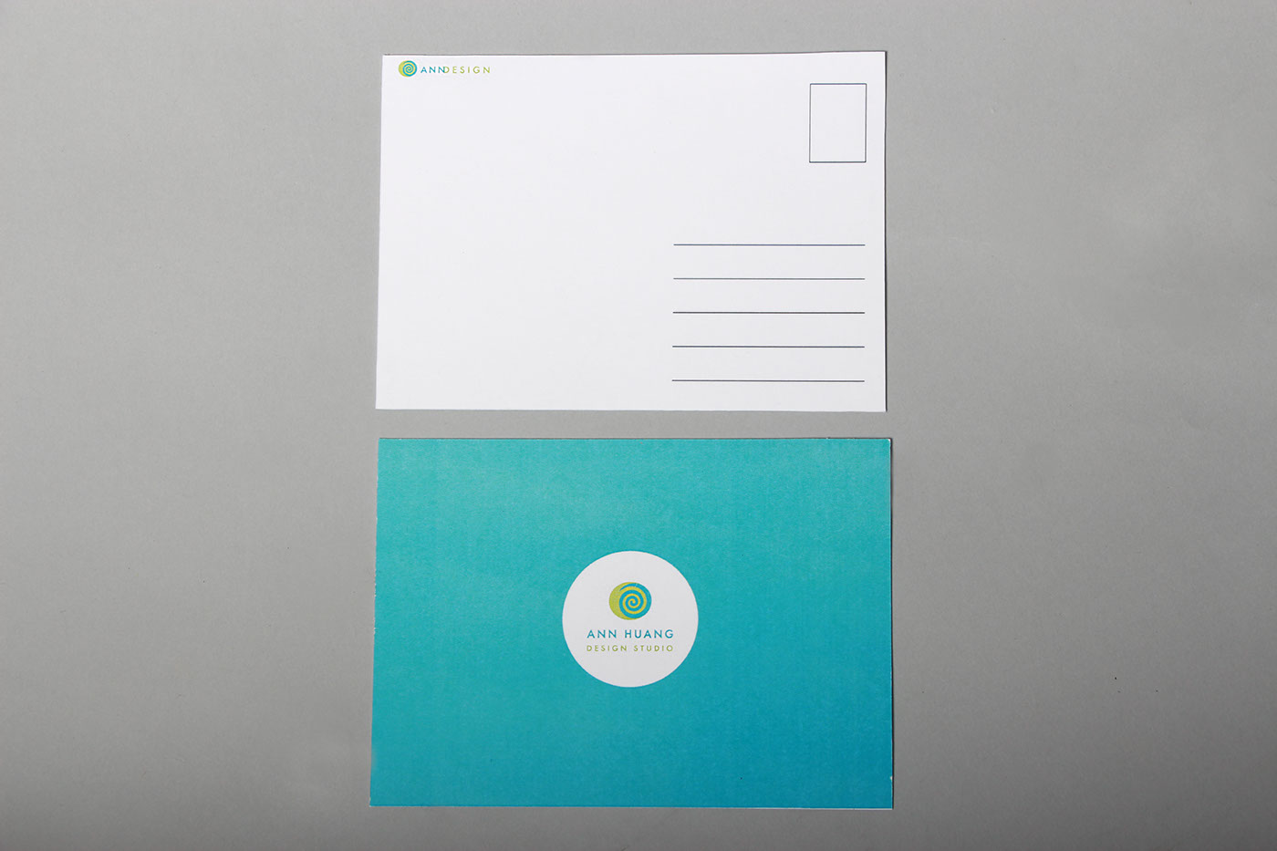
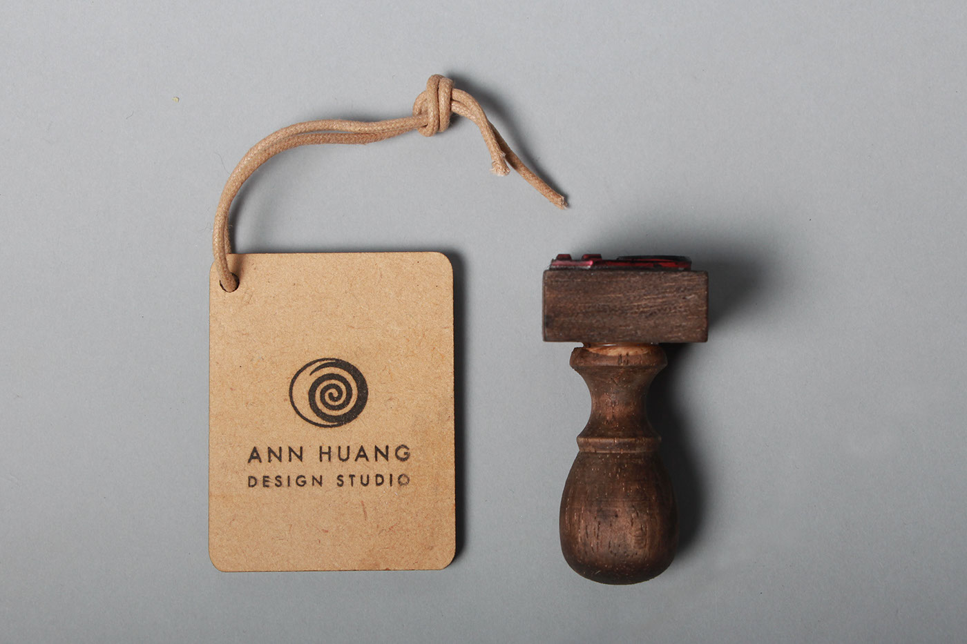
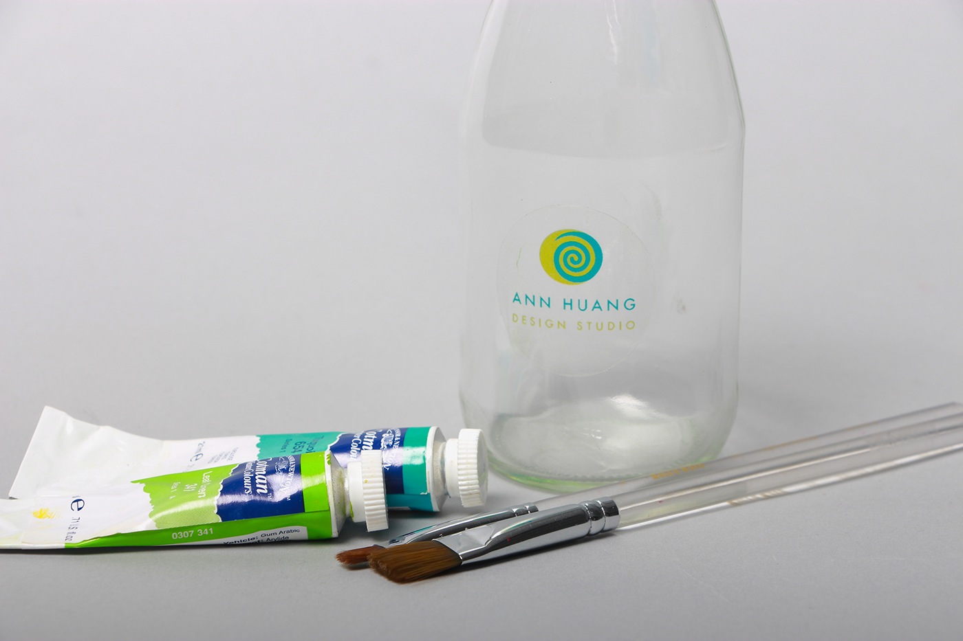
My work included business cards, stickers, postcards, hangtags, web and products, etc.
The idea behind the logo is the image of a coffee-mate stir in the coffee. Because coffee makes me think of relaxing, and my goal is to create a cozy and unrestrained workplace. The main colors of the Logo are blue and green. The reasons are blue represents ocean and sky, green represent the forest. Both colors will make people feel fresh and ease, and that is the exact feeling I want to present.
My work included business cards, stickers, postcards, hangtags, web and products, etc.
黃百安設計事務所
設計一套視覺系統給自己夢想事務所。
商標背後的意涵代表這是一個舒服的空間,logo中的螺旋就好像是咖啡與牛奶漸漸融合的樣子,傳達出喝咖啡那種怡然自得的感覺。藍色與綠色的運用讓人聯想到自然,向大海天空般遼闊的綻藍,與森林富饒生機的青綠,兩色彩帶出的清爽與平靜就是我想要傳達的概念。
周邊設計包括了圖騰、名片設計、貼紙、明信片、標籤、網頁設計等等。


......................................................................................................................................................

......................................................................................................................................................

......................................................................................................................................................