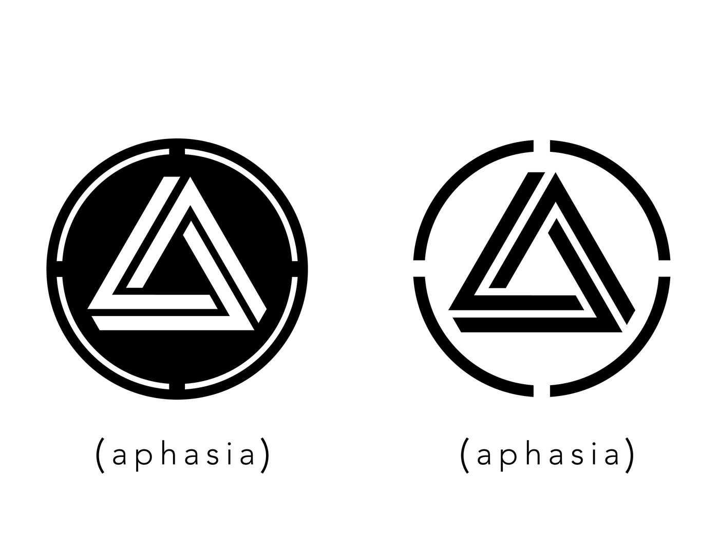
Identity: Aphasia
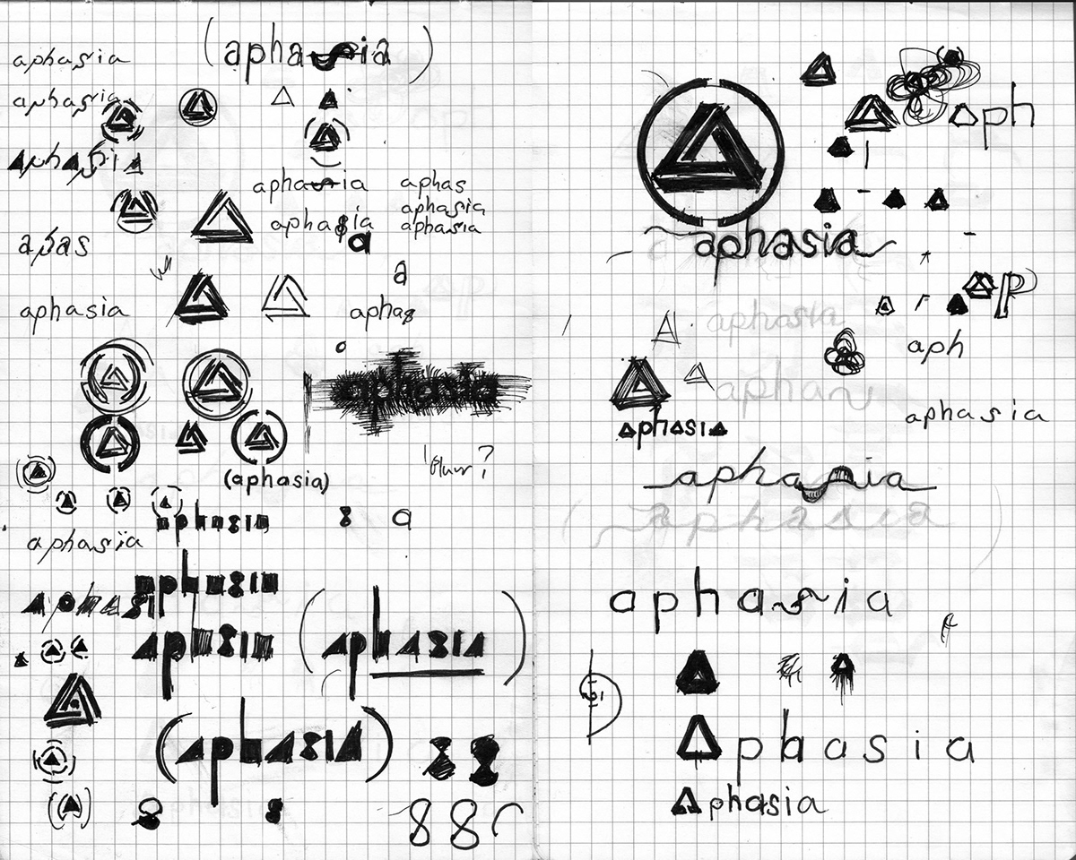
Aphasia is a medical term that covers several conditions related to the impairment of language. Aphasia Studios is mean to be a cross-disciplinary creative outlet for sound-engineering, graphic design, photography, videography and writing. The symbol is meant to unify the various processes and media under one central aesthetic keystone. The long-term goal of the Aphasia logo was to represent not just an institutional or commercial activity, but a banner for a grass-roots movement centered around art and collaboration. It was meant for shared ownership and partnership, not exclusivity.
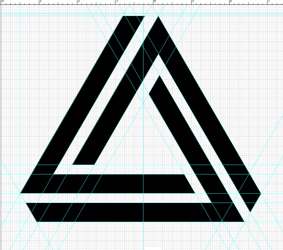
The geometric abstraction of an ‘A’ displayed as an impossible triangle is a symbolic reference. As an impossible object, it represents a specific, recognizable, and unique symmetry but an inconceivable reality. Designed to look distinct and deliberate, familiar and but amorphous. Open to interpretation and capable of carrying meaning and ethos defined by context and application. The symbol was meant to be easily reproducible not just for the sake of branding consistency, but for versatility and media application as such the basic symbol of the triangle and the inclosing “ripple” is meant to allow for stenciling.
The geometric abstraction of an ‘A’ displayed as an impossible triangle is a symbolic reference. As an impossible object, it represents a specific, recognizable, and unique symmetry but an inconceivable reality. Designed to look distinct and deliberate, familiar and but amorphous. Open to interpretation and capable of carrying meaning and ethos defined by context and application. The symbol was meant to be easily reproducible not just for the sake of branding consistency, but for versatility and media application as such the basic symbol of the triangle and the inclosing “ripple” is meant to allow for stenciling.