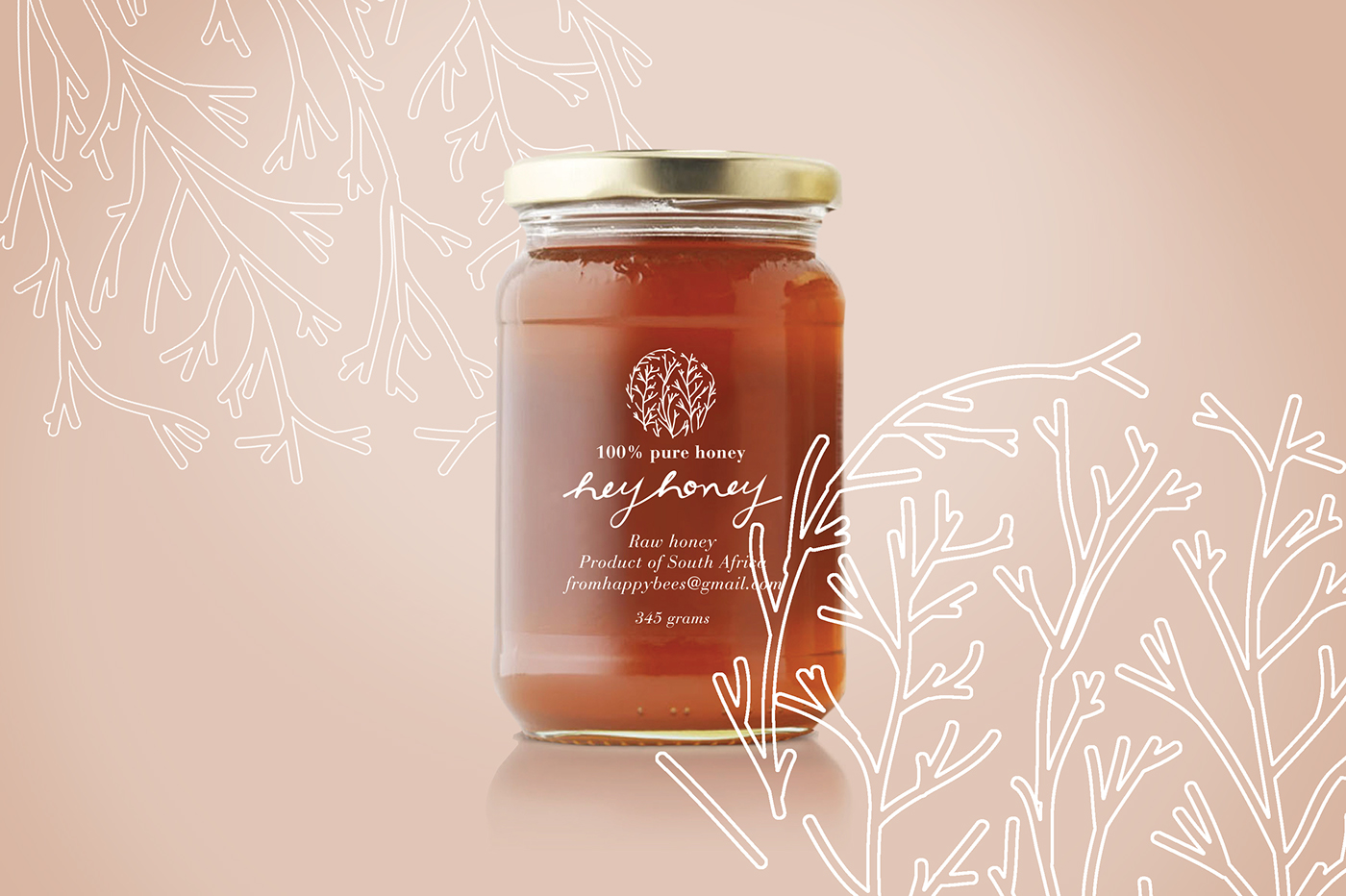
Hey Honey is a raw honey and natural product, produced in South Africa. The client approached me with the wish to create an upscale brand that could be marketed to a niche market of health conscience consumers, looking for a hip alternative as well as proudly South African product. Like their honey, the branding for Hey Honey is characterised by a natural, sophisticated style, and wholesomeness.
Inspired by nature, science and joys of healthy outdoor living, the proposal consisted of logotypes that communicates the premium value.
Inspired by nature, science and joys of healthy outdoor living, the proposal consisted of logotypes that communicates the premium value.
After many explorations and a quick focus group experience- the logotype which would become the packaging label was decided upon. The label captures the quality experience and natural elements. An abstraction of branches was used to communicate the nature aspect while the handwritten logotype suggested the cottage industry, home made aspect of the product.
The bottles appear clean and simple as the information is printed onto it in one colour- not to cover or hide the product.

Packaging: label schematic

Logotype

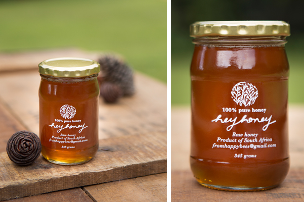
Photocredit: Lelanie du Preez

Other logo explorations


