The health care reform debate has been a huge issue here in the United States recently. If you haven’t been involved in some conversation regarding it with your family or those around you, it is definitely something worth taking the time to learn a little more about.
Recently had the pleasure to work on an editorial centerfold for The Reflector pertaining to the intricacies of the United States health care dilemma.
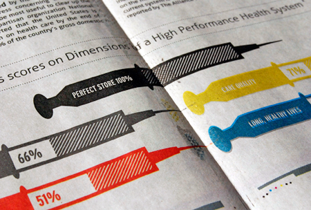
The editor was faced with the rather monotonous task of displaying a large amount of statistical data and some rather cumbersome articles in an appealing way. I stepped up to the task in hopes of creating a layout that achieved our intended purpose: getting readers involved in the debate without them being overwhelmed by the amount of copy that littered the page.
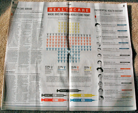
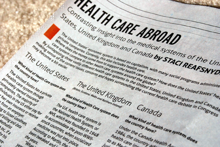
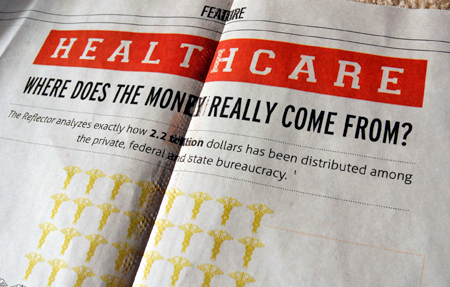
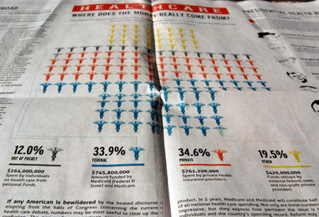
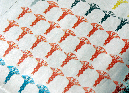
Key components included a compare/contrast, statistical analysis of the expenditures involved with health care, and a historical analysis of presidential efforts to pass health legislation. It can be said that one of the biggest questions in the debate is “Where will, or does, all of this money come from”. We hoped to address that with our main call to action and centerfold graphic which utilizes the caduceus.
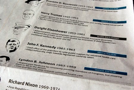
This was a great exercise in utilizing the information graphic to tell a story. Much of the research is initially compiled by the editor. However, once the copy has been wrote it is the designers job to translate that into something people will want to read. Maybe they’ll even enjoy your solution. As a designer it is also essential that you gain a firm understanding of the editor’s end goal. Much like a client, what they think they want may not be what they ultimately need in order to communicate their message. This was particularly true for the presidential time line that was included in the final piece.
Initially given a 5 page research paper, we hacked down the data into a manageable, modular layout that easily and quickly communicates the relationships between presidents and their health care legacy. By color coding which movement each president allied himself with, we can easily see shifts from term to term. Including simple illustrations of each president allows easy facial recognition and coherency to the final piece. From there we attach concise excerpts from each term.
Recently had the pleasure to work on an editorial centerfold for The Reflector pertaining to the intricacies of the United States health care dilemma.
The editor was faced with the rather monotonous task of displaying a large amount of statistical data and some rather cumbersome articles in an appealing way. I stepped up to the task in hopes of creating a layout that achieved our intended purpose: getting readers involved in the debate without them being overwhelmed by the amount of copy that littered the page.
Key components included a compare/contrast, statistical analysis of the expenditures involved with health care, and a historical analysis of presidential efforts to pass health legislation. It can be said that one of the biggest questions in the debate is “Where will, or does, all of this money come from”. We hoped to address that with our main call to action and centerfold graphic which utilizes the caduceus.
This was a great exercise in utilizing the information graphic to tell a story. Much of the research is initially compiled by the editor. However, once the copy has been wrote it is the designers job to translate that into something people will want to read. Maybe they’ll even enjoy your solution. As a designer it is also essential that you gain a firm understanding of the editor’s end goal. Much like a client, what they think they want may not be what they ultimately need in order to communicate their message. This was particularly true for the presidential time line that was included in the final piece.
Initially given a 5 page research paper, we hacked down the data into a manageable, modular layout that easily and quickly communicates the relationships between presidents and their health care legacy. By color coding which movement each president allied himself with, we can easily see shifts from term to term. Including simple illustrations of each president allows easy facial recognition and coherency to the final piece. From there we attach concise excerpts from each term.