

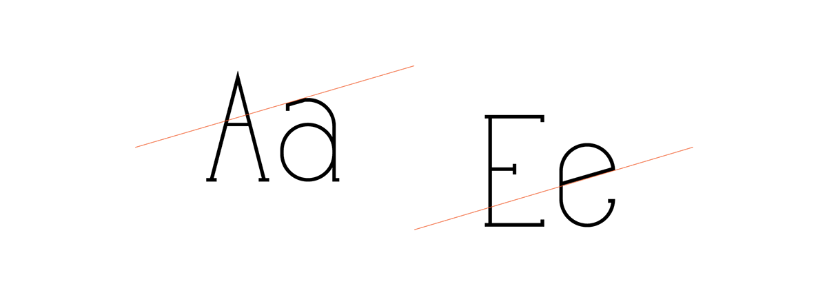
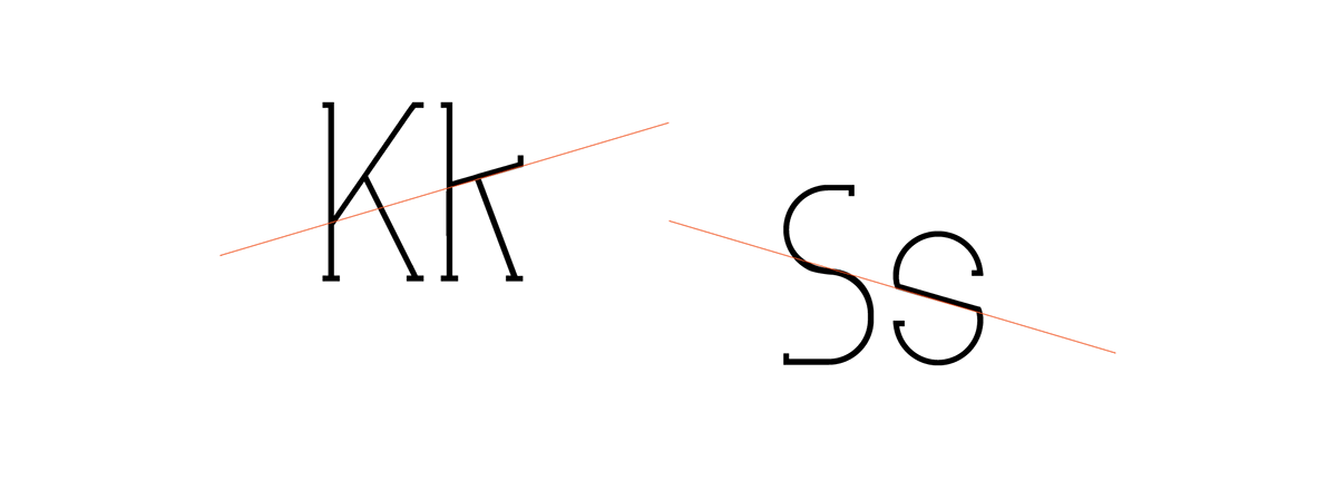
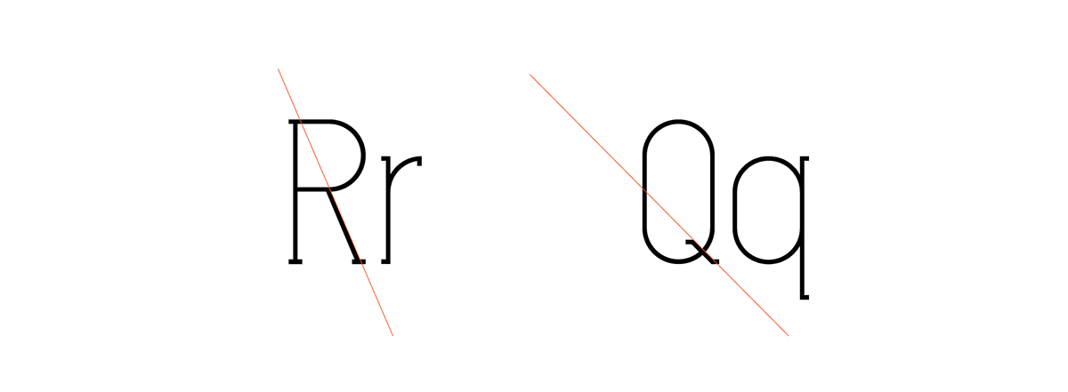
Font outline
The idea was to create something industrial but modern at the same time.A font that could portray elegance but also have a robust feel to it. The curves contrast with the sharp angles to give simultaneously the sense of modernism and unpredictability.
I named the font Hammer because the slab of the letters make them look like nails. It was purposely done to create a bit of contradiction with the feel of the font but again if I called it ‘elegance’ it would not have the same impact. This project was a good opportunity to complete the font that I have had in my mind for a long time. I am also planning to add some additional weights in the future.
Software Used
Illustrator CS5 / FontLab Studio
