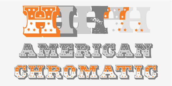
The HWT American Chromatic set is a multilayered font set that will allow for thousands of possible color and pattern combinations. The original 19th Century chromatic that this font set is based upon included 2 fonts. The HWT digital version includes 8. The alignment is configured to allow any combination of the 8 fonts to all align when identical text is set and arranged, one on top of the other. Due to the highly decorative nature of this font set, the character set is limited to upper case only with basic punctuation. Five of the eight fonts in the set can be used individually as variations of the classic Tuscan style of wood type, which is defined by its concave stems and serifs. There are no accented characters also due to the ornate nature of the design and because there were no accents originally intended for this design.

American Chromatic was originally created by Wm. H. Page & Co. circa 1857-59. It was created as a two part chromatic where portions of each color would overlap to create a third color via the blending of semi-transparent inks. Chromatic wood type was an innovative approach to the limits of the technology of the time. To print them as shown in their specimen books required a highly skilled printer.
The original two designs* (American Outside Class F & American Inset Class B) are reproduced as HWT American Chromatic and HWT American Inset. For the original source material, proofs were pulled at the Hamilton Museum. These included the full upper case character set and basic punctuation. No figures were found in any specimens. A single 4 was found printed in a specimen book that showed a comparison of a similar design by Morgans & Wilcox Mfg. Co.
The Morgans & Wilcox was almost identical to the Page design except that there were no stars in the top dark portions of the type. The figures were extrapolated using the unornamented Hamilton Tuscan no. 25 as a reference. For several reasons (including the crowding that would take place trying to fit in a dark shaded top and stars), it was decided not to create a lower case for this font.
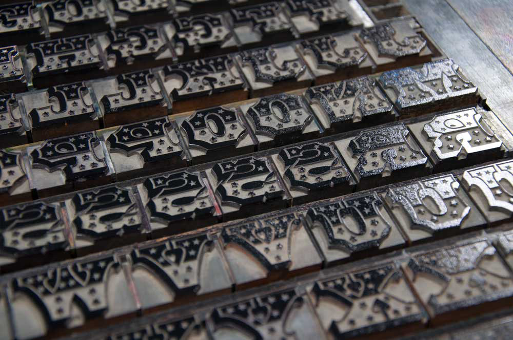
8 line American Chromatic type on the press at Hamilton Wood Type & Printing Museum

Proof of the original wood type in the Hamilton collection printed by Hamilton Assistant Director Stephanie Carpenter

Outlines redrawn into FontLab and layers created all using the same metrics and some technical gobbledygook
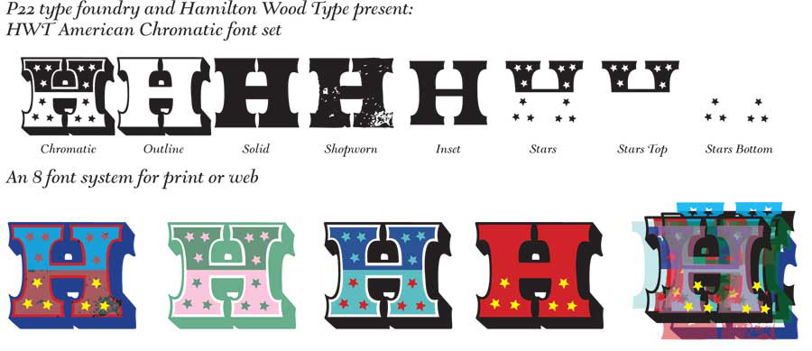
The dgital font iset features:
HWT American Chromatic
As originally designed in the late 1850s.
HWT American Inset
As designed in the late 1850s. The companion to the main chromatic font, on its own is a quirky, thinner Tuscan style with wider spacing
HWT American Solid
Similar to a classic Tuscan style, but with spacing and kerning that aligns with other American component fonts
HWT American Shopworn
As per American Solid, but with a simulated distressed look implying decades of use and abuse in a jobbing print shop. Includes OpenType scripting so three of the same letters next to each other automatically will not have the same distressed marks [for applications that access the Opentype contextual alternates feature]
HWT American Outline
Just the outlined Tuscan with a drop shadow
HWT American Stars
Top and Bottom Star components of type design
HWT American Stars Top
Top Star components of type design
HWT American Stars Bottom
Bottom Star components of type design
A detailed description of how to use the webfonts as multi layered live text is featured on this blog by Adrian Roselli
