The initial source material for this digitization project was found in the print studio of the Western New York Book Arts Center. All but one of the four different sizes of Gothic Round in the WNYBAC collection are coated with an enamel veneer. Wood Type with enamel coating is likely from the National Printers' Materials Co. New York of the 1880s. Lower case letters were only found for the smallest two sizes. As with most wood type found in shops, lowercase is harder to find since bold headlines of all caps were the primary need.

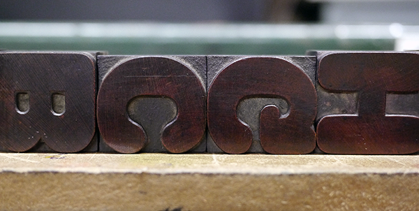
4-line of the Wm. Page version wood type Gothic Round, from the Cary Collection at RIT.

The are many version of Gothic Round from just about every wood type manufacturer. Each had their own quirks and defining characteristics. The earliest use found was from George Nesbitt in 1838. Additional versions as noted on the Rob Roy Kelly Collection site are:
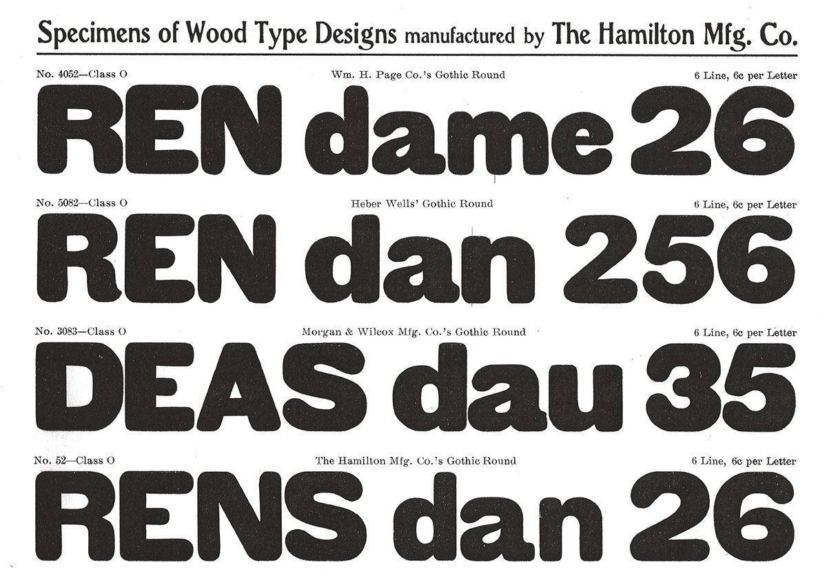
- Hamilton Gothic Round or No 52
- Knox Round Gothic
- Morgans & Wilcox Mfg. Co. Gothic Round [3083]
- National Printers’ Materials Gothic Round
- Wm. H. Page Co. Gothic Round [4052]
- Tubbs Gothic Round or No 2061
- Heber Wells Gothic Round [5082]
- Hamilton Gothic Round or No 52
- Knox Round Gothic
- Morgans & Wilcox Mfg. Co. Gothic Round [3083]
- National Printers’ Materials Gothic Round
- Wm. H. Page Co. Gothic Round [4052]
- Tubbs Gothic Round or No 2061
- Heber Wells Gothic Round [5082]
After Hamilton bought out Page, Wells and Morgans & Wilcox, they briefly offered the various cuts from their former competitors before standardizing.
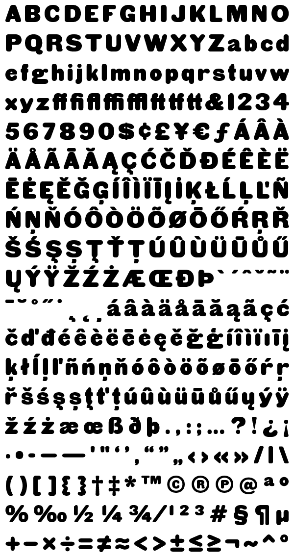
In settling on which version would best inform this new digitization, designer Miguel Sousa of Adobe looked at specimens from the Newberry Library in Chicago, Massey College Library (University of Toronto) and at wood type from the Cary Collection at RIT in New York. He also visited and printed at the WNY Book Arts Center and, of course, at the Hamilton Wood Type Museum to get a full immersion into this font project. Ultimately he settled upon the use exemplars from multiple cuts to create a more pleasing hybrid. The uppercase, the figures, and the punctuation were based on 8-line print samples of the Heber Wells version (WNYBAC collection), while the lowercase was sourced from pictures of 4-line type of the Wm. Page version (Cary collection).
Overall some of the most jarring quirks found in various versions were left out, in favor of a solid type. But many distinctive features, such as the flat top of the lowercase j and the asymmetrical counters of the numeral 8, were left intact to preserve the design's character.

The question mark for Gothic Round was spotted in the a box of type that The Arm Letterpress proprietor Dan Morris acquired for the Cooper Union Letterpress Studio. This font contained no lower case letters and was stamped Hamilton.
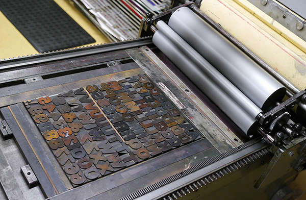
Detail of the uppercase as it was being printed at the WNY Book Arts Center studio.
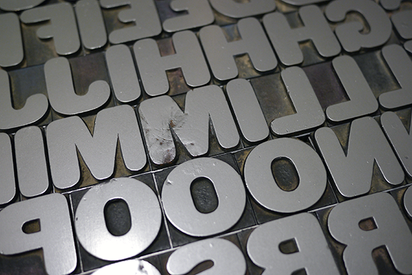
Closeup of the uppercase to study the different widths of the blocks.
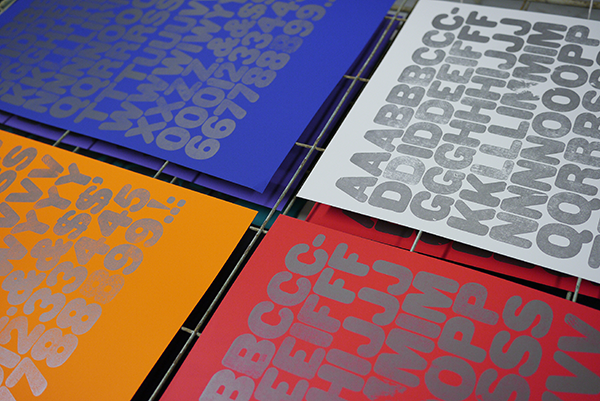
Letterpress specimen posters of the uppercase.
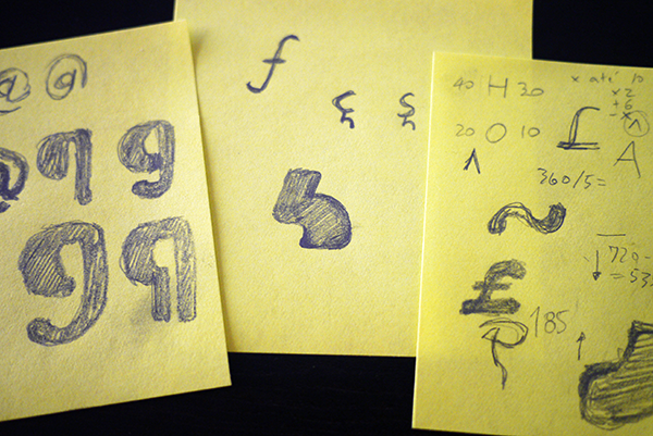
Sketches by Miguel Sousa for some of the glyphs that never existed as wood type.
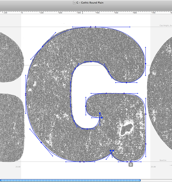
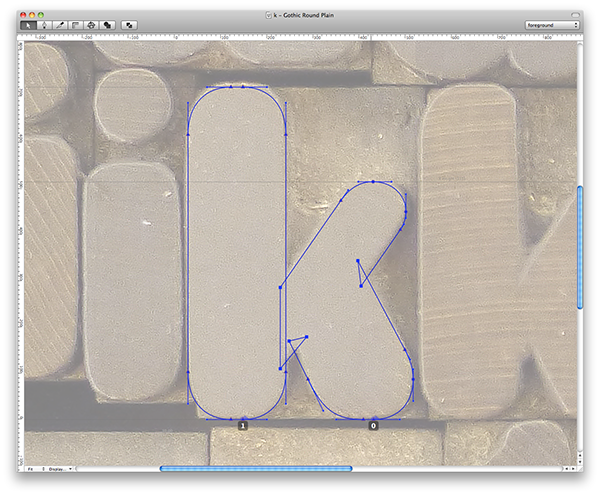
Digitizing the uppercase G and lowercase k in RoboFont
Available for sale via http://www.hamiltonwoodtype.com/
The Hamilton Wood Type & Printing Museum in Two Rivers, Wisconsin is the only museum dedicated to the preservation, study, production and printing of wood type. With 1.5 million pieces of wood type and more than 1,000 styles and sizes of patterns, Hamilton's collection is one of the premier wood type collections in the world and an unparalleled source of research material for type designers. A portion of proceeds from all sales of the HWT digital fonts goes toward supporting the mission and operation of the The Hamilton Wood Type & Printing Museum.
