Early in 2008, looking at the sort of typesetting that was in a locally-produced paper, and those from the rest of the planet, I had an idea for a font. I had already been producing fonts from the beginning of the noughties but before the end of 2008, I had finished and published this project (check out Luc Devroye's Typeface site at McGill University, Montreal, Canada). I called it 'Gurvetica' and like all of my fonts, you can download it and use it, commercially or non-commercially, for free.
Gurvetica is designed to have high legibility - in a similar way to the popular font Helvetica, hence the name - but in the context of Gurmukhi text. As a result, rather than being just a clone of Helvetica, it differs from Helvetica in some areas such as: deliberately not complying with Helvetica's 'only horizontal- or vertical-ends of letter lines' simply because doing so makes Gurmukhi ugly; deliberate mono-linear design for higher legibility; and, font sizes 'growing' from central lines because they are based on the bar - which is not at one extreme but around two thirds of the way up the writing system - rather than fitting between two lines. These give it better legibility, especially when changing weights.
The font comes in two types: 'Gurvetica' and 'Gurvetica A'. You can have both installed at the same time and they will co-exist without any problems. However, if you just want one, you need to know the differences.

Gurvetica has Roman characters in the ASCII range of the font and Gurmukhi in its own range - something that has been standard since Windows XP.This means that you can mix Roman and Gurmukhi text in the same paragraph and keep a consistent appearance using just one font.
The Roman characters match the weight, height and width of the Gurmukhi characters in the font.

Gurvetica A has Gurmukhi characters in the ASCII range.This font allows you to use it on older pieces of text that haven't been updates and still use the ASCII range for Gurmukhi characters.
However, this means that if you want Roman text in there, you need to use a different font.
Why Roman characters ? . . .
In newspapers and other media where a mixture of Gurmukhi and Roman characters become necessary, you often see fonts that just don't fit.
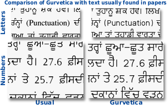
On the top-left, you can see a reproduction of an example from an exam paper where the Roman text font just doesn't fit in at all. The style (serif instead of sans serif) the size, weight, alignment and so on are all wrong. On the right, you can see that when using Gurvetica, these attributes do match the Gurmukhi font.
Below that, with numbers this time, on the left, you can see a reproduction of an example from a newspaper where the Roman numbers font just doesn't fit in at all. Again, the style (not mono-linear) the size, weight and so on are all wrong. Again, on the right, you can see that when using Gurvetica, these attributes do match the Gurmukhi font.

Here, you can see that the Roman text fits in with the Gurmukhi text even at different weights so that it does not look out of place and maintains its legibility.
Why Mono-linear ? . . .

The Gurvetica font is designed to be very legible at any font size, both in body and display text. It is intended for production use and is supplied in a number of widths and weights so that instead of stretching or compressing the font, you just choose a different width. By choosing different widths, you keep a more legible font because people don't need to keep swapping from narrow verticals to wide verticals and so on. Look at this font sample PDF to see what I mean.

Here is an example of text from a newspaper, showing how the people responsible for setting it have just taken the normal font and stretched/compressed it so that it fits the required width.
As a result, you end up with some text that has wide horizontals and narrow verticals and other text that is the other way around. Whilst one or the other is all right if it occurs on its own, seeing both together reduces legibility of the text.

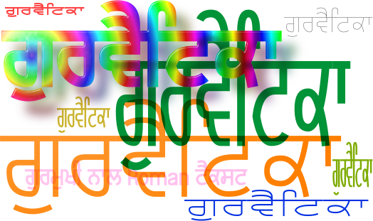
Gurvetica comes in a variety of widths and weights, as you can see from the image above.
As with all of my fonts, this is free to download and use as a normal user would use a font - the font itself is protected by the GPL so you can do what you wish with it apart from modify it.
You can download it for free from here.
It was brought to my attention recently that there was somebody who had decided that they could use my trademark 'Gurvetica' for one of their own fonts but I do not endorse that font and indeed, I have no evidence that such a font exists in reality - it is easy to put up some low resolution images of what a font could look like. As always, all of my fonts, including Gurvetica, are free to download and use so if somebody is passing off some other font by using the name of one of my fonts, word needs to get around of what they are up to because by using one of my names and passing off something else as though it was theirs, they are damaging the reputation of and good faith in my fonts and font families.


