Old Logo
Client requested business cards, I asked her about her logo, and we decided together to redo the entire brand, as the logo did not at all represent what the company does.
The comany services the governement with cleaing, gardening and stationary supply services. She is expanding her business to the private sector and wanted to look the part.
The comany services the governement with cleaing, gardening and stationary supply services. She is expanding her business to the private sector and wanted to look the part.
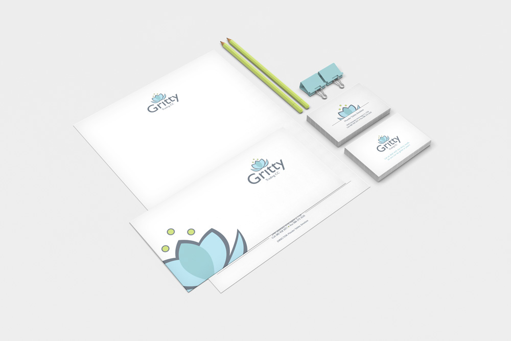
I chose the Lotus flower to represent clean (water of the Lotus), and the flower also represents the gardening aspect. The look and feel is very corporate and professional in other to relate to the corporate market she is aiming for.
The client was very pleased here is her response:
The client was very pleased here is her response:
Hi Hendra
I love what I see hey………………I’m speechless.
I’ll go for option one, the color is accommodating in case of uniforms as well.
I can’t wait to go print my business cards, lol….
I just love your work.
Thanks very much.
Kind regards
Moeder
Option one (Chosen concept)

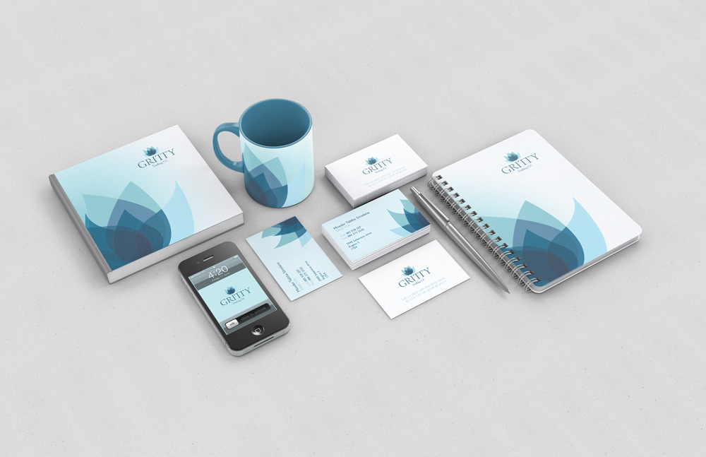


Opton 2