LINDFORM
lindform.se
Graphic Design & Visual Identity
Lindform is a Swedish company that design and manufactures varoius ceramics for a global market. They needed to update their visual identity and the printed materials they use at fairs and retailers.
lindform.se
Graphic Design & Visual Identity
Lindform is a Swedish company that design and manufactures varoius ceramics for a global market. They needed to update their visual identity and the printed materials they use at fairs and retailers.
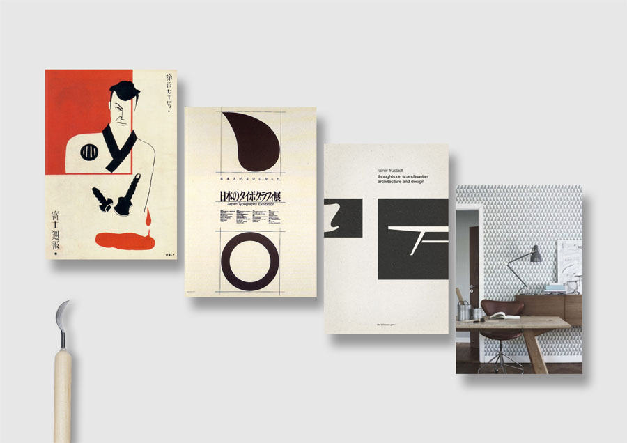
The inspiration for Lindform comes from the Scandinavian nature, with its organic tones and simple shades, and from Japan, whose minimalist style marries well with the Nordic design. The new printed materials would be able to convay this.
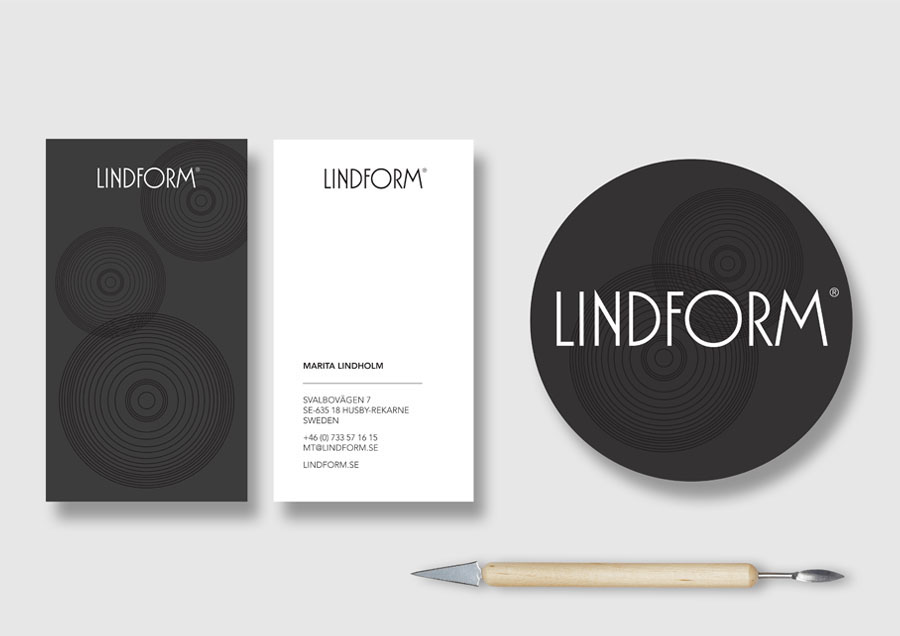
Previously, Lindform had black as their main color and a graphic white three as their symbol. It was decided to remain with the dark color to stay close to the old material. A new symbol in black were created inspired by old Japanese illustrations and the company's pots, viewed from above. A dark grey color was used as the new background color.
The new business card in the new grey color and the new symbol got a white backning to be used for taking notes at fairs. Lindform also asked for a new big stick label to put on the product's packaging.
The new business card in the new grey color and the new symbol got a white backning to be used for taking notes at fairs. Lindform also asked for a new big stick label to put on the product's packaging.
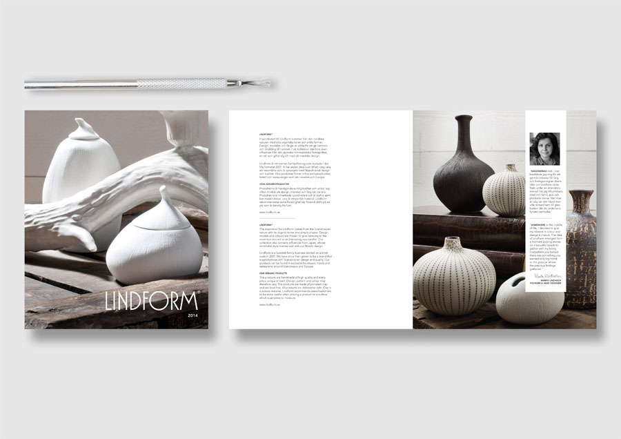
The end result of Lindform's twelve pages product catalog, size 210x250 mm, where page 2-3 containes infomation about the owner, the company and the products. Remaining pages shows the products, interspersed with interior photos.