
Graphic Design for the 2009-2011 year.

This project was a series of 8 x 8” black and white designs. Each design features one unifying element repeatedly while keeping in mind size, scale, background color, overlapping, perspective, etc. The theme of this design is straight lines of varying widths. I used white lines of varying widths on a black background positioned very close together to depict depth and perspective.
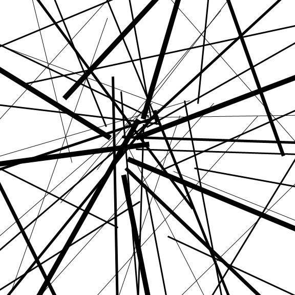
The theme of this design was also straight lines of varying widths. In this design I used a white background with blacklines. In this design all the lines emanate from the center of the square. The varying widths help depict depth and there is an evenuse of positive and negative space.

The theme of this design was simply free flowing lines. This design uses flowing lines of different widths to depict movement and depth. Due to where the lines are located within the square, the design also shows good use of space.

The theme of this design was inverting shapes with a vector layer mask. In this design there are many groups of overlapping squares with either an additional fill layer or has been inverted. The variation in thesize and color of the squares give a sense of dimension and space.

Life is filled with many grey areas. Art imitates life so there are infinite possibilities of shades and color in works of art. This project utilizes many solid blocks of value to create imagery. This project is made from a personal photograph. Each square in the background is .5 inches and the squares in the face and neck are .25 inches that better represent the transition between two colors or color areas.

This project was called Please Recycle, it is a work of art that bridges the connections between my various art practices and ideas. After looking at all of my work, I realized that they had common themes or ideas. This project is a compilation of many projects throughout the semester. Lines, color, and texture seem to be repeated in much of my work. The use of space – or lack there of – and the layering of specific works was the main point of this project.

These last five designs are part of a collaborated “Abcedarium” project or “Book of the Alphabet.” We divided the letters up, each person was given 5 letters to work on. The book had one unifying theme, High Pointism’s. I go to High Point University that is known for its eccentricities. This is an ABC book that points out the more obvious of the eccentricities. As the Panther is our school mascot you will find him invariably somewhere on every page. This first page is for the letter E, it depicts our president making his well-known “Be Extraordinary” speech to the freshman class.

This second page is for the letter J which shows the manyspeaker poles that line the walkways of the promenade and endlessly play jazz and classical music – for the students benefit of course.

This third page is for the letter O. O stands for the many outstanding objects that our school offers that we could not fit in the book under otherletters. It shows, for example, sorority housing, the life size nutcrackers that line the promenade during the Christmas season, the movie posters that show what’s playing that week in the theater on campus, etc.

This fourth page is for the letter T that represents our San Fransican like trolleys that transport its students to many places around campus.
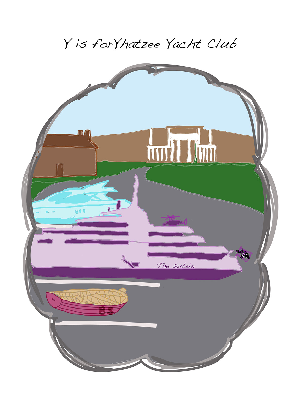
This fifth and last page is for the letter Y. There is a running joke at High Point that everyone who goes there is rich (due to the many country club like amenities offered to us) and therefore must own a yacht. This page illustrates the parking lot in front of one of the buildings but instead of cars parked in it, there are yachts.


