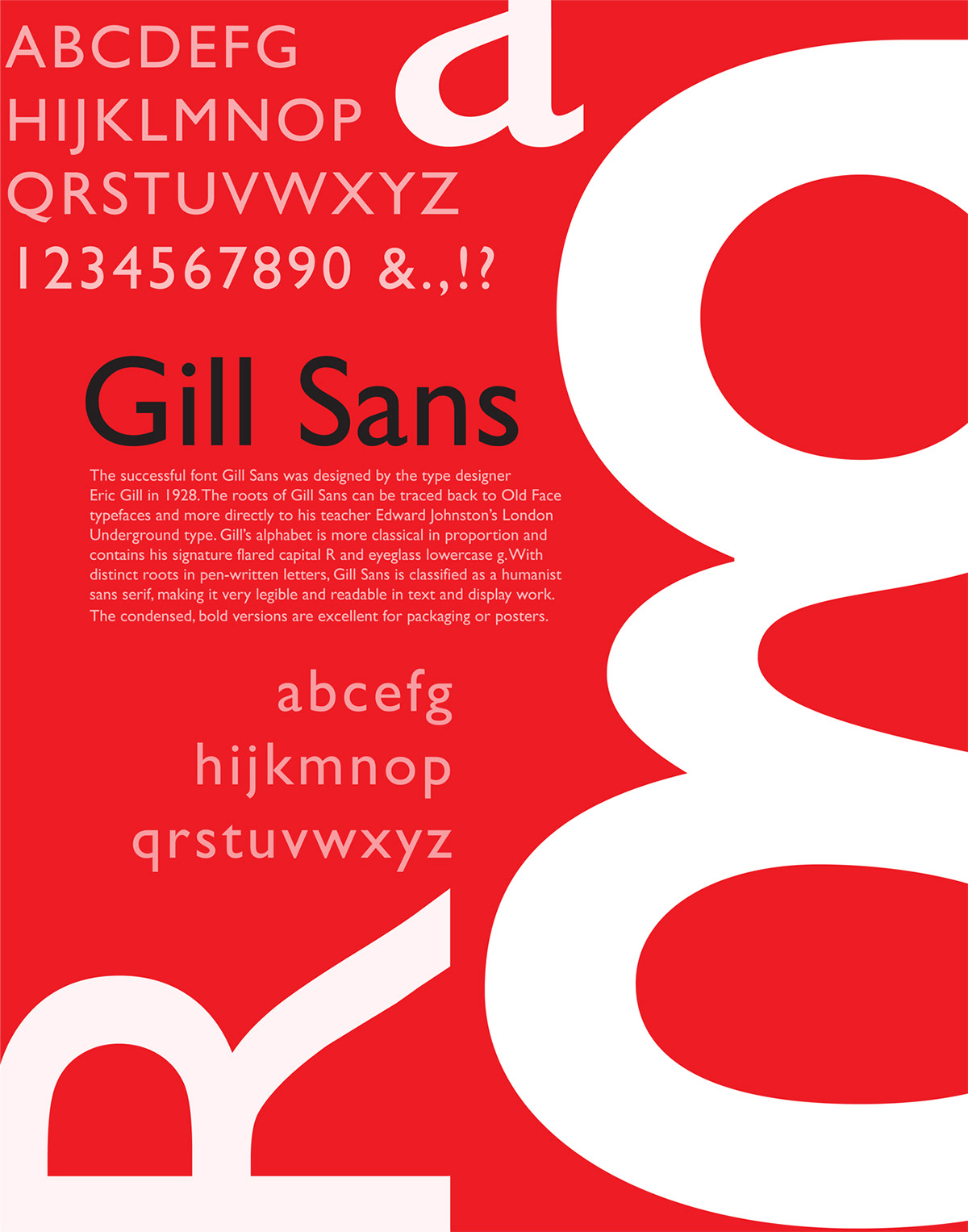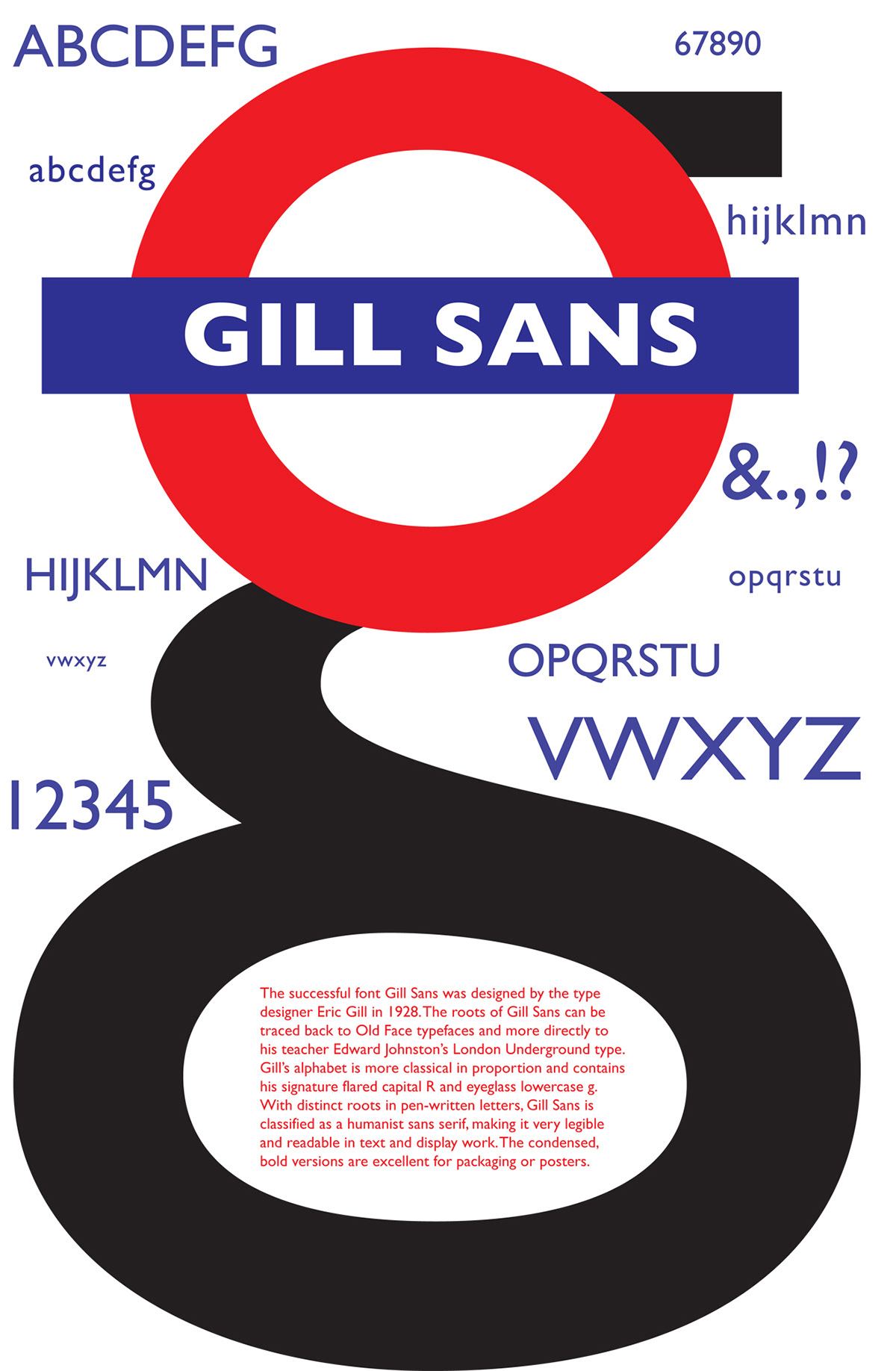
Gill Sans is a very common sans-serif, however its shapes, characters, and proportions are distinct. The lowercase "g" is used because it is creator Eric Gill’s signature. Since, 1997 British organization, such as the BBC, has used Gill Sans as the font for the lettering in its logo. The Church of England has recently begun to employ Gill Sans as the font for its Common Worship texts and collections. While reading the history, it came to my attention that it’s the main typeface for the London Underground. I then decided to incorporate that notion in this advertisement project. I turned the bowl of the lowercase "g" into the London Underground sign by replacing the bowl with an uppercase "o". Since colors are crucial to convey the history, I used red, blue, white, and black. The alphabet is blue and scaled to create movement or in this case a representation of transportation, yet not taking away the main focus "g".
ANOTHER STYLE OPTION FOR THIS GILL SANS PROJECT: