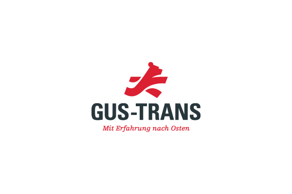
Branding GUS-TRANS
Transporting company specialized in shipping to Russia
Transporting company specialized in shipping to Russia
For this project I eventually received a card blance because the company owners realized that it was very dificult to visually make a link to shipping to Russia without touching any sensitive history. I took the two elements of their brand they wanted to stand out: transport and Russia and conveyed it visually to everyone's likings.

I wanted two contrasting fonts to create some extra tension in the brand to have some balance with the powerful bear. To be sure picking two fonts wouldn't backfire on us I chose two fonts by the same designer: Adrian Frutiger.
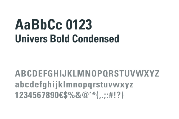
Secundairy typeface

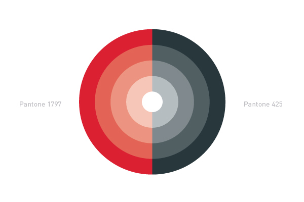
Colors