
GHP Full is a Gurmukhi display font that covers both the Unicode Gurmukhi range and also places Gurmukhi characters in the ASCII range so it is compatible with systems or programs that are not quite as advanced as those that are able to use Unicode.
For those who don't know, the Punjabi word for 'flower' is 'Full' - hence this font's overall style - that of decorative, hand-painted semi-permanent signs such as those you might find for shops or outside buildings advertising regular or important events.
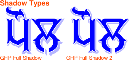
In addition to the style of the font - which stands up as well without any extras - there are two other components to it: a drop shadow (two variants) that has more to it than just the basic type you can make with your image editor; and, a small border (again, two variants) which you can use to help to define the edge of characters when you are using certain colour combinations of shadow and character.
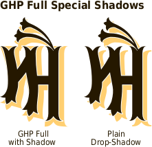
You can see from the image above with the two aerdas in it, the difference between the drop-shadow that you would produce merely by copying the text down and to the right because the left side of the character extends downwards to form the shadow, the right side goes to the right and the bottom-right travels down and to the right.
However, it is not a straight 'zoom' either. each part of the character has this or variants of it done to it, similar to the way that a painter would add a shadow by painting around the character. In the image on the right, you can see two variants of the drop-shadow: the shaped variant and the uniform thickness variant.
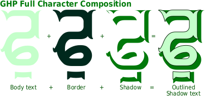
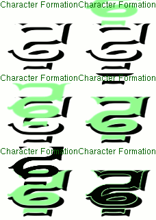
Here, you can see how characters are built up: first of all, you input your text, then you select the body text font; next, you copy that and change it to one of the outline fonts so as to form a border; finally, you add the shadow of your choice by copying the text and changing the font to the shadow font.
You might, depending upon your image editor or DTP program, find that you have to move the border and/or the shadow horizontally, in order to get them aligned properly. To do this, position the shadow text so that it aligns with the body - the shadow has the body removed from it so it should be a perfect match - you might need to change the line-spacing for the shadow layer on some programs - and then, make the border/outline layer visible and position that so that it is evenly spaced around the body layer.

So, which outline layer to choose? If you are going to make your text fairly small, you will need to increase the outline's visibility by choosing the 'outline 2' font, otherwise you can use the 'outline' font or the 'outline 2' font according to your taste.
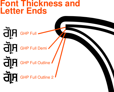
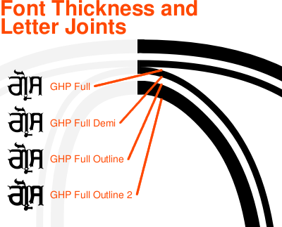
Here, you can see the various thicknesses for the ends of a letter.
GHP Full, goes to a point and is best suited to use in large signs where it can be seen.
GHP Full Demi-Bold forms an end that is more visible at smaller sizes.
The Outline and Outline 2 variants form the border around the letters and you can see here the relative thickness with respect to the body variants.
Here, you can see how each of the variants mentioned above meets up with the next character.
Again, the GHP Full variant goes to a point that all but disappears at smaller point sizes so if you are using this font to make a smaller image, you might want to use the Demi-Bold variant for the body text part of the characters - it might be that you decide that the smaller one looks best - that is your choice.
The Demi-Bold variant forms a stroke that is non-zero-width between characters and makes nice, continuous words, without any apparent breaks.
The outlines overlap each other and form a continuous word - this is why you should form all of your shadows in one layer; your outlines in another, on top of the shadows; and, your body text in the top layer, preventing the lower layers of one character overwriting the higher layers of the previous character.
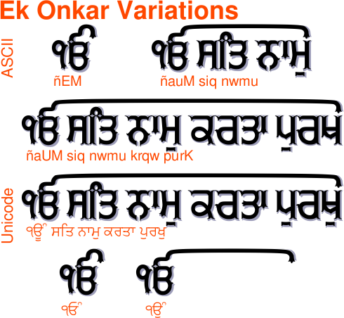
Another feature that I have programmed into this font is that it can extend the tippee part of the oorda of the Ek Onkar so that it is able to reach over some of the following text.
Instead of using the normal Ek Onkar character, use a Gurmukhi one - either in the ASCII range or the Unicode range - and then follow it by either the horda form of oorda, or the aunkard or dulaunkard forms of oorda as in the image above.
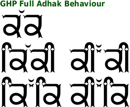
The ASCII part of the font has two variants of the adhak so you can choose whichever you like depending upon the space available. However, the Unicode part of the font will do this automatically for you so there is no need to worry about that.
Also, bindis next to biharis and so on will change as well - this is done automatically by the font if your editor conforms to the specifications - the free image editor 'The Gimp' does this automatically.

This font - like almost all of the others - is a Unicode font with the Gurmukhi characters mapped onto the ASCII character positions as well.
Note that you can see that there are normal ASCII numbers in the ASCII range as well as the Gurmukhi numbers repeated in the extended ASCII range in addition to their presence in their normal place within the Gurmukhi range.
As a result of this, you can use the ASCII keyboard set-up you have if you want to use the ASCII characters and have access to both sets of numbers, or you can use the Unicode layout with Gurmukhi numbers on the keys above the alphabet on the regular keyboard or get the ASCII/Latin numbers using the number pad at the same time.
Also note that there are symbols for Rupee and Euro as well as the regular ones for Pound and Dollar/Cent.
If you are using ASCII, your keyboard layout should include the Gurmukhi numbers as certain key configurations. However, if you haven't got that or are unsure how to get them, the Gurmukhi numbers are at 0x00f1 through to 0x00fa. You can simply copy the string of characters below their corresponding numbers here (starting with ñ)
੧੨੩੪੫੬੭੮੯੦
ñòóôõö÷øùú
and paste them into your image/word processor (or copy the Gurmukhi numbers instead, if your system handles them appropriately).
GHP Full, like all of my fonts is free for you to download and use in the same way that any normal font user would - that is to say for producing work of a commercial or non-commercial nature.
Although the font has only been out for a few months, it is already being use commercially.

by Diljit Dosanjh - singer and film actor. Amongst other films, he was in 'Jihne Mera Dil Luteya' which used the GHW Dukandar font on posters, DVD cover material and so on.
You can download the font from here as well as find out a little more about how to use it to its fullest effect.


