

Funky Business Romania
Redesigned visual identity of the company I work for, as part of its re-branding process
The new identity is part of the company's rebranding process, as the company has not changed its logo for a decade, since its beginnings. The website was also 6 - 7 years old and totally outdated in terms of... well, everything. The old identity was dry, unexpressive, simplistic (not simple) and didn't say anything about anything. So I went for a brutal, total re-invention of the logo and graphic system. Inspired by Leveleleven's work for the city of Melbourne and after an internal focus group, the final symbol and logotype are the ones below. The logotype is set in Ariel Di Lisio's typeface Paz (light weight) – square, techy but elegant, modern, all caps, full of personality display typeface. Titles and stand-out text is set in Paz throughout other identity apps.
Since I didn't have the sole decision for all elements of the redesign (the colour variations and logotype alternates would have been a way to further diversify the whole system and make it more versatile) the chosen logo works almost exclusively on a dark background (>80% black), making the whole additional elements a black & white play, with little accents of magenta, green, yellow and cyan (which are to be used on titles and rarely on emphasizing body text). Even within these restrictions, the whole identity is still pretty flexible and visually exciting.
Since I didn't have the sole decision for all elements of the redesign (the colour variations and logotype alternates would have been a way to further diversify the whole system and make it more versatile) the chosen logo works almost exclusively on a dark background (>80% black), making the whole additional elements a black & white play, with little accents of magenta, green, yellow and cyan (which are to be used on titles and rarely on emphasizing body text). Even within these restrictions, the whole identity is still pretty flexible and visually exciting.
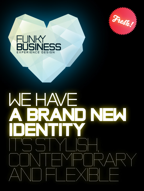
Announcement poster
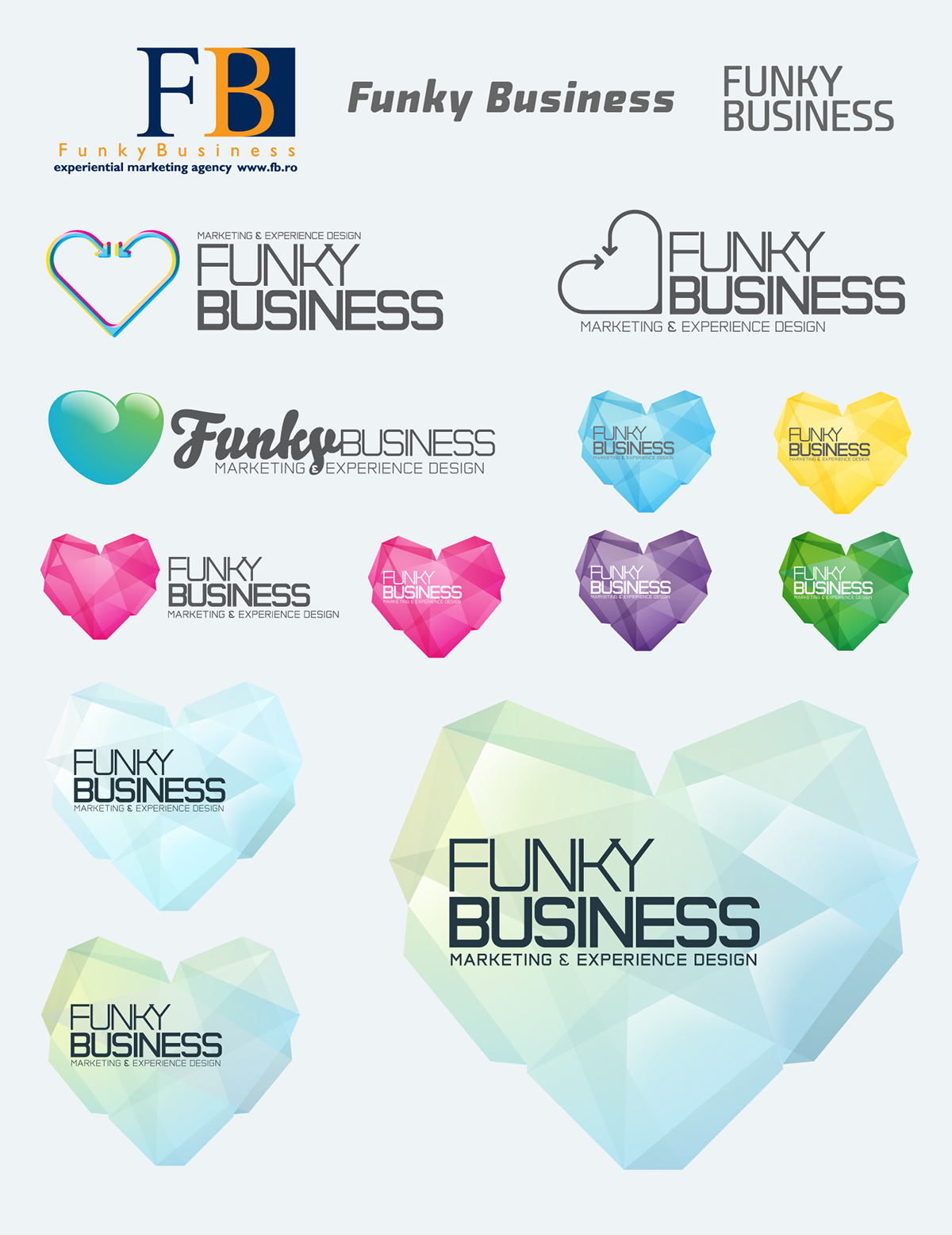
This is a part of the creative process. The old logo is the one on the upper left. I would've also employed the coloured alternates for the new logo, as well as the wordmark positioning alternate. I abbandoned that direction as it wasn't fully embraced internally
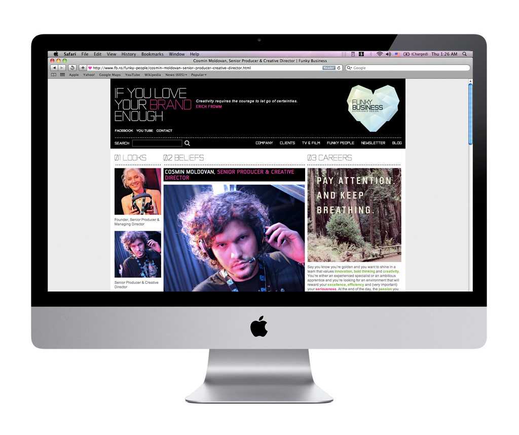
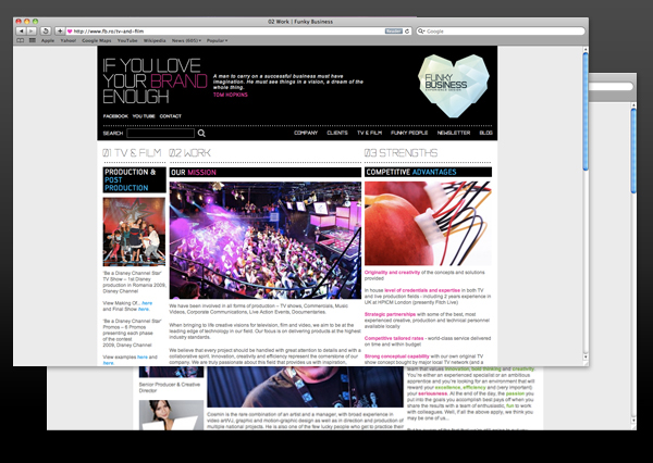
The website. Pretty simple layout emphasizing on usability, intuitiveness and quick browsing through the content. The header features the logo, the selling line and a, on every refresh, a different inspirational quote. A simple blog-like structure works well with the content. See it in action at www.fb.ro
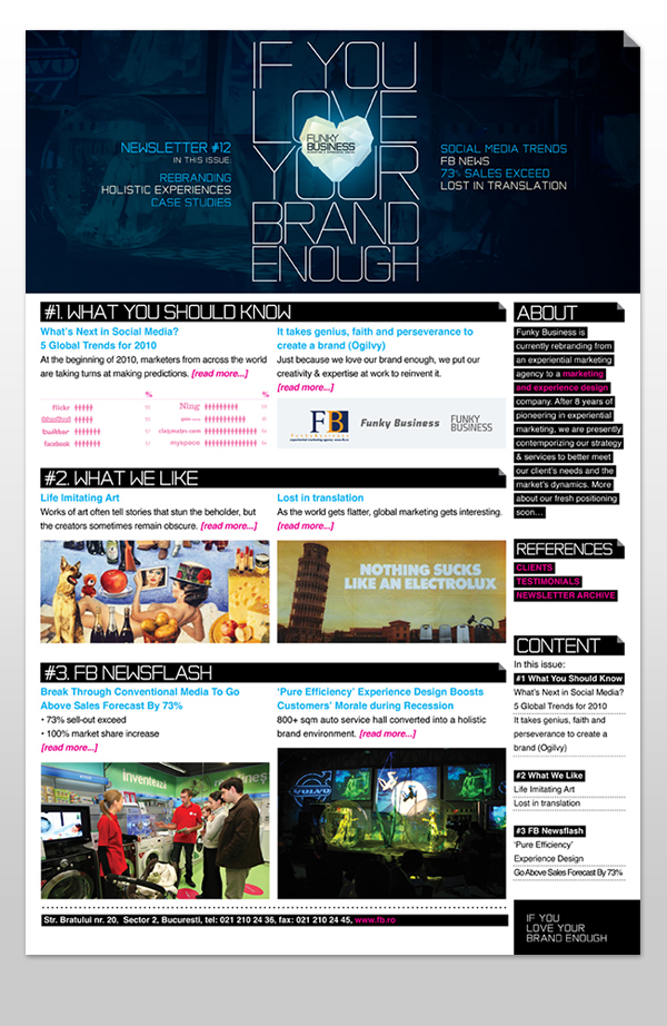
The newsletter layout
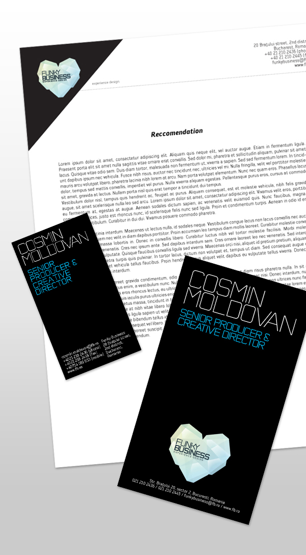
Stationery (letterhead, business card, staff badge)
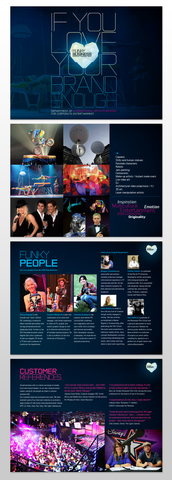
Pages from the departments' presentation brochures.
Short clip announcing the company's rebranding. The clip is part of a promotional e-mail campaign