

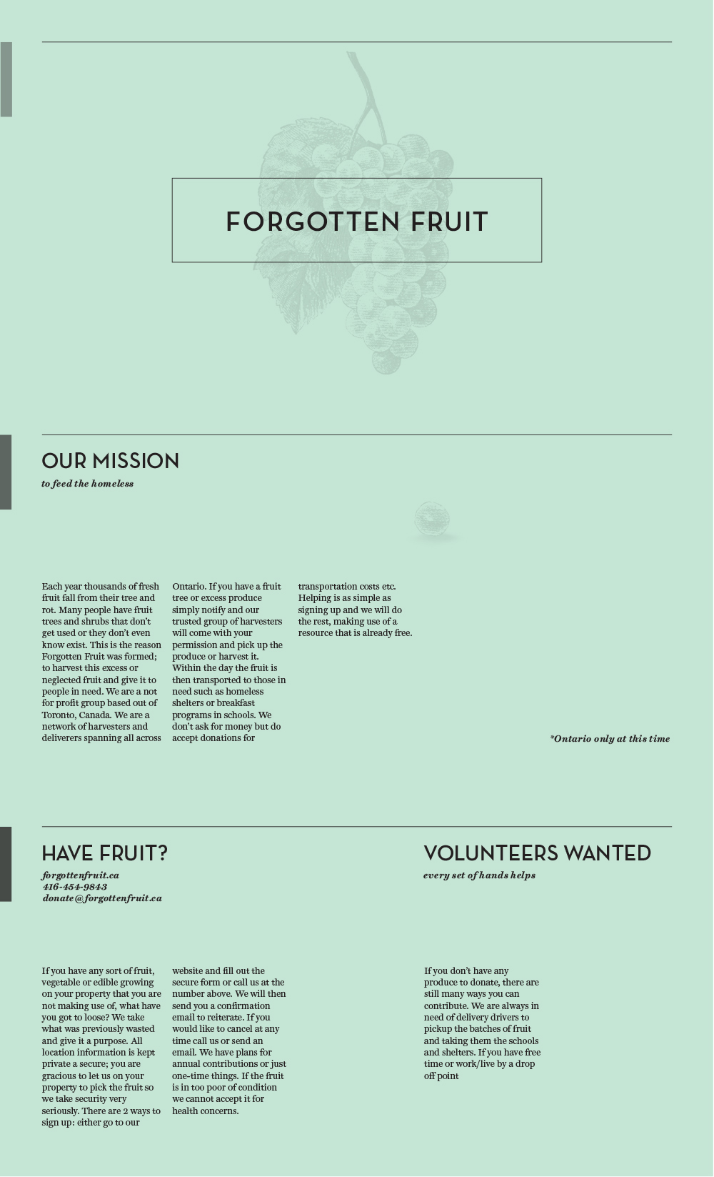
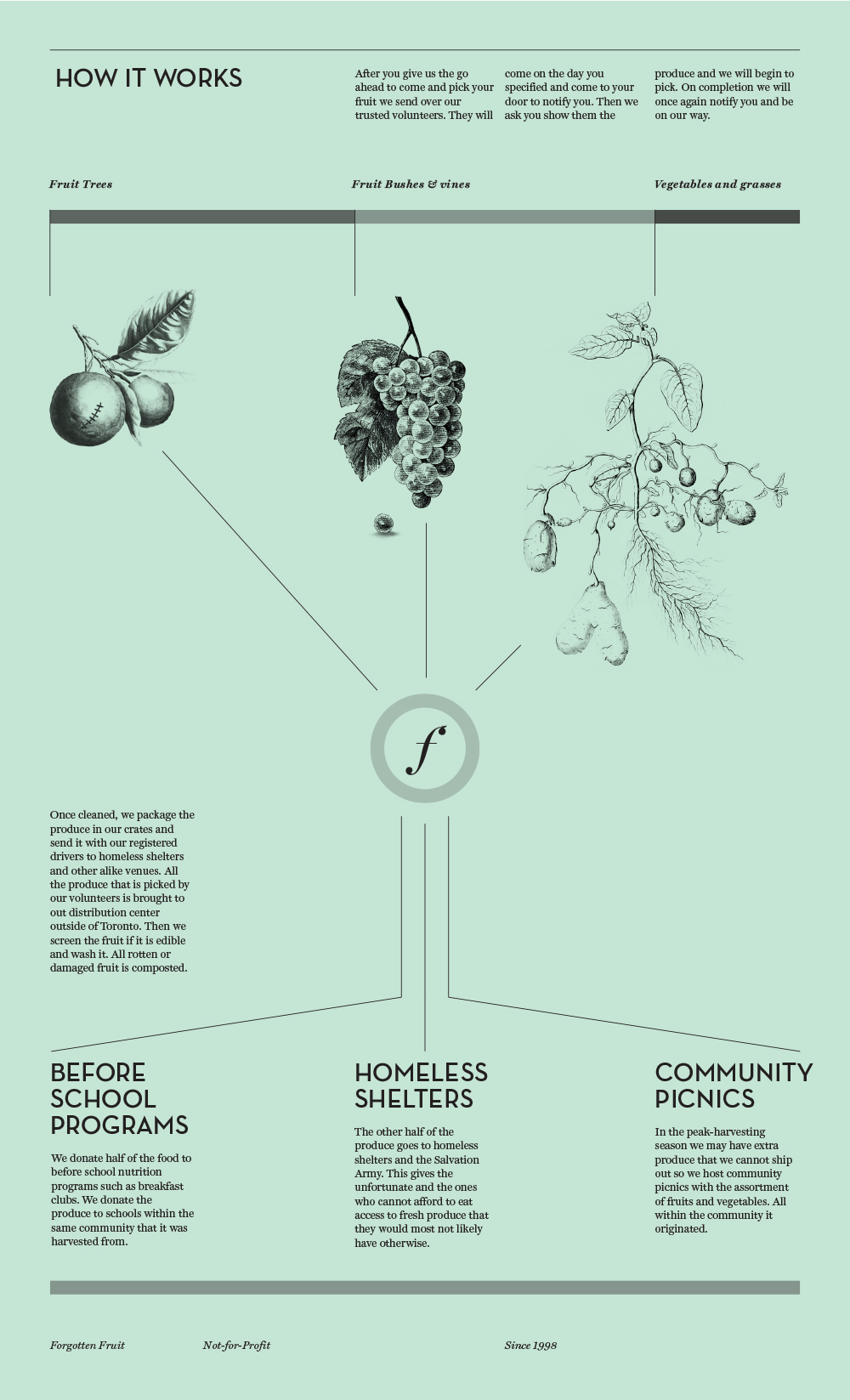
I want to give this this campaign a sophisticated and clean design, but not to be too cold and untouchable so I incorporate some quirky humor. I made the colour scheme green and black to be naturalistic and clean. The imagery I chose was inspired by my title Forgotten Fruit because I chose old wood block carvings of fruit to give a sense of age. The images of fruit have been forgotten in an old book and now scanned and repurposed for my campaign, like the fruit we harvest and give a second life. My type choices also reflect this by using an old 1920s geometric sanserif and italics. I use a 5 column grid to bring order to the design, contrasting the natural subject matter and imagery. My logo is a heavily modified version of Didot, that I shortened and put a leaf and stem on the ball of the serif to relate it to fruit. My tagline is forgotten fruit feeding the homeless. It is purposefully not that strong because my name says it all.


