Super Duty
A robust stencil font family
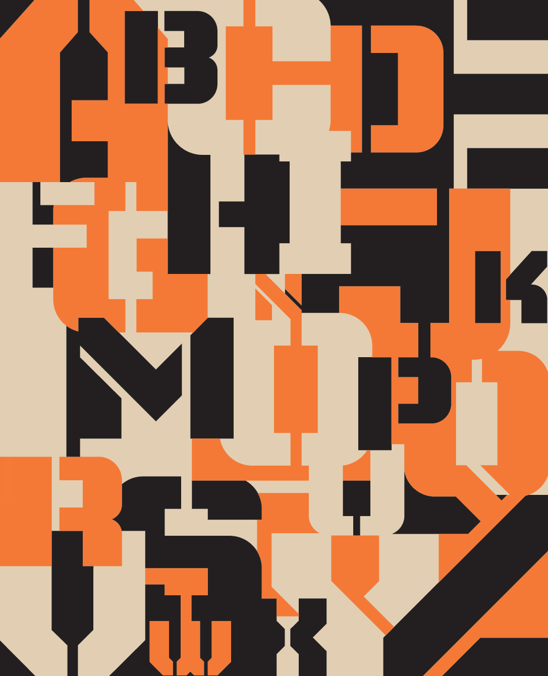
Poster Design for type specimen.
Stencil fonts often evoke rigid and sterile images such as packing crates or military vehicles, but Super Duty is somewhere between serious and fun. Super Duty is designed with sharp mechanical angles which give the letterforms a square-jawed and ready-for-action feel. A rounder companion version is included that has the sharp edges smoothed out.
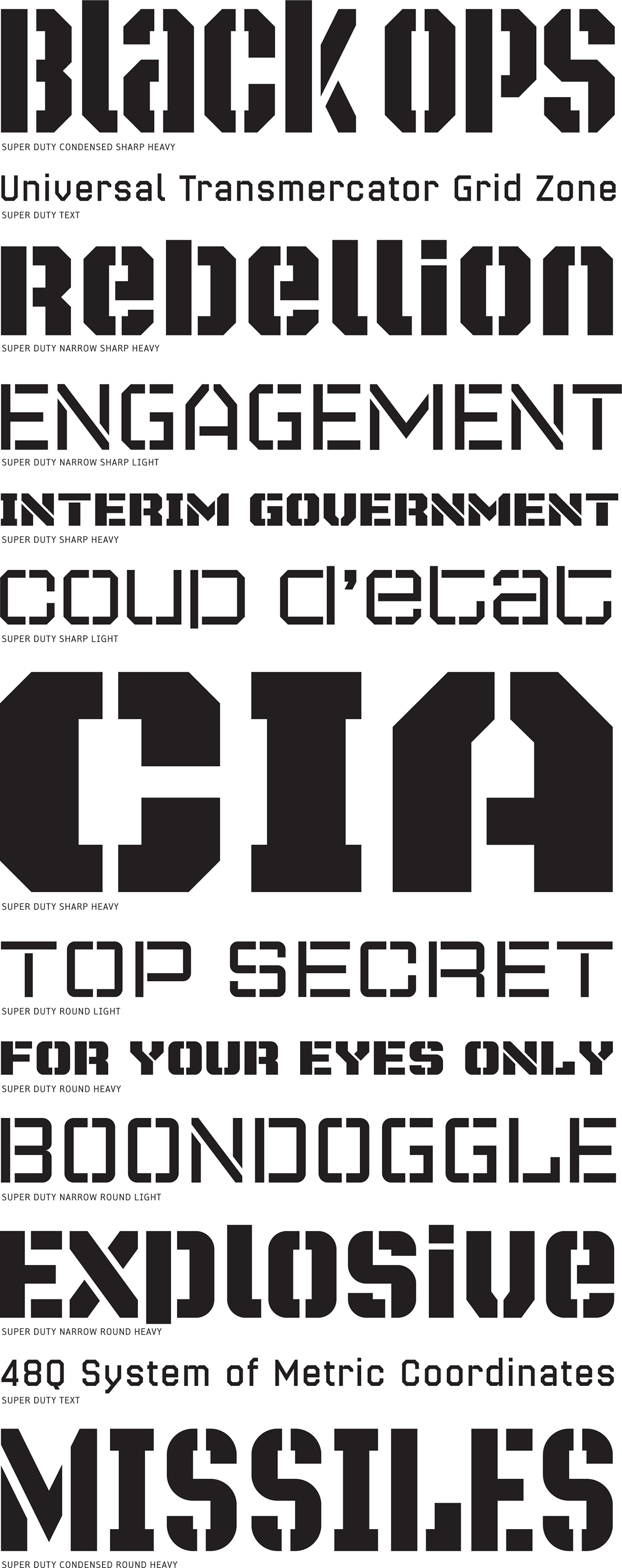
Unlike most stencil fonts this one has a lowercase that matches the strength of the uppercase. The lowercase has been designed with an x-height equivalent to the cap height and barely protruding ascenders so that the user can interchange the upper and lower letterforms for a funky graphic effect.
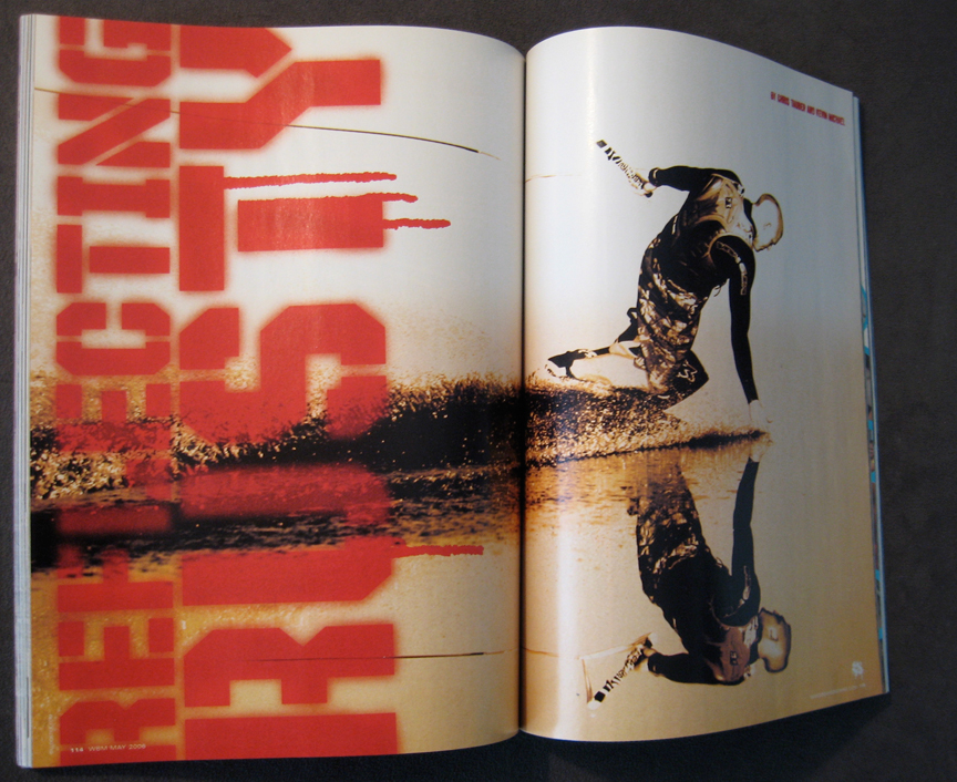
As seen in Wakeboarder Magazine editorial design.
Super Duty is a robust and versatile stencil font family of 25 fonts—sharp and round variations with closed versions in 2 weights each. These are provided in 3 widths—regular, narrow and condensed. Super Duty includes a text version that has more regular proportions and letter forms for a well rounded display font system.
