Font Study: Gotham
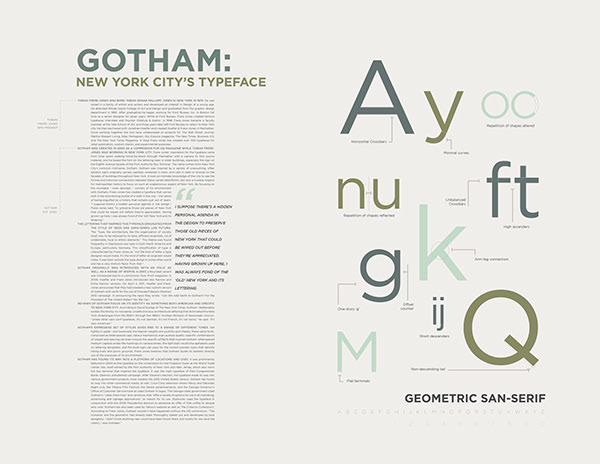
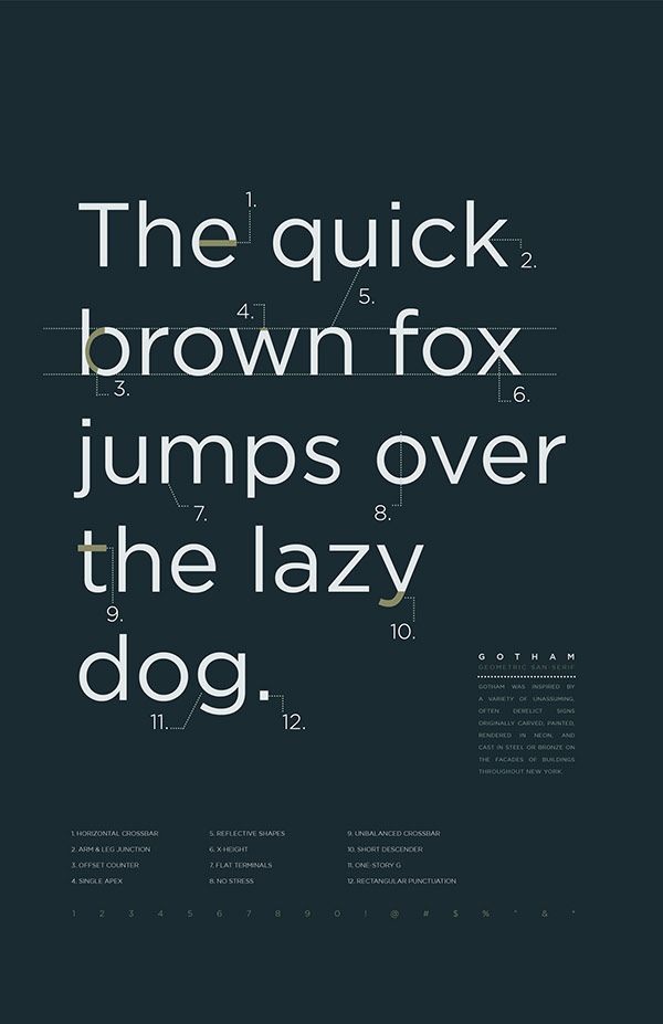
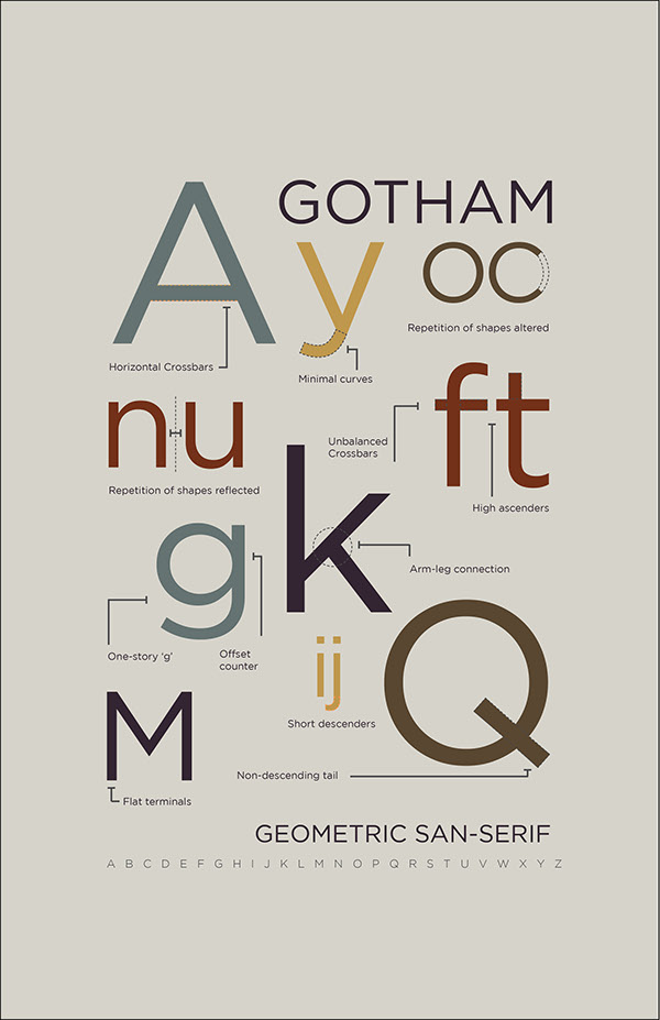
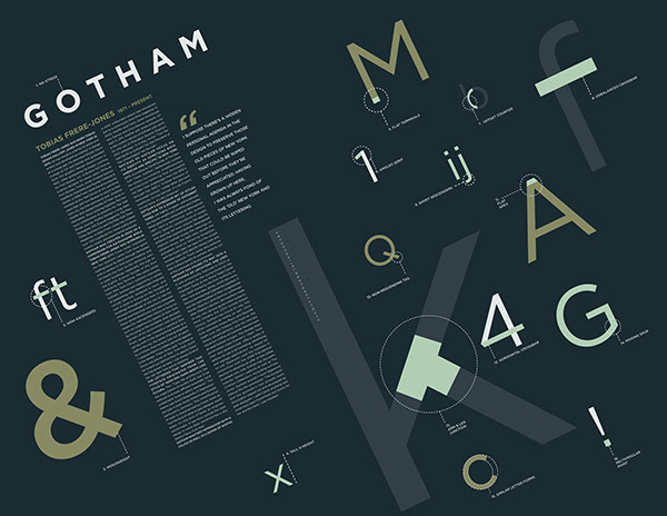
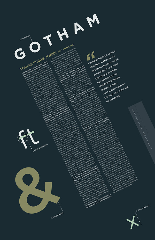
The objective of this project was to become “masters” of a specific typeface. I was assigned to study Gotham, a san-serif typeface created in 2000. My outcome was to be two posters educating others on the anatomy and history of Gotham. The first was to be based on the anatomy and individual characteristics of my typeface, pointing out at least twelve specific details. The second poster was to match the first in imagery and style and provide information on Gotham’s creator, Tobias Frere-Jones, and the history and usage of the typeface.

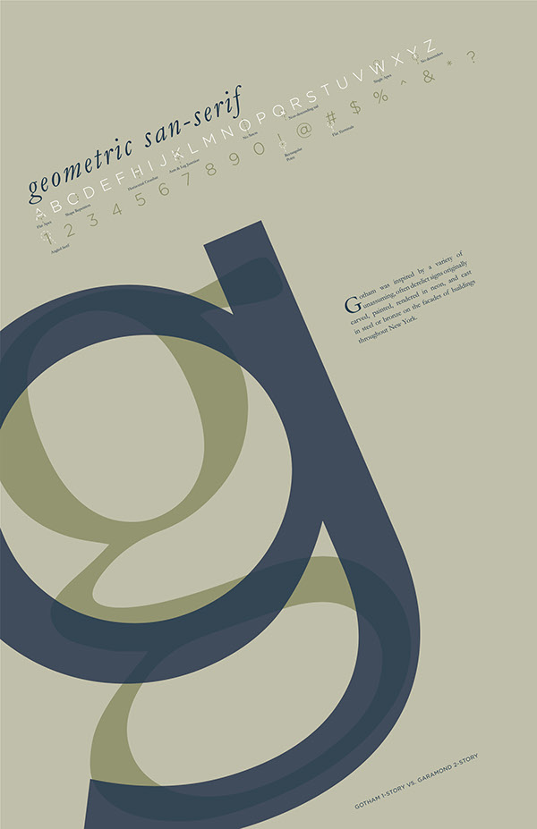
Other Explorations