

This rebrand is about a new era in the Florida Panthers’ history books. Previously, the palm tree was used as the main icon to draw a connection between team and location, but this branding scheme is less about representation and more about the intigration of Miami’s raw elemental energy. The wave-crashed coastlines and fiery sunshine are all iconic reflections of the Floridian lifestyle, which have now been harnassed and combined with the ferocity of its native feline killers. The brand’s ties are still remeniscent of the Panthers’ glory days with Bure, Vanbiesbrouck, and Niedermayer, but are different enough to offer a fresh start to a rising team full of youth and potential.
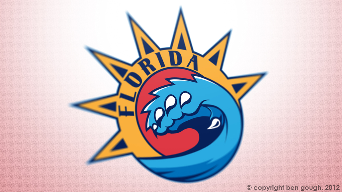
Main Logo
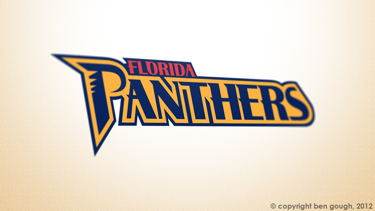
Wordmark

Alternate Logo


