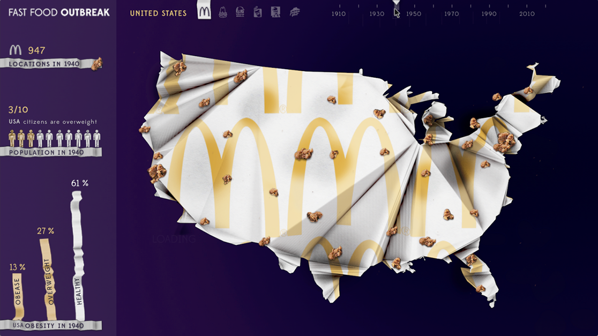
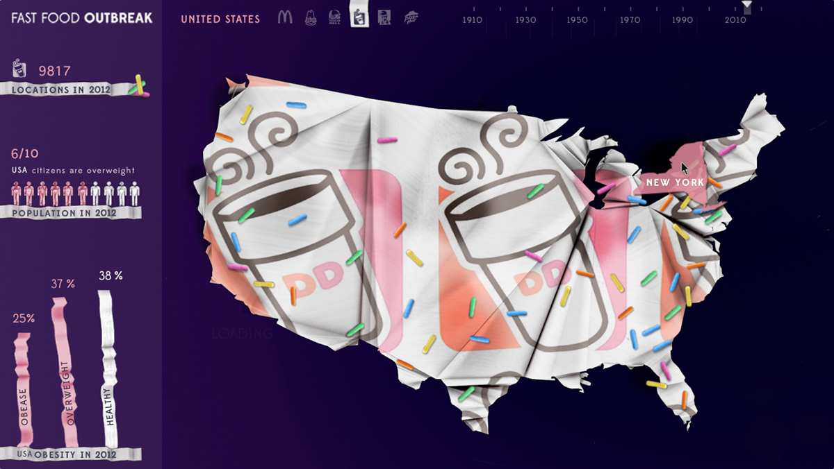
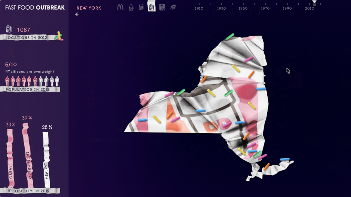
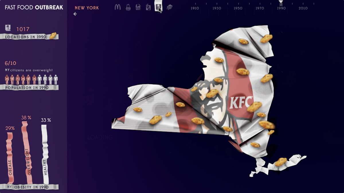
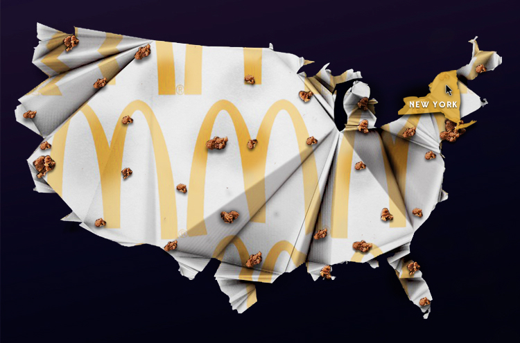
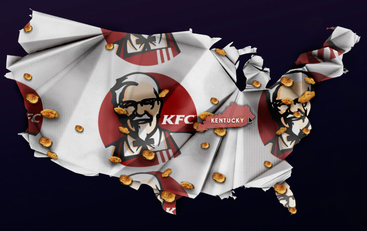
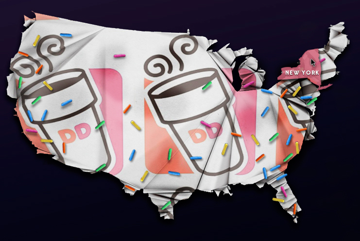
I created an infographic on the expansion of fast food over the years, and show how it relates to obesity. For the maps, I chose to make a crinkled paper similar to a wrapper one receives at a fast food restaurant. The wrapper represents the map, and the food represents the areas that the locations are most prominent in. The user can click on a state, or view the full United States map, and from there the user can select a fast food restaurant, and see how the locations change over time as the user scrolls through the time line. The obesity information on the left updates accordingly. I created this infographic for a class, and and was not endorsed for the use of the logos. Information is representational.