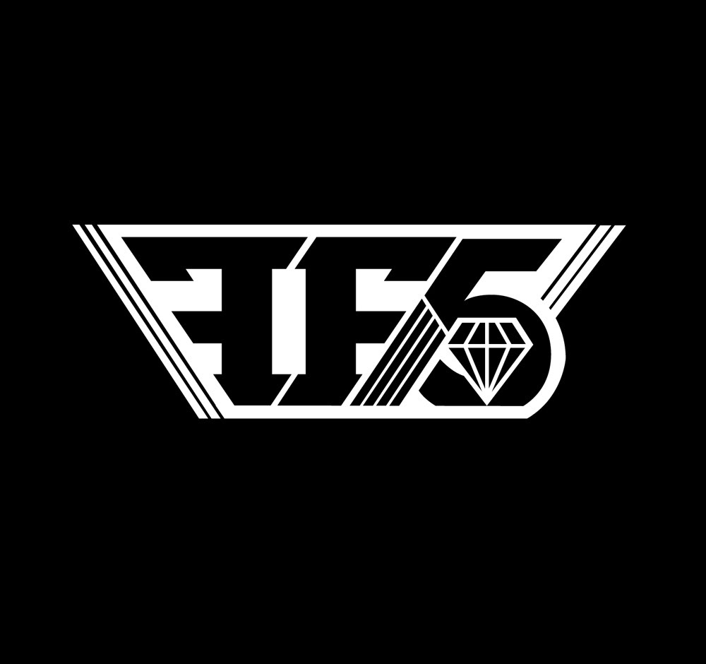
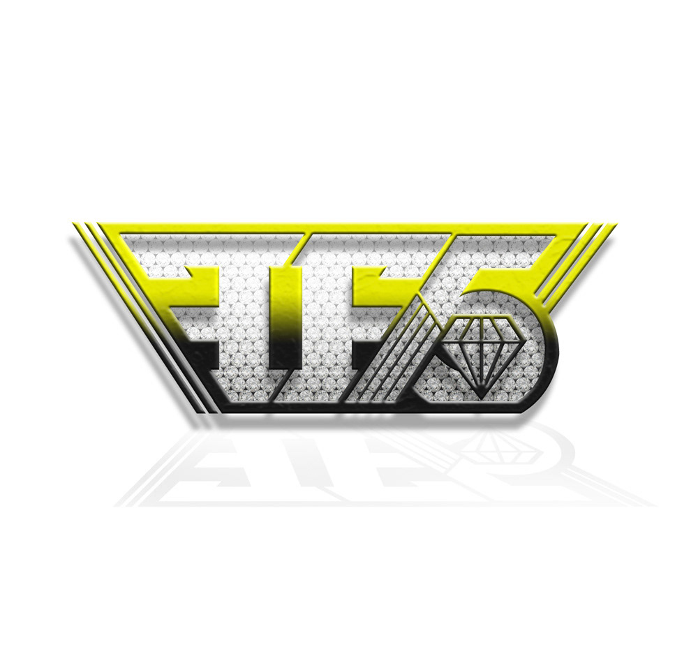
The Band Family Force Five asked me to develop a logo mark that can be used to start abbreviating there name in print to the initials FF5.
I decided to make everything fall into a diagonal lined grid that made the type look like late 80s early 90s hear band ironic typography. Family Force Five has always played off of a "Dirty south" "Dirty Rock" style that comes alive in there stage show. I wanted to capture that intensity in the mark.
These guys are ridiculously cool to work with and gave me tuns of freedom with the project.
You can check out there music at familyforce5.com