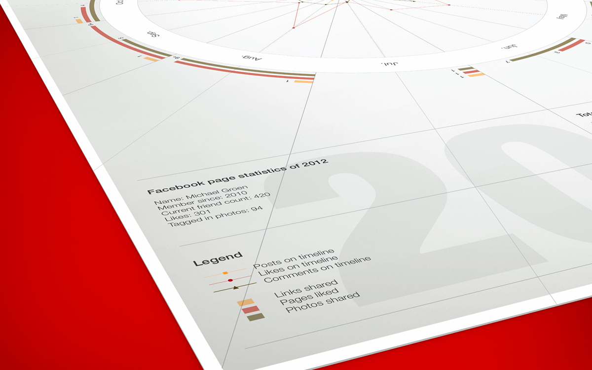
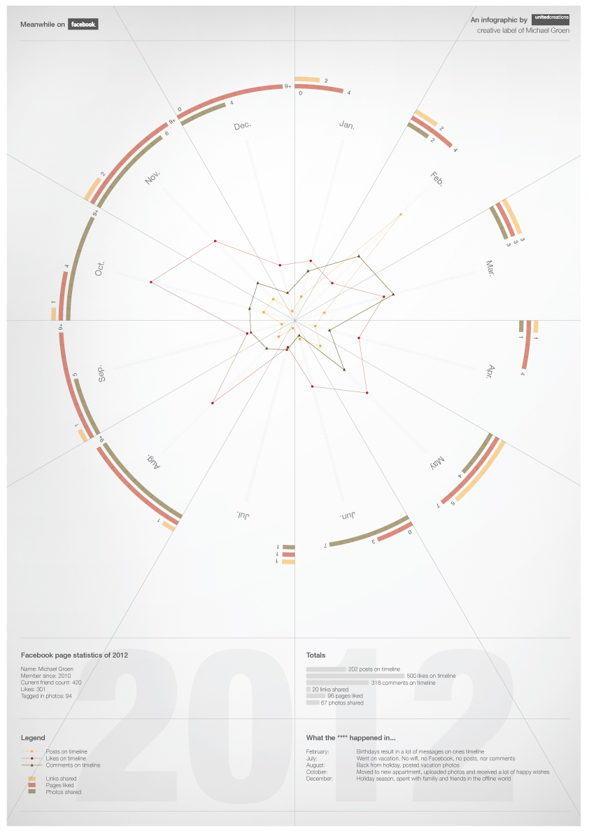
Facebook infographic 2012. To train myself in making infographics I made this visualization of my Facebook activity of 2012. For this Facebook infographic I used six variables:
- Posts on timeline
- Likes on timeline
- Comments on timeline
- Links shared
- Pages liked
- Photos shared
- Likes on timeline
- Comments on timeline
- Links shared
- Pages liked
- Photos shared
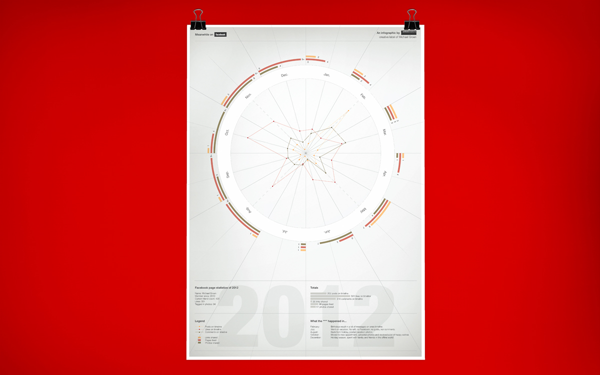
For each variable I made an item score by hand counting all posts, comments, photos etc. from the year 2012. By adding another variable ‘time’ I created a shape that looks like a pie chart. The pie chart itself contains bar graphs and line graphs to visualize the items scores of the six variables. This way the main graphic of the visualization summarizes all the Facebook activity.
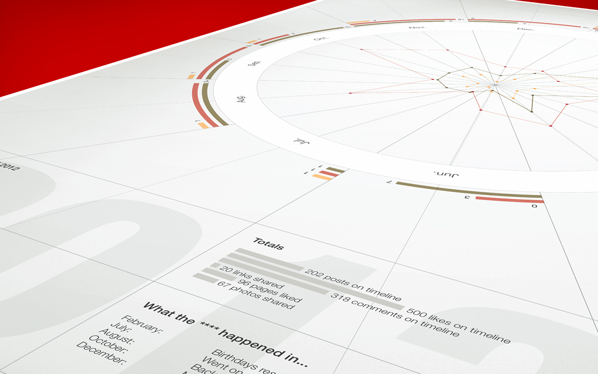
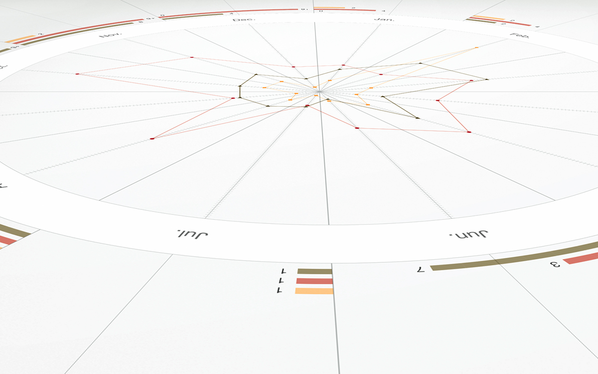
Some extra analysis of the data can be found on bottom area of the poster. I’ve also included a legend to make the different lines and bars a bit more clear. For example there’s a peak in February. The explanatory text shows that february was the month of my birthday. Birthday wishes and communication about the party increased the number of posts that time. October was the month I moved to my new apartment, also resulting in a lot of posts with heart warming wishes. A drop in activity can be found in June, the month I went on a holiday and when I didn’t have acces to internet.