Facebook iOS 7
My own version of Facebook following the new iOS7 style
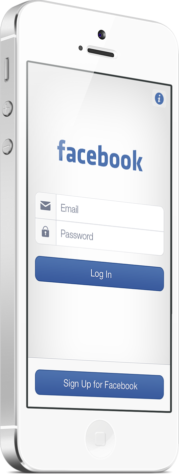
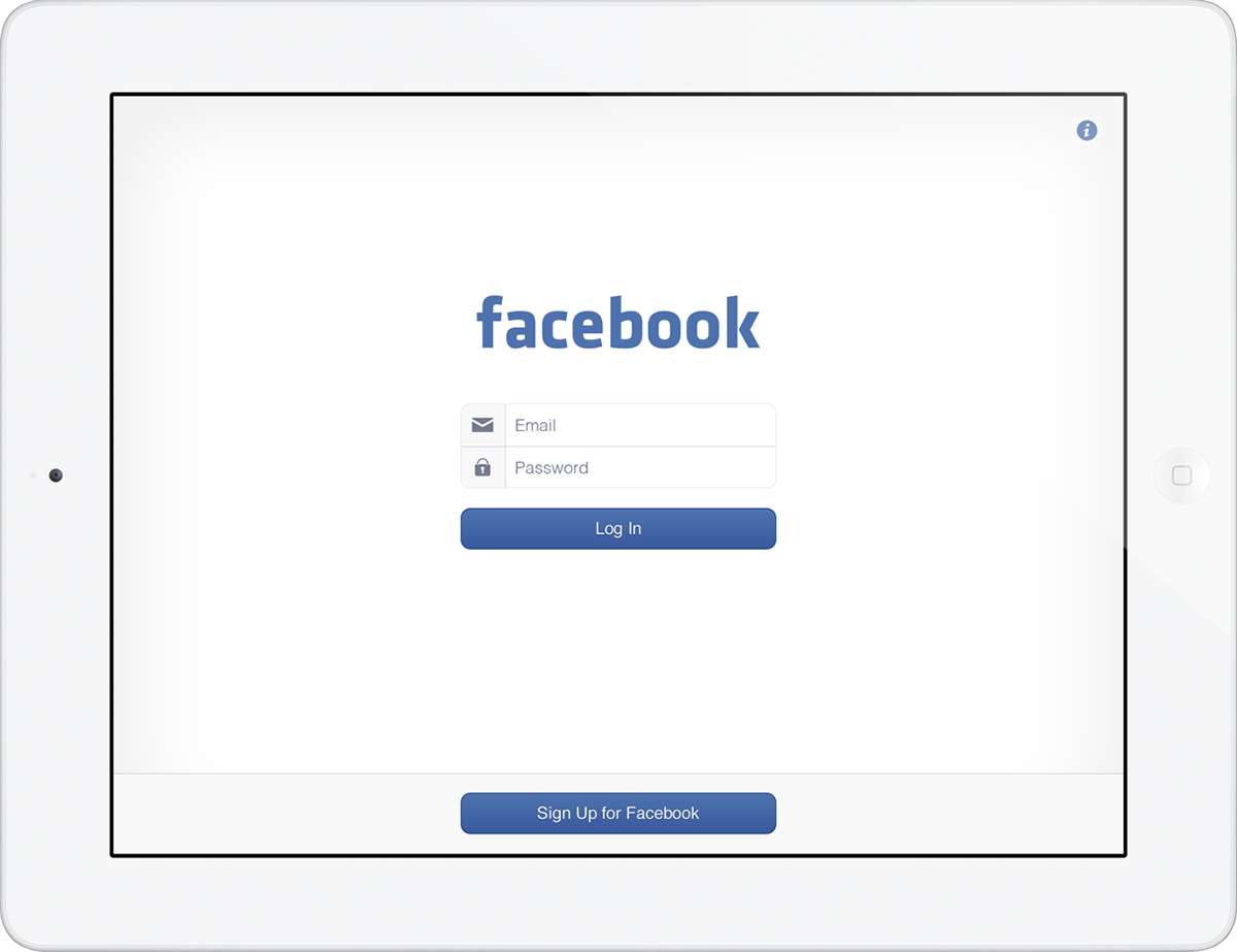
Log In
The new log in screen has had most of the blue stripped away to offer a more clean cut look, while giving a clear indication that it's still Facebook.
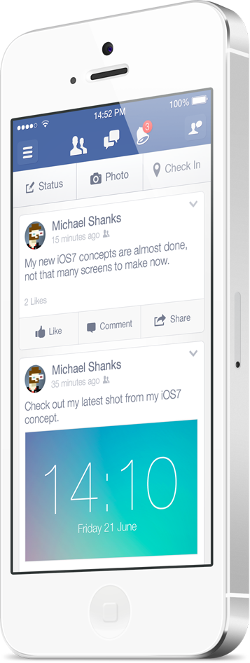
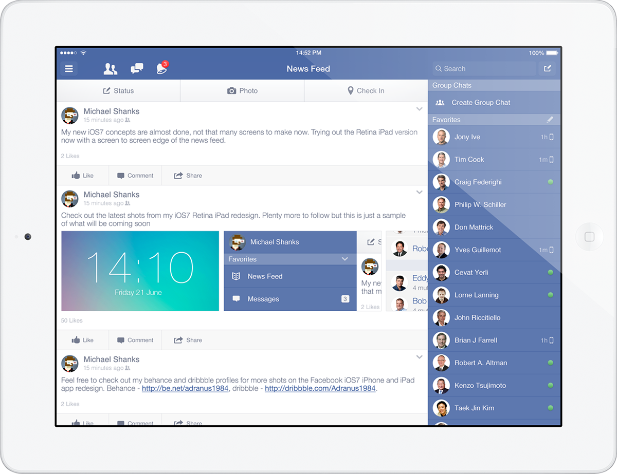
News Feed v1 (containers)
The News Feed has been given a flatter and simpler look. The notification icon and badges among other icons have been simplified to maximise visual recognitition for a new user. I've also kept each post within it's own container like the existing app.
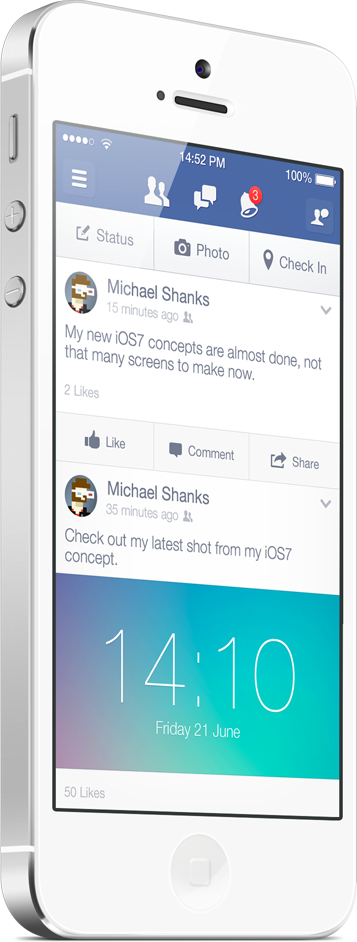
News Feed v2 (edge to edge)
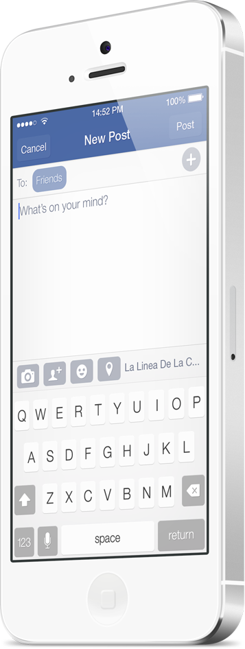
New Post
The new post screen has been given the same icon style as the previous shots and given a background to maximise functionality. The colours again have been flattened again to follow the iOS7 styling but still maintaning a clear area on the screen.
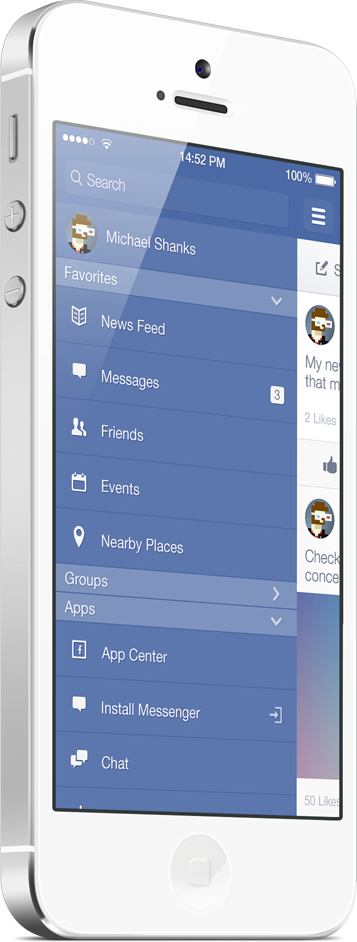
Side Menu - Options
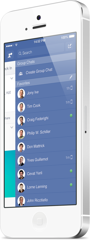
Side Menu - Chat
The chat menu on the current Facebook app has a "settings" button which allows the user to enable/disable chat, this option should be put in he left menu so i have added a "compose" which will allow the user to quickly compose a message instead of scrolling the large list.
I also wanted to make the profile picture shape consistent with the open conversation pictures, currently when you initiate a chat a circle profile picture appears overlaying the app and i wanted to keep these elements consistent to enable faster visual recognition.
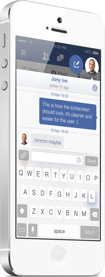
New Chat
The new chat follows the same structure as the existing, i've only flattened the colours and made some changes to icons to match the iOS7 look.
The new message icon which currently is a chat bubble didn't work for me as it didn't visually represent a new message, for consistency i have changed this to the compose icon which is used in other apps. I've also kept the profile picture within the chat itself circular to keep that visual consistency across the app.
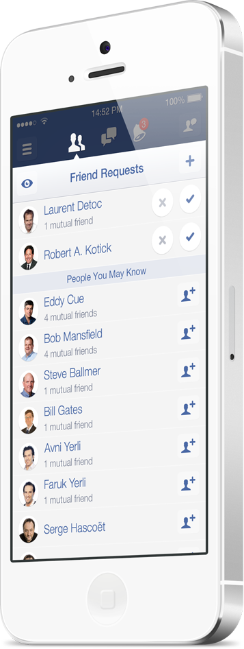
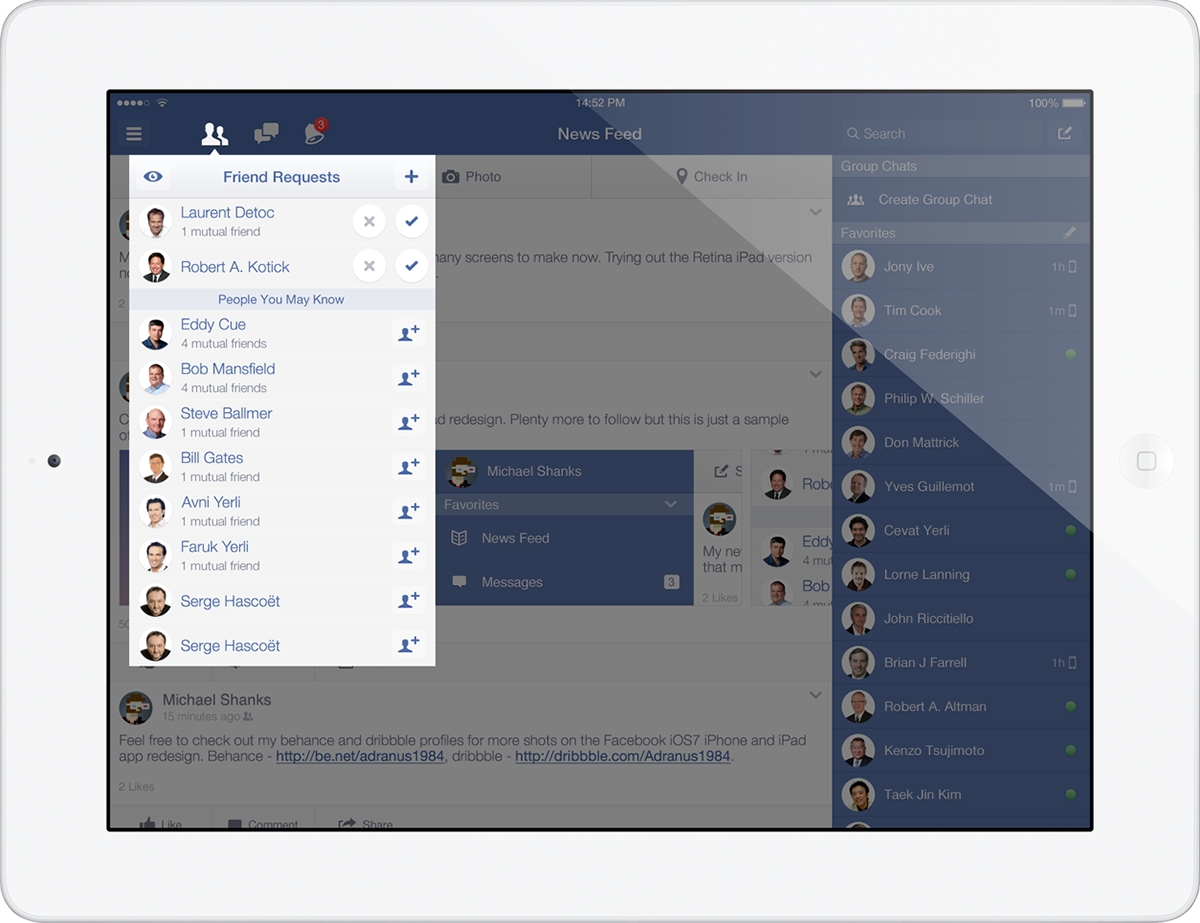
Friend Requests
For the Friend Requests i wanted to use the same style background and header as the New Chat, this gives a visual consistency when callouts appear over the main app.
I've also changed the icons for accepting a friend request, with them now being a simple tick and cross the user can quickly identify what each icon is and make a call on the action required.
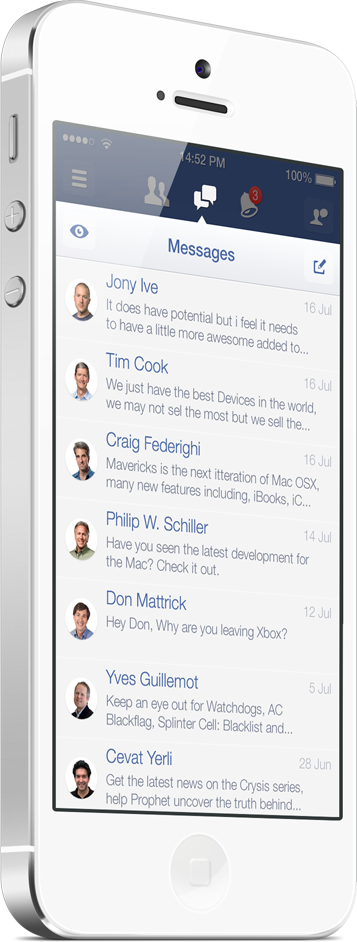
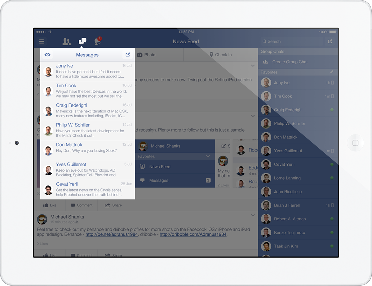
Messages
Similar to the Friend Requests i wanted to use the same style background and header for the messages, this again will keep it familiar to the user and allow for quick learning when browsing through the app.
Most will have noticed that in the current Facebook app there are 2 Compose message buttons when you tap the messages icon from the topbar, the only difference is that one loads the keyboard instantly and the other gives you suggestions with the keyboard minimised. Both of these screens give you the same functionality so it makes sense to have one area to compose a new message.
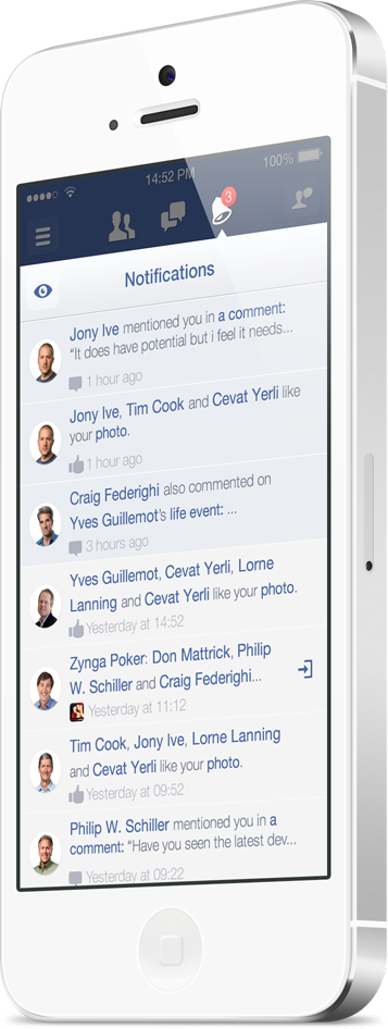
Notifications
Similar to the Friend Requests and Messages i used the same style background and header for the Notifications, this again will keep it familiar to the user and allow for quick learning when browsing through the app.
Instead of the yellow background for new notifications i have changed it to the Facebook blue and added 5% Opacity which is enough just to show the difference between new notifications and old.
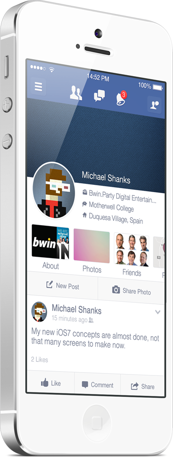
Timeline
For the Timeline i wanted to shrink the cover photo and give more space to the actual content. On a device you are limited to screen real estate (unless it's a tablet) and i wanted to give more content but keep the cover photo.
Login - iPad Retina
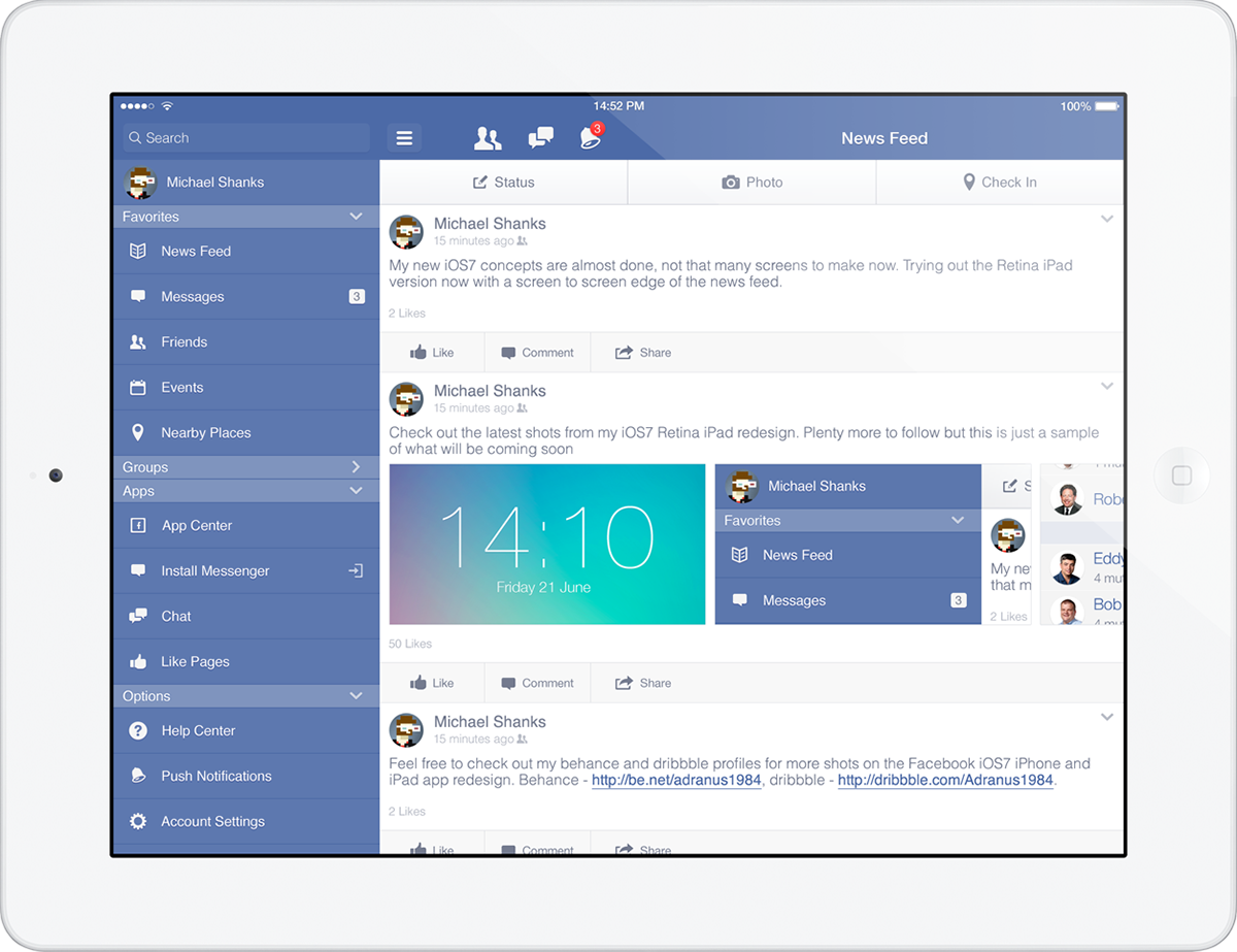
News Feed - iPad Retina
Friend Requests - iPad Retina
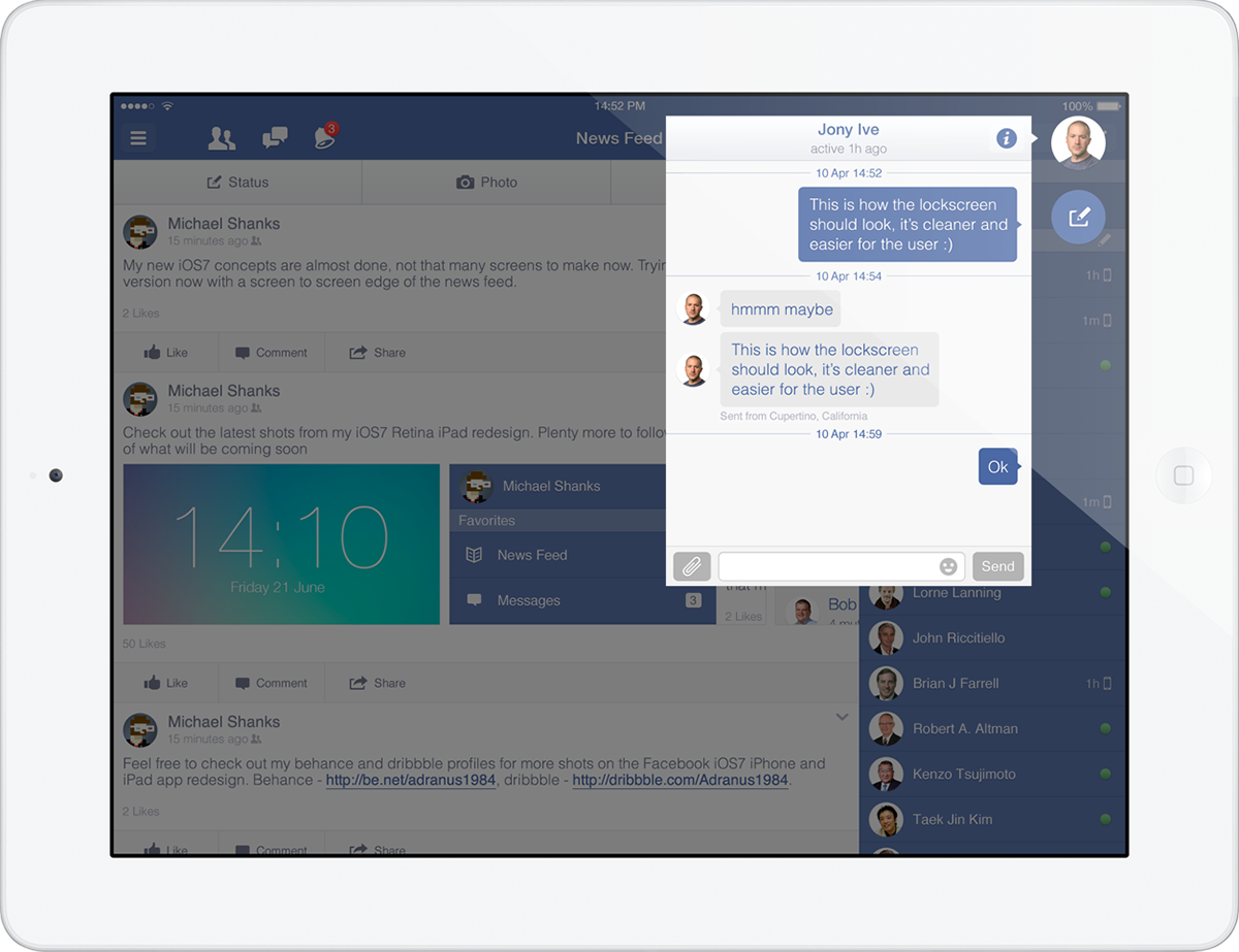
Messages - iPad Retina
Using the same elements as the iPhone Messages this content is also a callout (as it is in the current app). As above the callout allows maximum viewing of the remainder of the app while keeping focus on the callout.
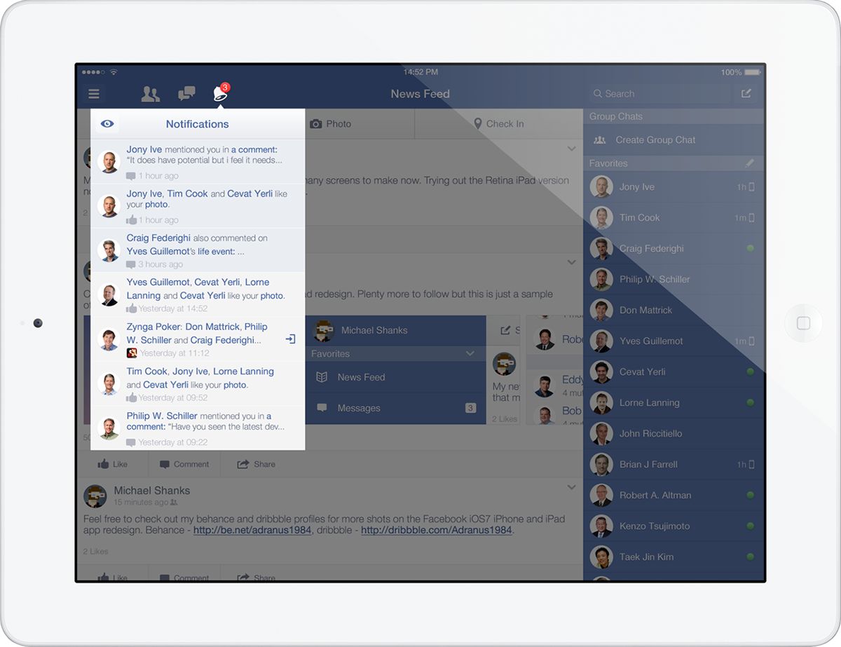
Notifications - iPad Retina
The Notifications again is a callout (as it is in the current app). The purpose of each of the callouts is to maximise focus on content withought distracting the user with other content on the screen but allowing them to see it if needed.
Side Menu - Options - iPad Retina
The Options Menu for the iPad is styled identical to the iPhone version. The colour of the background is kept the same to match the Topbar colour to give a visual connection and a seamless transistion when opening and closing.
New Chat - iPad Retina
The iPad chat menu is styled exactly the same was as the iPhone version except i have followed the location of where the chat window appears.
As aboe the new message icon which currently is a chat bubble didn't work for me as it didn't visually represent a new message, for consistency i have changed this to the compose icon which is used in other apps.