FF Tisa Sans
Mitja Miklavčič’s follow-up typeface to his highly successful FF Tisa.
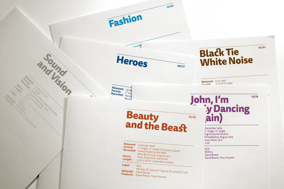
FF Tisa SansMitja Miklavčič’s follow-up typeface to FF Tisa. Whether used together or separately, both of his families are excellent choices for branding projects and complex editorial applications. The originalFF Tisa is one of the new-millennium favorites in the FontFont library—known for its sturdy and friendly forms, hence its common use in newspapers and magazines.
In all important details, FF Tisa Sans matches FF Tisa perfectly. Aside from the lack of serifs, the Sans features slightly reduced ink traps. Necessary system elements have been fine-tuned to one another,including the color density of blocks of text, the proportions of the letterforms and their distinctive stroke endings, and even the eye-catching Italics. Of course, the FF Tisa Sans character set contains the same range of characters and typographic features as the original FF Tisa, too. Since FF Tisa Sans should prove quite suitable for signage and information design projects,Miklavčič included a range of specially designed arrows in each font as well.
In all important details, FF Tisa Sans matches FF Tisa perfectly. Aside from the lack of serifs, the Sans features slightly reduced ink traps. Necessary system elements have been fine-tuned to one another,including the color density of blocks of text, the proportions of the letterforms and their distinctive stroke endings, and even the eye-catching Italics. Of course, the FF Tisa Sans character set contains the same range of characters and typographic features as the original FF Tisa, too. Since FF Tisa Sans should prove quite suitable for signage and information design projects,Miklavčič included a range of specially designed arrows in each font as well.


Necessary system elements have been fine-tuned to one another, including the proportions of the letterforms and their distinctive bulging stroke endings.

Subtle variations in slant lend the eye-catching italics their friendly and dynamicappearance.

FF Tisa Sans’s italics have FF Tisa’s same weight, structure, and refined “bell-bottom”construction, but without its top-half serifs.

FF Tisa Sans features slightly reduced ink traps.

FF Tisa Sans’s italics have FF Tisa’s same weight, structure, and refined “bell-bottom”construction, but without its top-half serifs.

