

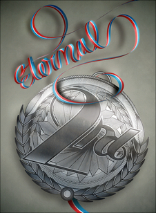
I was asked by Maxim Italy to make a typografic illustration for an article about the eternal seconds in sports. The final idea was a second place medal with its ribbon twirled like a cursive text, saying "eternal".
1ST PART: THE RIBBON
A couple of quick sketches, looking for a ribbon-like flow

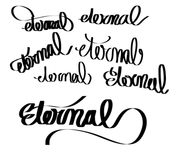
Cleaning the shapes of the logotype

Adding some depth
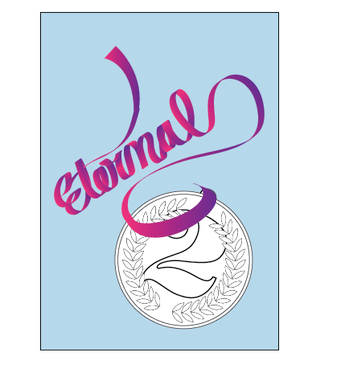
a first raw and horrible-looking layout
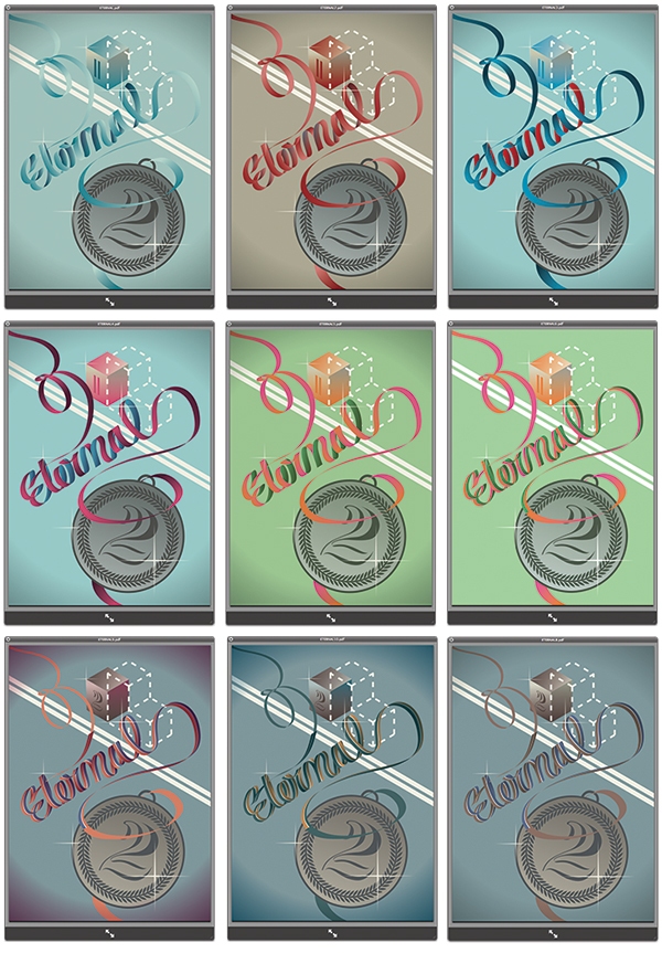
getting some color treatment, adding some details, doubling the ribbon, recoloring the artwork

final color layout. But still the medal sucked :-)
2ND PART: THE MEDAL

I started with making a custom typography of the "2"

some evolutions of the "nd" ligature
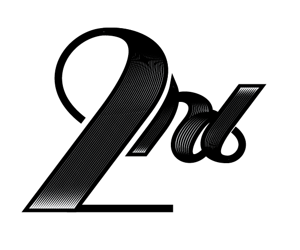
the final result

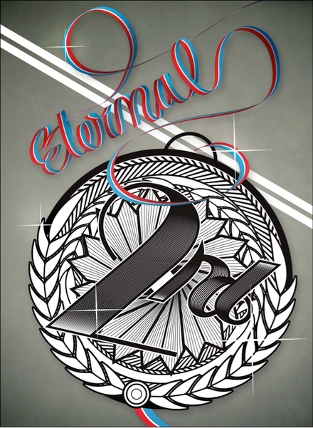
adding some heavy decoration. The graphic design of the medal is ready
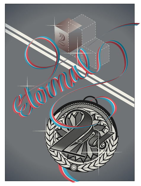
this is how it looked like once put in the context
3RD PART: FINAL CHANGES
After some feedback the medal got bigger, and the podium went out. Also the general look had to be more texturized
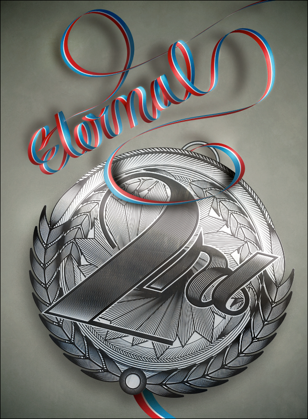
The final result

detail of the medal

detail of the ribbon
Graphic Design: Stefano Polli
Art Direction: Federico Albertini
Art Direction: Federico Albertini


