Elite Colour - Rebranding project
/
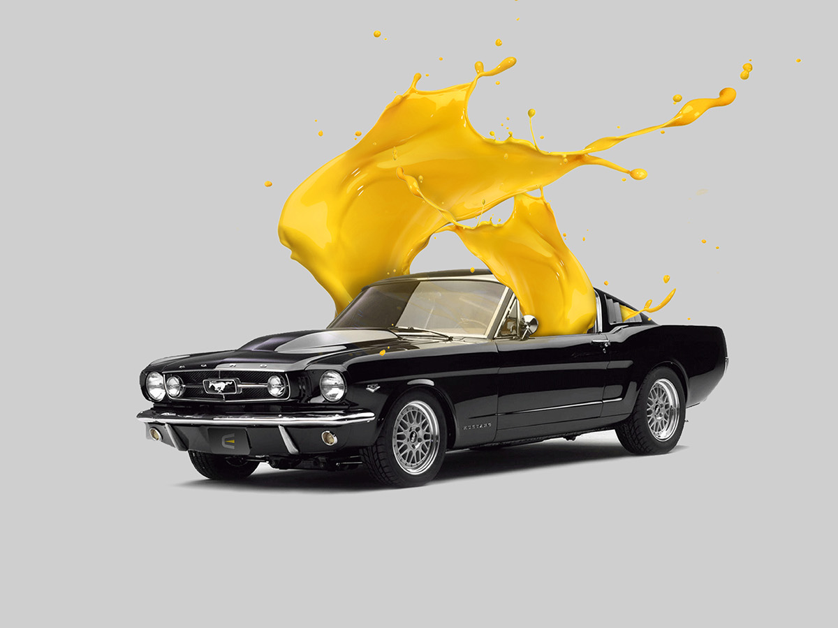
A company specialized in auto repair and painting services. So, I had to explore two aspects - the sobriety of their professionalism and the creativity of their innovation. How did I get to this insight?
When we are talking about auto repair services, what we mostly value is the serious side of the professionalism. On the other hand, the painting services are valued more for their creativity and innovation. And here comes the colored part of the story.
When we are talking about auto repair services, what we mostly value is the serious side of the professionalism. On the other hand, the painting services are valued more for their creativity and innovation. And here comes the colored part of the story.
/
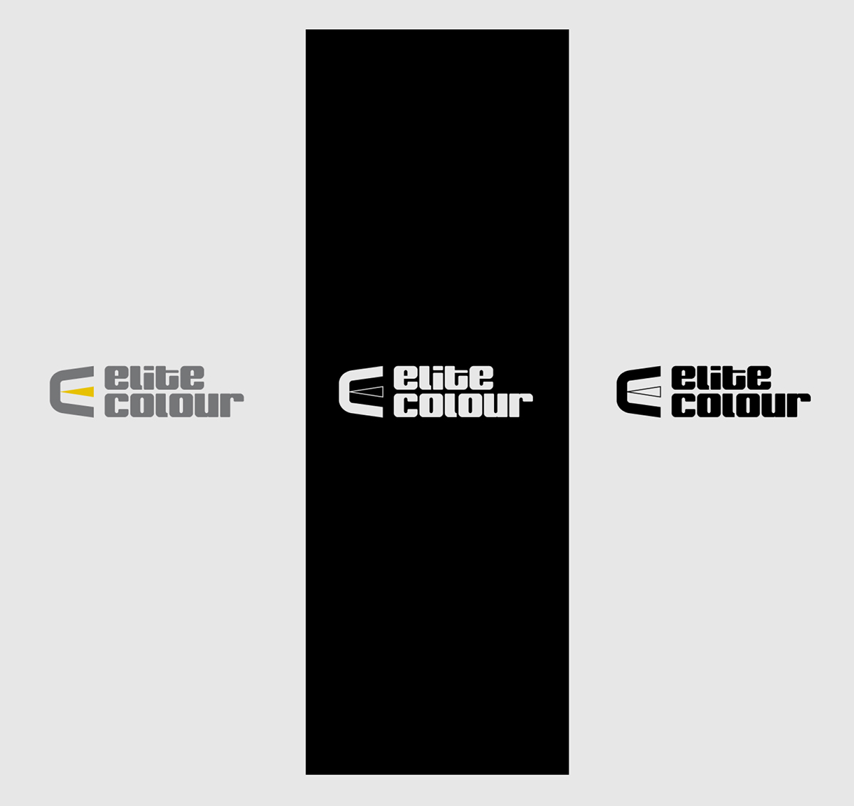
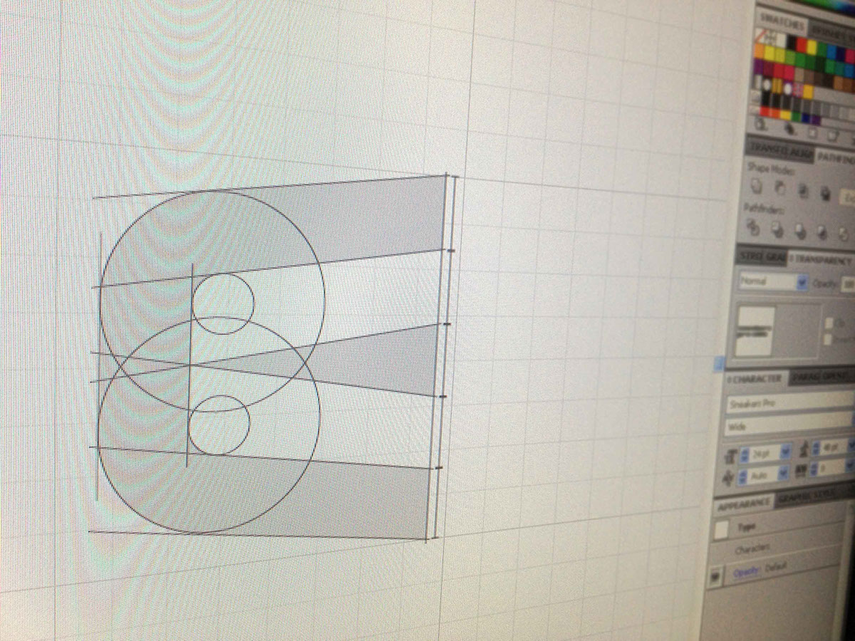
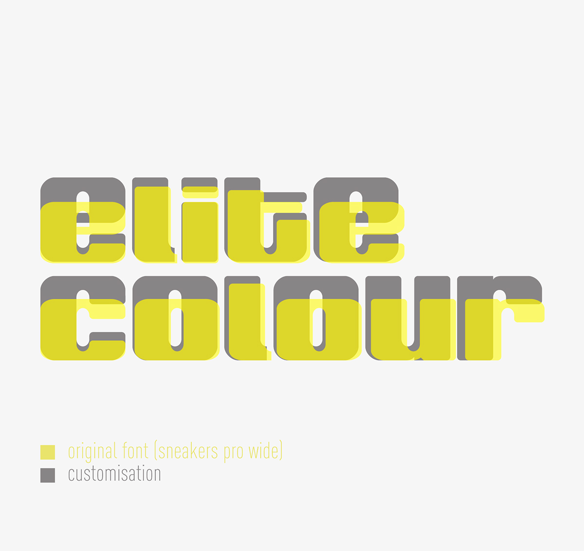
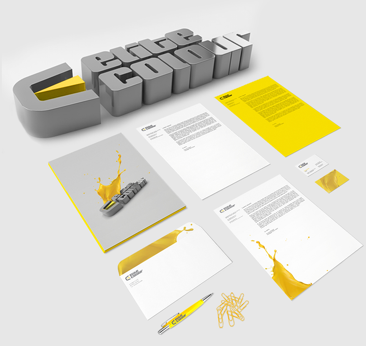
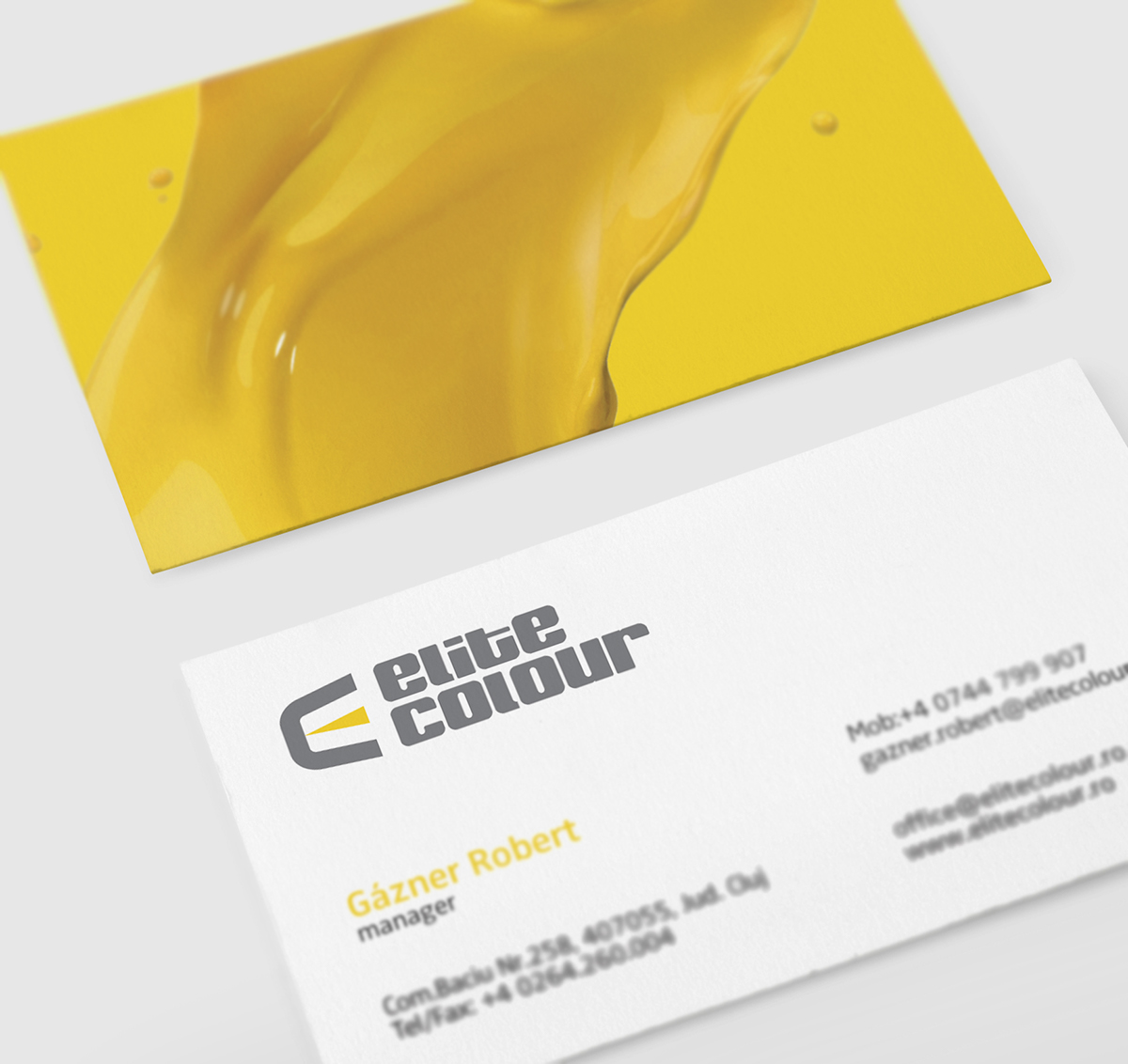
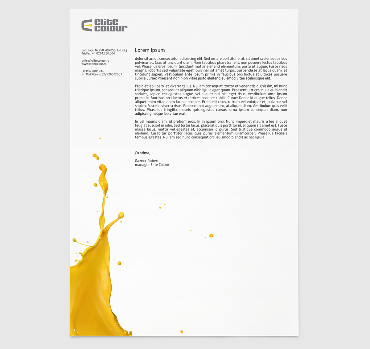
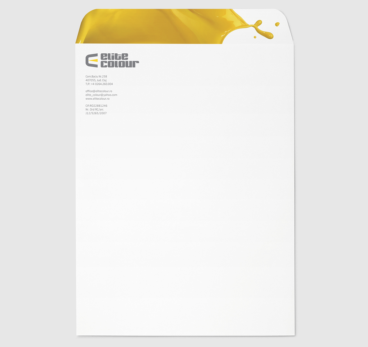
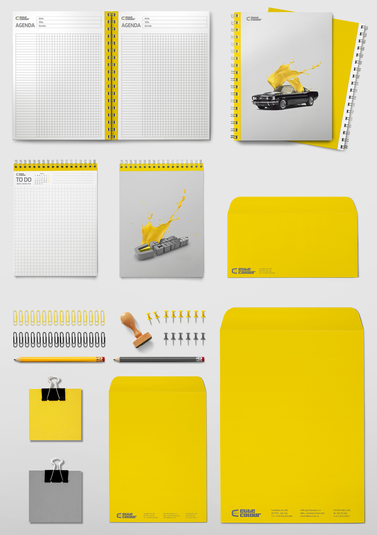
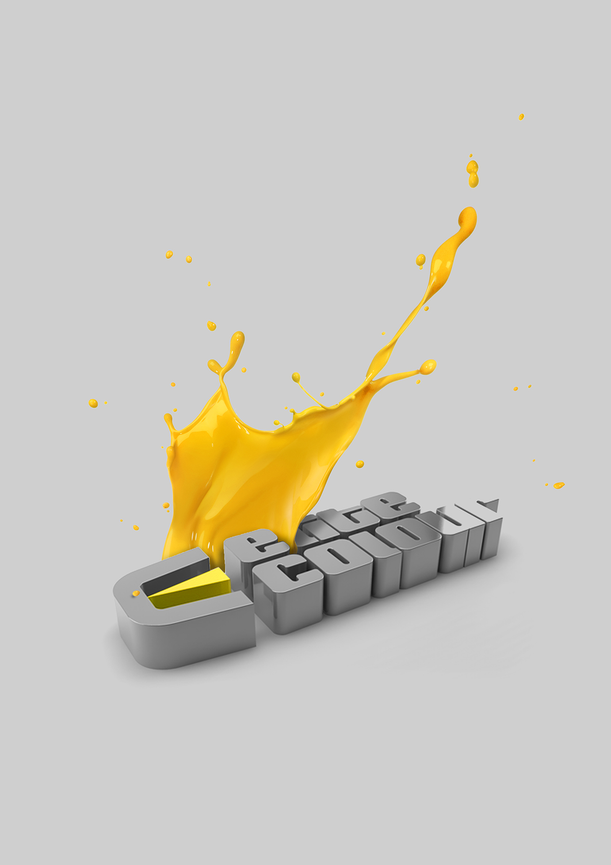
Logo concept
For Elite Colour logo I created a symbol composed by the initials of company “E” and “C” with another thing which is representative for it - a jet spray used for car painting. In the addition of this symbol comes the name of the company - “Elite Colour” a customized bold font. In that way, both components of the logo can be used also individually.
/
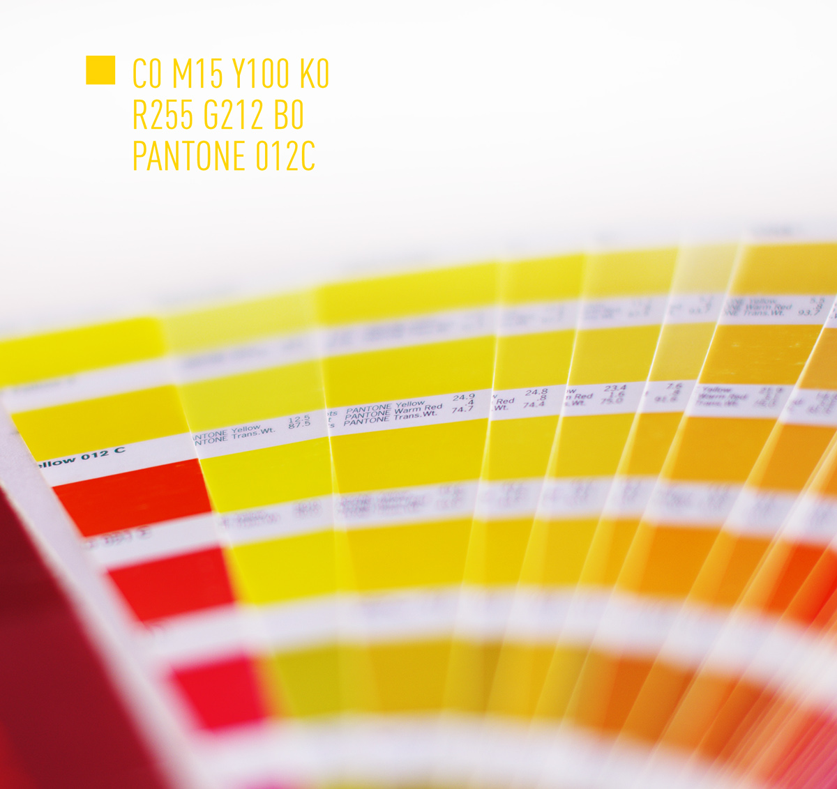
Chromatic concept
I explored the same dual insight, so I chose gray and yellow. Grey is neutral and cool and inspires a corporate mentality, somberness, and stableness. Yellow comes as a complement to get attention because is bright and highly visible. This color can often be found on caution and other road sign. With other words, “we are creative when painting your car, but in a safe way!”
/


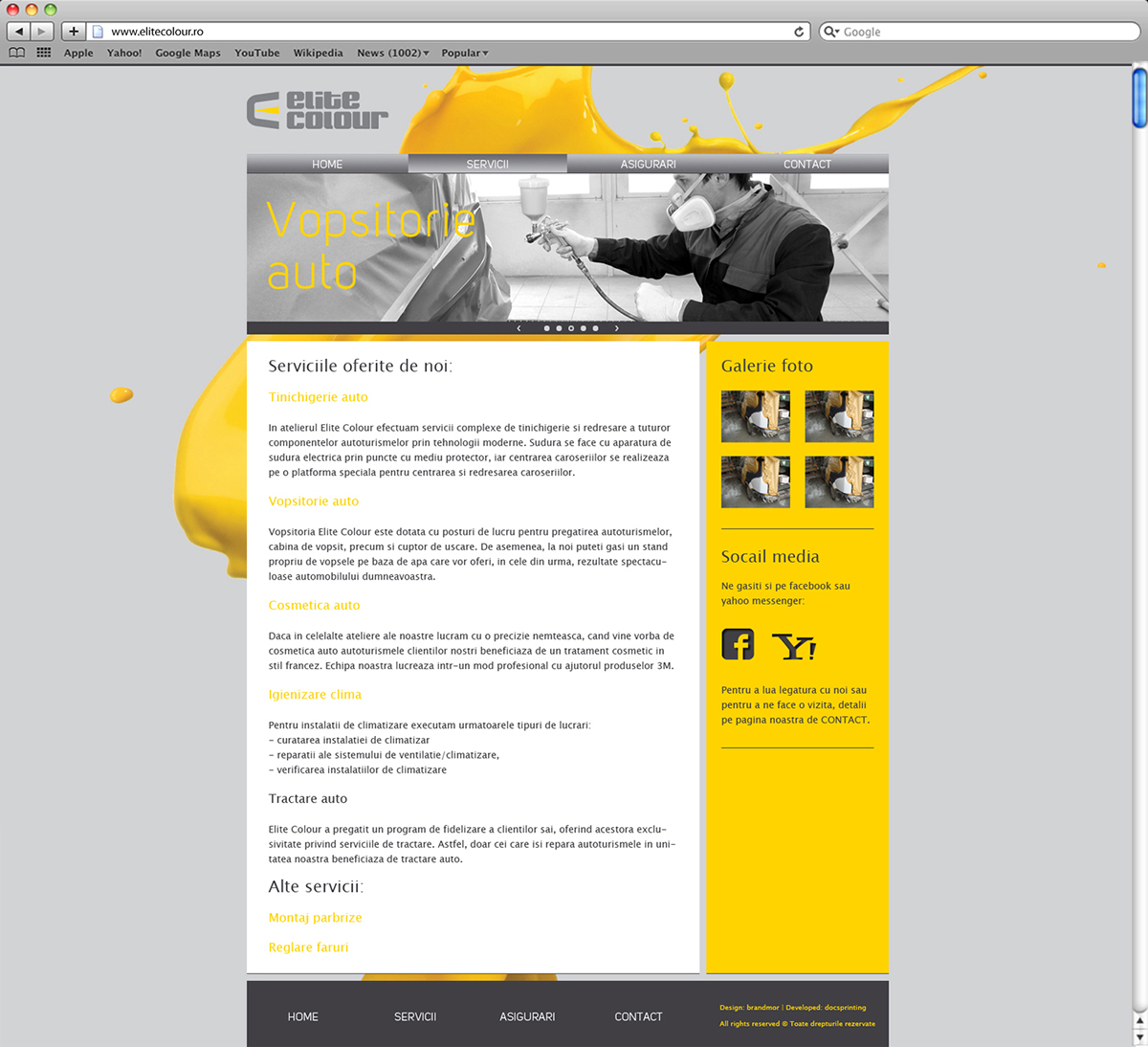
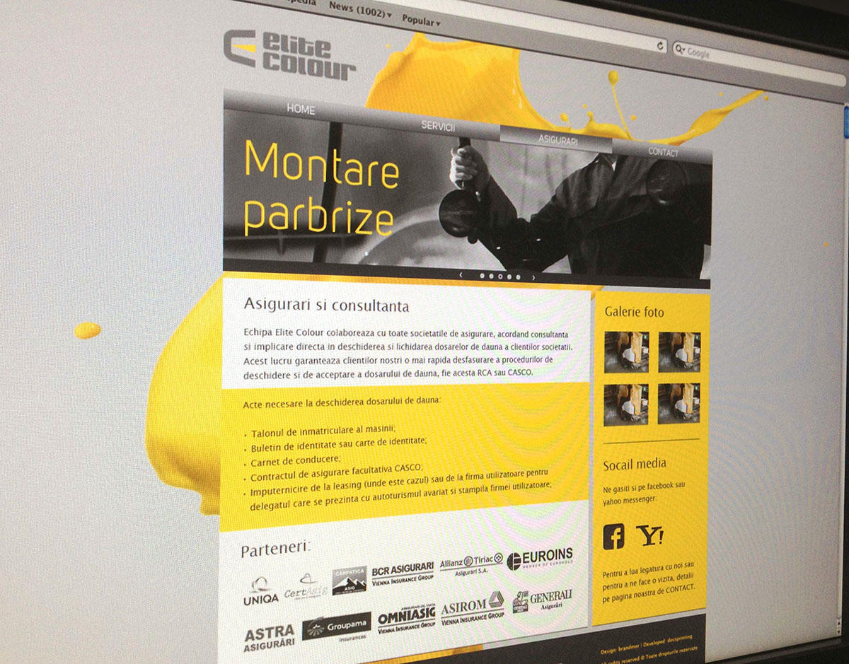
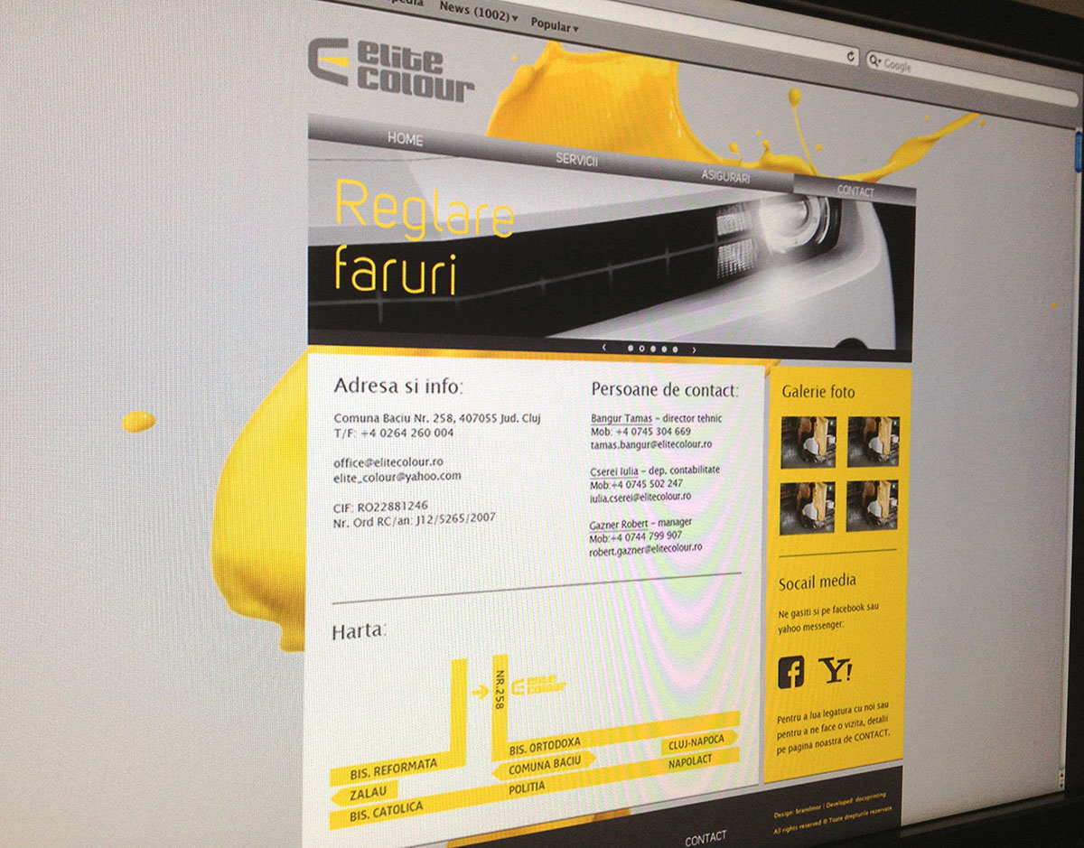
Website

/
Thank you for watching :)
/


