

Dodo
Packaging for an organic pasta brand
Packaging for an organic pasta brand
This is a school project in graphic design.
The idea is to make a package for couples who like to enjoy good food and are willing to spend some money for it. The pasta's are all organic.
The idea is to make a package for couples who like to enjoy good food and are willing to spend some money for it. The pasta's are all organic.
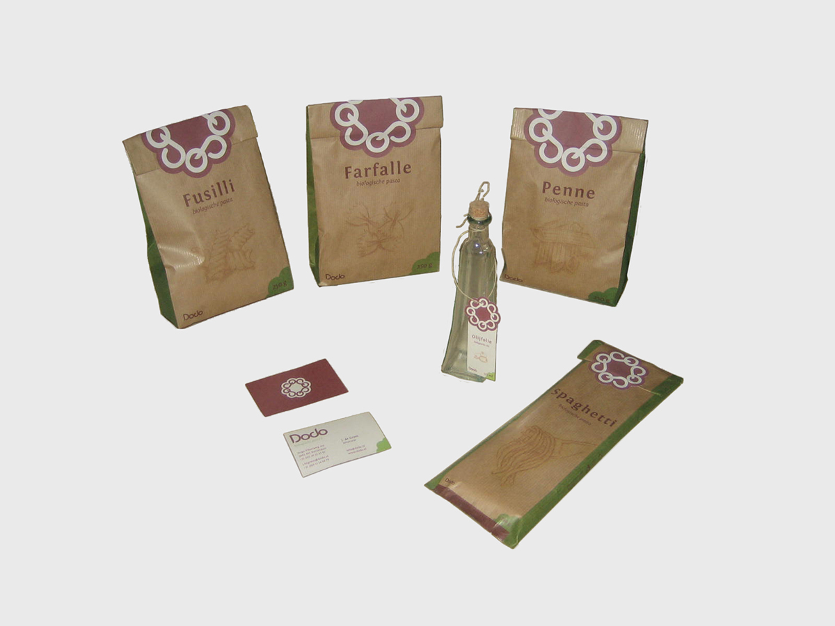
The paper for this package is very impotant. It's actually ordenairy wrapping paper i printed on. Because Dodo is an organic pasta brand i felt it should be printed on (what looks) recycled paper.Normal recycled paper was still to white to my opinion. When i came across this wrapping paper i new this was the paper i had to use for my package.

Spaghetti. On the backside a descripton of the amount of energy and a an alternative menu.

The front and the backside of the Fusilli package.

As you can see the packages have no pictures of whats inside but drawings.
I felt i could'nt leave my public geussing of what's inside. Photo's did'nt do it for me so i decided draw the pasta. This also gives a nice atmosphere to the package and feels more 'home made' than photo's would do.
I felt i could'nt leave my public geussing of what's inside. Photo's did'nt do it for me so i decided draw the pasta. This also gives a nice atmosphere to the package and feels more 'home made' than photo's would do.
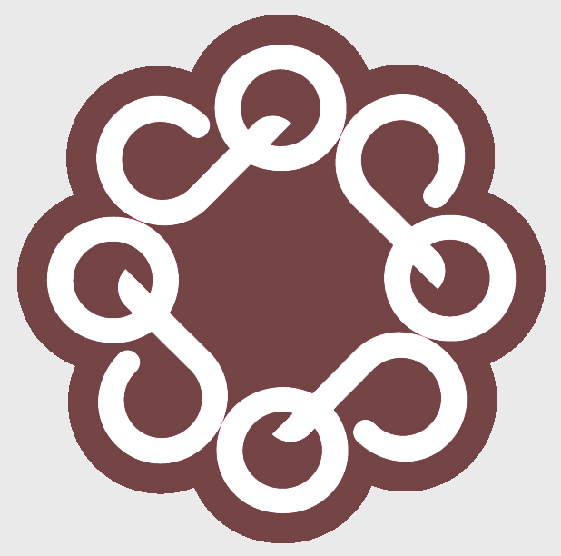
The logo plays an important role in the whole. It's not only a logo now but also a seal.
I was working on a typeface for Dodo and came up with this font. (You can read Dodo al way round.) It was still normally written but i needed something to express the organic value of it.
As i was fooling around with pasta before and making letters out of it, i also made a flower shape out of macaroni. That flower shape got stuck in my mind and then it hit me. I could still make the flower shape with the typeface i had made. After some experiments this is the final logo.
I hope you enjoyed this little showcase. Bon appetit!


