This project asked us to visualise two sets of data.
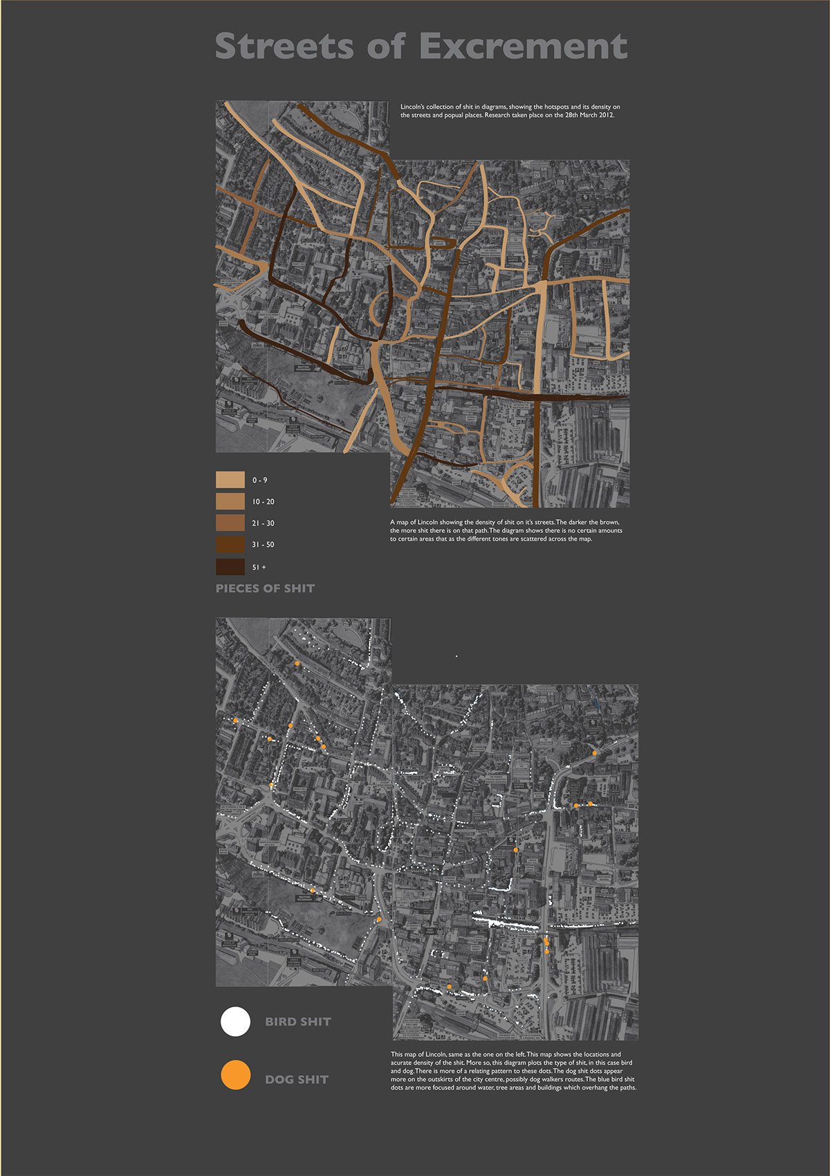
For the first graph I mapped out the excrement on the streets of Lincoln on one day which shows the density of the dirty areas.
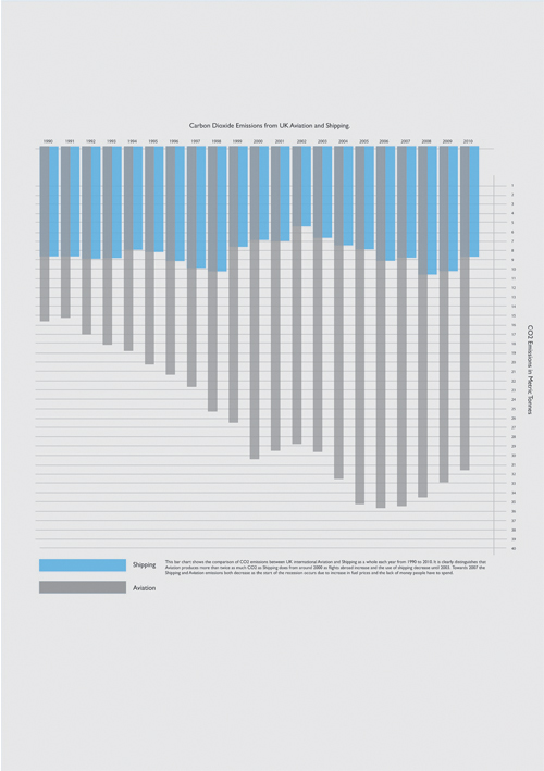
The second chart simply shows the Carbon Dioxide emissions from UK Aviation and Shipping from 1990 - 2010
For the first graph I mapped out the excrement on the streets of Lincoln on one day which shows the density of the dirty areas.
The second chart simply shows the Carbon Dioxide emissions from UK Aviation and Shipping from 1990 - 2010