

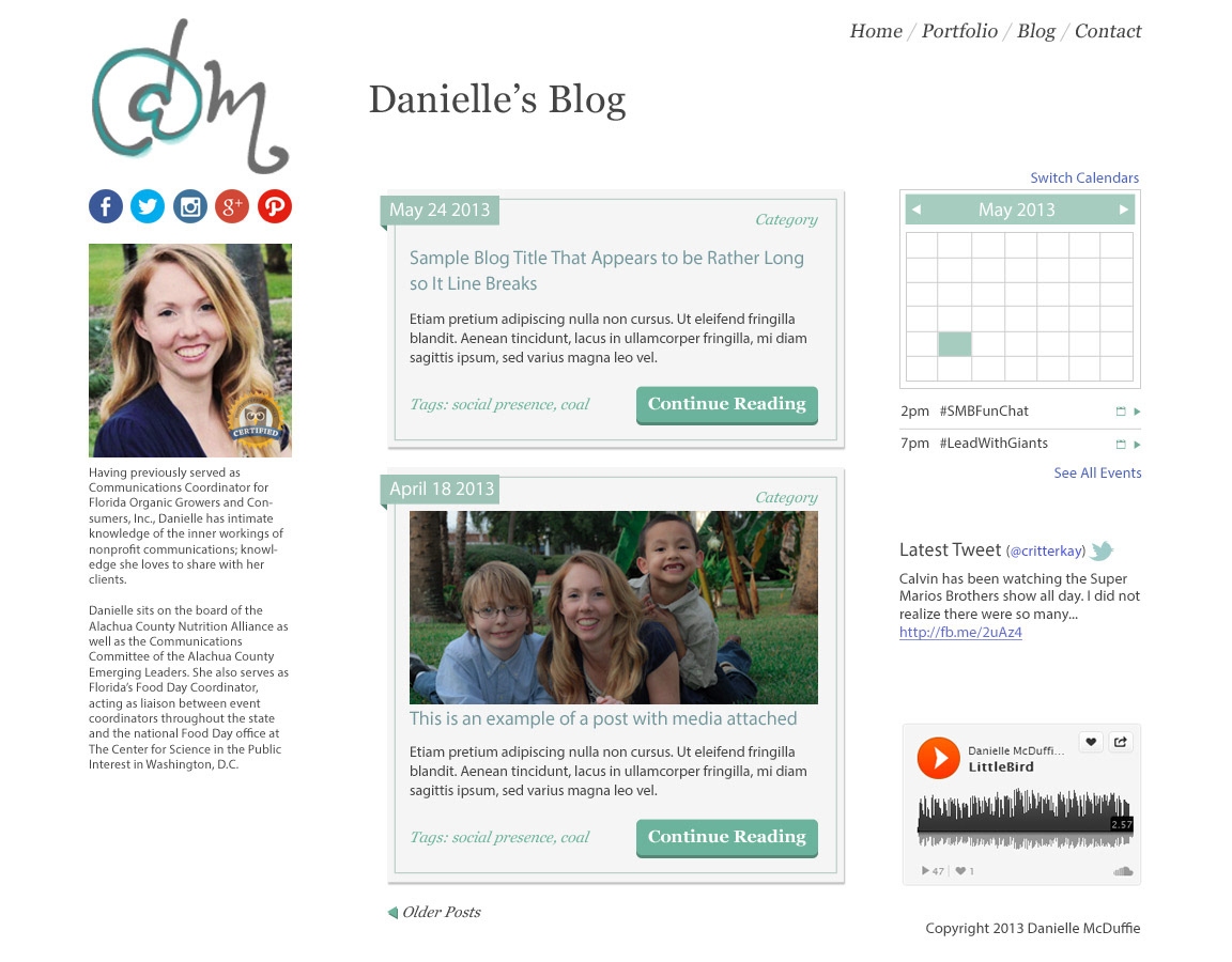
The above image was her current solution using a "cookie cutter" Wordpress theme.

I utilized lage typography to put the overall message of the site up front.
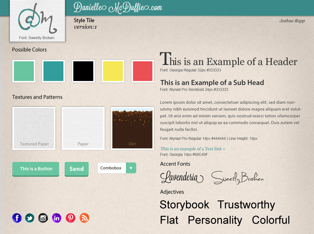
The style tile is built in order for Danielle and myself to help her cultivate a personal brand and identity. It clearly outlines font faces, colors, and textures used in the theme and defines a certain interface style at the same time.


