
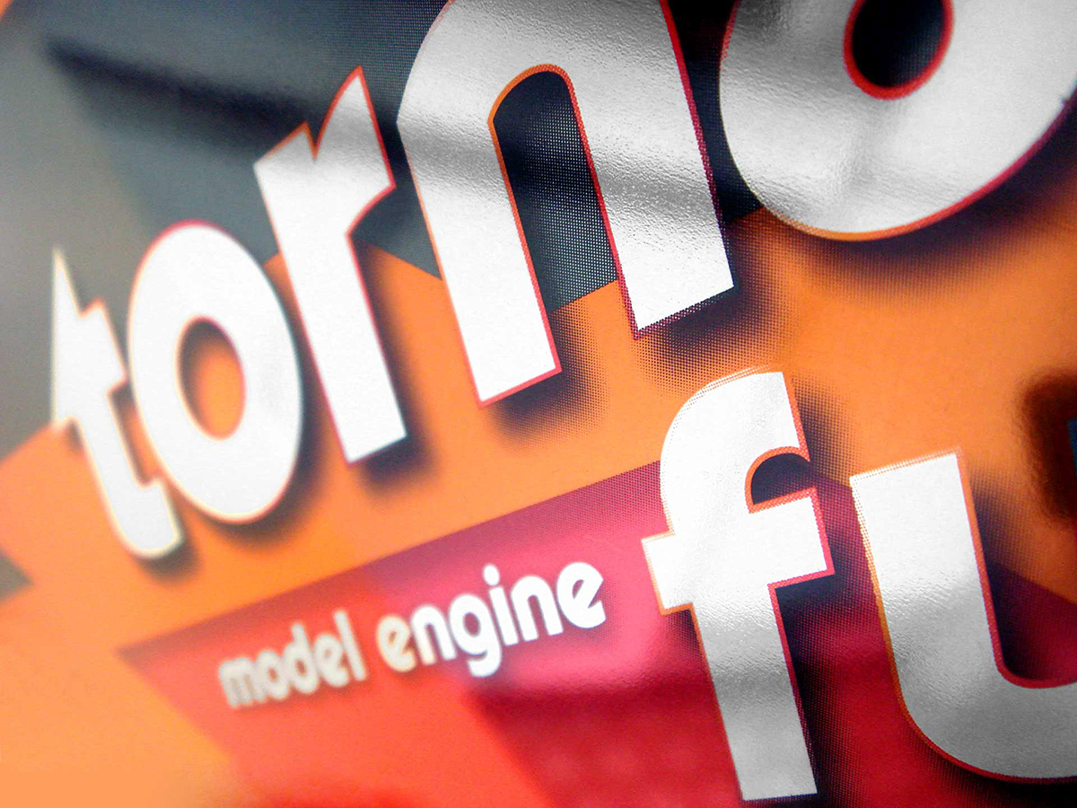
Lettering Tornado Fuel logo
Fuel for winners
Fuel for winners
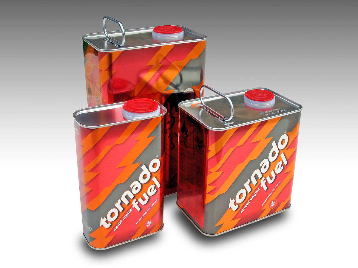
Tornado supplies a wide range of quality products for modelling. The products are manufactured in highly specialized facilities in the Netherlands. A world-wide distribution enables the world’s best drivers, pilots and modelling fans to amazing performances. Own research and development facilities turn innovative ideas in reliable products and a well organized distribution network ensures world-wide availability.
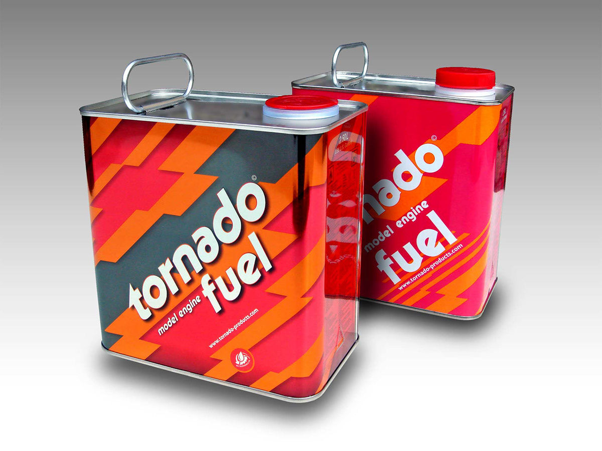
The Tornado Fuel brand is over 35 years old and has a very good reputation in the field. Known for their eye-catching 'red can' the client felt is was time to upgrade their brand identity. The project scope was to upgrade their A-brand Tornado Fuel and position the new lower-priced Glow on Tornado's old position.
Respectful upgrade
Tornado's corporate font is Serif Gothic Black by Herb Lubalin and Tony DeSpigna in 1972. The Tornado brand has not been really changed since the company was founded in the mid 70s. Clearly Serif Gothic was a modern font at the time, and it has earned them a solid reputation over the time, but the client realized it was time for a major upgrade.
Commissioned
Commissioned by Stoere Binken Design I did a careful but very effective overhaul of the logo, as used on all the packaging. The small serifs were removed, counter forms opened up, proportions optimized, glyphs were unified to balance the logo and many more subtile changes have been made. I polished out the good side of the typeface and juvinated it. All with respect to this 35 year old logo.

Dynamic italic
Since the original font had no italic version, the roman was used on the packaging. This made the overall appearance quite static. I descided to make a special italic version of the logo that would appear even more dynamic on the packaging. I slanted the redesigned logo and corrected the round forms so that it did't look like a amateuristic mechanically slanted roman.
The result
The result is just stunning. I changed the details so carefully and retained the original soul of the logo, so the appearance on the metallic red fuel cans is plain eye-candy.
Copyright design: Stoere Binken Design
Your own custom typeface
Companies make every effort to stand out from their competitors. A custom typeface is a very powerful visual element to position a Brand. They can be made to fit the companies needs and even save money. It's no longer exclusively available to large companies, but to me it can be done at a smaller scale for medium sized companies too.
I offer creative and highly distinguishable corporate custom typefaces that push your brand to a higher level. I also work in close contact with graphic designers for their clients Brand.
Contact me for more information.
If you're still not sure, read the custom type options.