Corporate Identity | Examples from the CI Manual
On 19 June 1999 in Seoul, the International Olympic Committee awarded the 2006 Olympic Winter Games to the City of Torino. In 2000 an international competition was initiated for the realisation of the Olympic Emblem.
In August 2000 my studio Husmann-Benincasa Brand Design won the logo competition under 1471 logo entries from all over the world. From 2000 to 2005, aside from the logo, my design studio also developed the Corporate Design for the XX Olympic Winter Games Torino 2006.

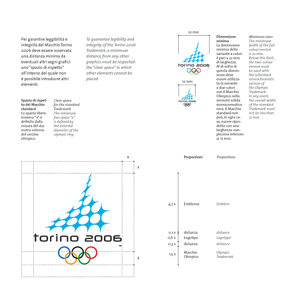
Excerpts from the CI Manual | use of the trademark

Excerpts from the CI Manual | horizontal version of the trademark and logo typeface


Excerpts from the CI Manual | the Olympic Rings


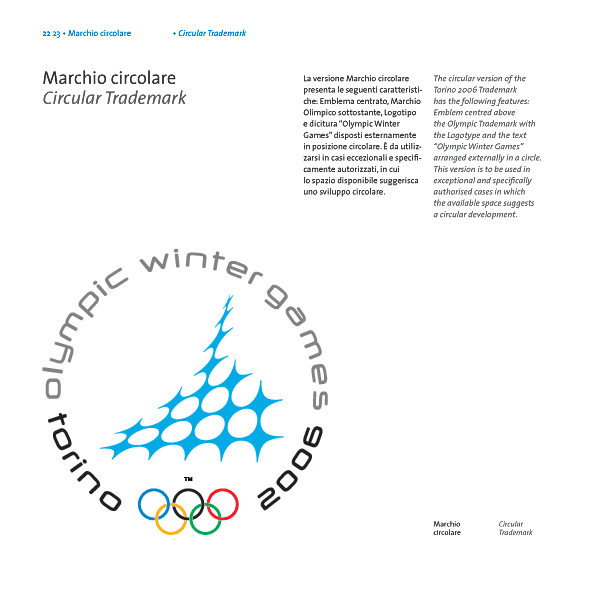
Excerpts from the CI Manual | circular version of the trademark

The visual concept of the Emblem


Brand Architecture | Logo Paralympic Winter Games and Sub-brand logos
After the design of the official Torino 2006 standard trademark in 2000 I was commissioned by the TOROC (Turin Organising Committee) to design the Corporate Identity and its sub-brand logos. From 2000 to 2002 I was commissioned to work on the brand architecture of the twentieth Winter Games.
From the very beginning my intention was to create a "Sign-System" for all sub-brand logos. A complex Corporate Identity as the Olympic Games should be easily perceivable. All the logo's should be identified by a common morphological structure. The look and feel should convey the idea of a "Olympic logo-family":
- The Logo of the Paralympics
- The Sub-Brand Logos: the Volunteers logo, the Art & Culture logo, Environment logo and the TOBO logo.
We started with the logo of the Winter Paralympic Games which is a morphological derivative of the official Torino 2006 standard trademark. We reduced the number of elements and we gave them a slightly more dynamic touch.
The logo of the Paralympic Winter Games has strong similarities to the Winter Olympic Emblem and to the Paralympic Symbol. The Paralympic Winter Games Emblem has kept the same style and abstract quality of the Olympic logo, and provides various levels of interpretation. "As with the logo of Torino 2006, the Paralympic emblem conveys important meanings, as is the case for the Olympics, the Paralympics represent values of solidarity, friendship among peoples, courage and loyal competition. Possible connotations of the logo are the image of three persons holding hands, three persons supporting one another and creating a bond of solidarity."
The three graphic elements forming the emblem recall a human figure and the three "agitos" of the IPC Symbol. The colours chosen for the emblem - red, acid green and blue - re-interpret the colours of the IPC Symbol in a Torino perspective: blue is the colour of the Italian sports world-wide as well as the colour of snow and ice; green symbolizes the natural elements of Italian landscape; red is the colour of passion, the value which best expresses the vitality and enthusiasm of Paralympic athletes.
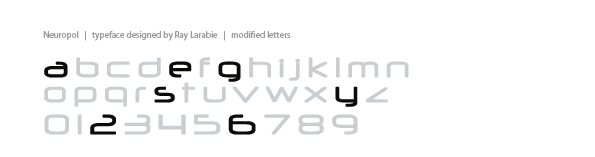
As typeface for the complete "logo family" I used the Neuropol (designed by Ray Larabie). To ensure a better legibility I had to modify some letters of Larabie's typeface. Some letters undergo quite strong modifications –a, e, g, s, y– others have been modified only slightly.
The sub-brand-logos: the Volunteers logo, the Art & Culture logo, Environment logo and the TOBO logo kept all the dynamic look and feel. We achieved this by keeping similar angles and radii. From a morphological point of view the central theme is always the dynamic movement of the signs which merges together with the communications concept and purpose of each logo.


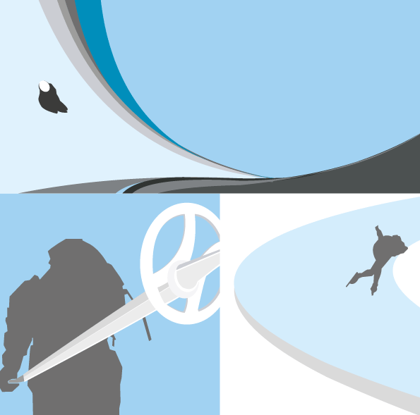
Brand Architecture | The concepts of the Ellipse
One of the major aspects of the relationship between the Olympic Games and the sponsor is the identification of a graphic solution able to assure maximum visibility and legibility both of the Trademark of the games and that of the sponsor, highlighting the association between these. Accordingly. I decided to use an ellipse-shaped space, one of the elements deriving from the Torino 2006 Emblem, that encloses the pair of trademarks. This graphic solution integrates seamlessly with all Olympic communication, assuring value added for the sponsor which is inserted in a space rich with references and significance.