Clutter Magazine Branding (2004-2013)
Clutter Magazine
The Clutter Logo has had a few iterations over the years, outlines added, other details subtracted along the way, but last year we gave the logo its biggest overhaul to herald the beginning of a new era for the company. As the most recognisable element of our brand it was important to get it right.
The original design from nearly a decade ago was based on circles, so oval letters were perfectly circular, L's and T's trailed off with a quarter circle etc. This was all well and good back in '04 but not it looked dated and the logo felt cumbersome and difficult to work with. I decided to strip away the unnessesary space caused by the quarter circles and simplify it to a point where it could be used as 1 color.
Another emerging part of the Clutter brand was the gallery space and we decided to brand the gallery events under their own 'Clutter Gallery' Logo, so i put together some new lettering in the exact same style and the 2 words dovetailed perfectly.


Current Logo on Issue 17
Logo History
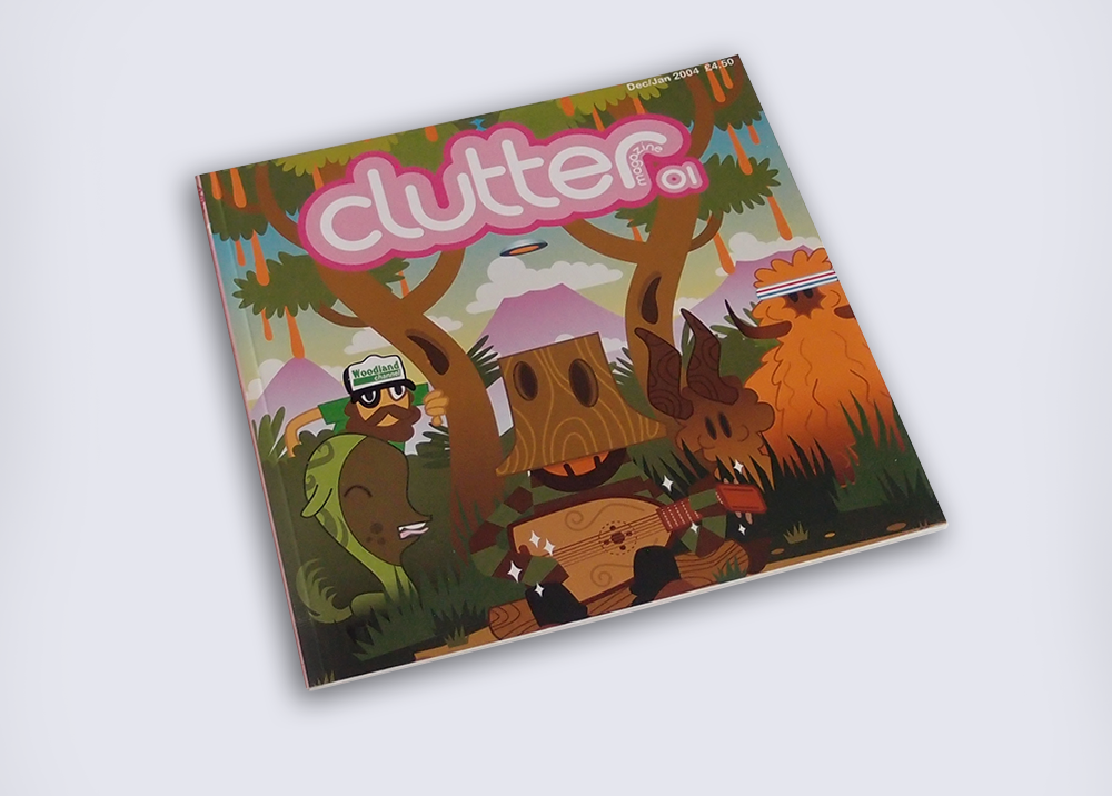
Original Logo 2004

Mini Update, circa 2008


