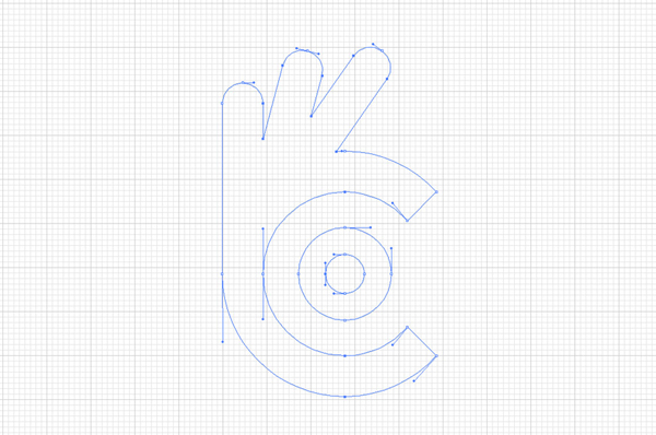
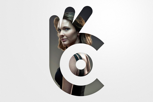
On the first sight the logo shows the hand gesture which says awesome . The hand is showing how the photographer is holding the lens. The focusing on the lens is nicely visible and so it brings the beauty and meaning to logo. As the name of the brand starts with the letter 'C', we have carved it also in the logo.
When we were designing, we want to make it sure that , the logo will not have the direct resemblance with photography. It is the story and the meaning brings the beauty to the logo. So we believe we were successful in bring that to the logo. Color we have chosen is light shades , which makes it suitable in all elements, photography presentations etc.


Thank you!