While in the third year of study at Emily Carr University, communication design students were given a co-creation project with Vancouver Coastal Health (VCH), the health authority in the local region. Students formed teams of two or three, and I worked with Caitrin Wootton and Tia Blunden. The objective of our project was to improve hospital hand hygiene, and therefore decrease the occurrence of hospital-acquired infections. Before beginning the design phase began, we toured numerous facilities with staff and made observations of the environment we would apply our solution to. We also ran a co-creation session with VCH employees, in which we determined some existing weaknesses in current campaigns.
Although the intentions of existing campaigns were good, attempts to enforce hand hygiene were confusing and inconsistent throughout the facilities. Our campaign sought to keep language and aesthetic simple, but bold enough to capture the attention of otherwise busy visitors and employees. The campaign was very versatile and could accommodate a variety of messages while remaining cohesive, with the idea that a more widespread application of the campaign would lead to higher visibility and compliance.
Initially, all the student projects were created on a prototype basis, then we proceeded to pitch our ideas to leaders of Vancouver Coastal Health. Our project was eventually chosen to be applied within Vancouver General Hospital, and selected elements of the campaign are scheduled to be installed near the end of 2012. This gave us a wonderful opportunity to better develop the project into a real-world situation and scale needed for the hospital.

We initially titled our project "The Blue Line Campaign" because the blue line was the inspiration for the entire project. When we were initially brainstorming possibilities, we thought of creating a line on the floor as an implied barrier, that some action must take place before crossing this barrier.
In our co-creation session, one of our activities involved visual-verbal associations. Blue was the color most associated with cleanliness. The typeface we chose was Gothic No. 13 because it cleanly emphasized text and could still be read from a distance.
In our co-creation session, one of our activities involved visual-verbal associations. Blue was the color most associated with cleanliness. The typeface we chose was Gothic No. 13 because it cleanly emphasized text and could still be read from a distance.

"Clean Before You Cross" appears multiple times on the line around each entrance, often used in tandem with messaging on the glass doors. Visitors and staff must clean their hands upon entering and exiting the building in order to prevent the spread of infections.
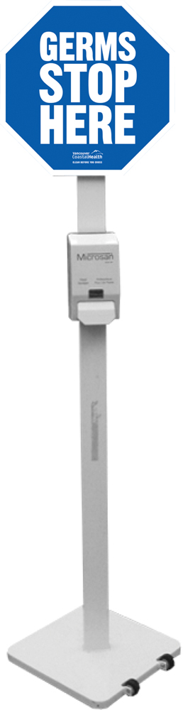
Stop-sign sanitation stations already existed at all the entrances and exits. This was another simple chance to bring another element to the campaign and make the whole campaign message even more cohesive.
Stop-sign sanitation stations already existed at all the entrances and exits. This was another simple chance to bring another element to the campaign and make the whole campaign message even more cohesive.

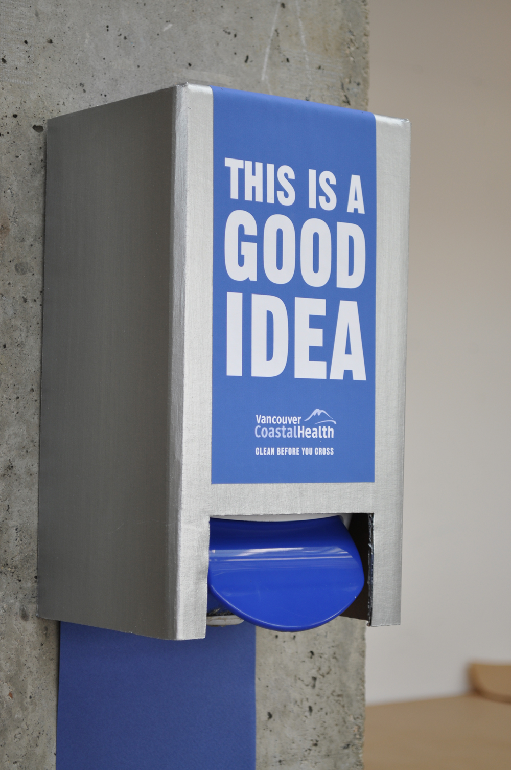
In the instance where the blue line would not be as noticeable, we created a wall display that can highlight a sanitizing station. This was particularly helpful in smaller entrances.

The elevator wraps were not a part of our original campaign, but was later developed at the request of our clients. This was an important location to address because many people spend a moment waiting for the next elevator, and clarifies the importance of hand hygiene on every floor, particularly after coming in contact with the elevator buttons.