Overview
Client:
Toronto-based start-up loose leaf tea company called "Steep This!".
Objective
Immediate objective is to develop a logo, but with additional brand suite materials to be added over time, thinking about a unified, strategic brand image now will help increase the overall effectiveness of the brand's messaging and reach in the future.
Background
My clients' main source of inspiration for the brand's values and messaging were the U.S. civil rights movements of the '60s and '70s. When doing their research, they came across a grainy black & white mug shot of Jane Fonda, taken upon her arrest in 1970, raising her fist in an act of solidarity. This image, above all others, really helped mold the Steep This! core values, as it communicated powerful themes of strength, empowerment, conviction, and the act of defending one's beliefs at all costs.
Target Audience
A younger, more discerning crowd of both tea drinkers and those who wish to explore tea, but haven't yet. Regardless of their tea-drinking status, this audience doesn't identify with or respond to how tea is currently being marketed. As such, they feel no sense of brand loyalty.
These "What about me?" tea drinkers want to belong to a "tea scene" specifically for like-minded individuals, but don't find themselves aligning with any of the current tea-drinking demographics, and are often dismayed by the negative stigmas surrounding tea. They're liberal, medium to medium-high income, and environmentally conscious. They're leaders, not followers, and are not interested in buying something because others say it's cool.
These people feel lost and ignored by the current state of tea. They're angsty. They're looking for a company like Steep This! to come along and say, "You. Yes, YOU. We want YOU. You belong here. Together, let's show the world just how cool tea is. This isn't your grandpa's boring old English tea. It's not tea for fair-weather eco-hippies. This tea is for YOU."
My clients want their target audience to feel like their time in the shadows is coming to an end, and that Steep This! will be the one brand they can fall in love with based on values and benefits they could really relate to.
Tone
While pulling messaging inspiration directly from the plight of civil rights activists of the '60s and '70s, my clients wanted to avoid the often gritty, overly militaristic visuals or hippie psychedelia often associated with that era. They want to portray boldness and a core value strength, while still maintaining a semblance of fun, energetic, youthful whimsy.
After many initial conversations about tone, we collectively decided that artists such as Saul Bass, Paul Rand, and Steve Ditko (co-founder of Marvel Comics) were all worthy inspiration sources.
Development
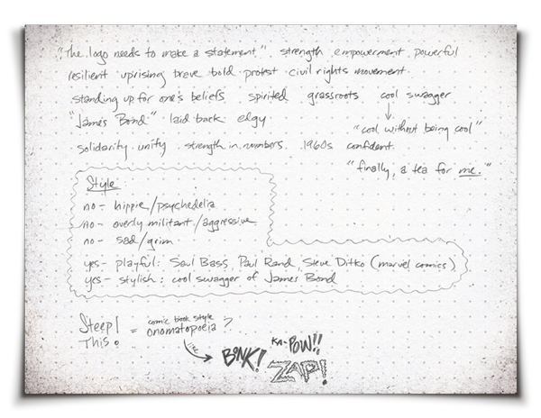
Step 1: Word Map Exercise
After familiarizing myself with a client's business, objectives, industry, target audience, and competitors, the first step of my creative process is to conduct a wordmap exercise, during which I write out any words or phrases that come to mind. This helps me establish launch points for visual exploration.
Step 2: Inspiration
After revealing creative pathways of exploration through the wordmap exercise, the next step is to seek inspiration. This mostly comes from visuals, but can come from music, food, traveling, or anything else that will help establish an emotional connection to the material.
After revealing creative pathways of exploration through the wordmap exercise, the next step is to seek inspiration. This mostly comes from visuals, but can come from music, food, traveling, or anything else that will help establish an emotional connection to the material.
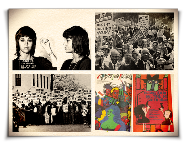
Client-supplied imagery, depicting protest-era themes.

(left) Solidarity fist icon; (right) client-supplied Cuban revolutionary poster art from 1969.
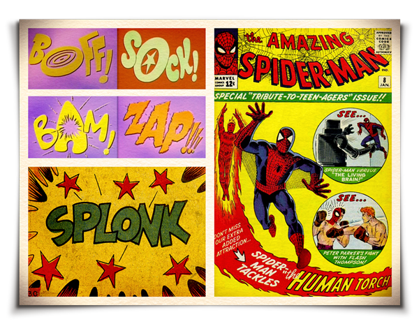
Clients displayed an affinity for the vibrant, energetic comic book artwork of Steve Ditko.
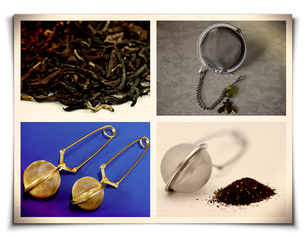
Loose leaf tea and tea infusers were obvious sources of inspiration.

The whimsical, cut paper style of Paul Rand.
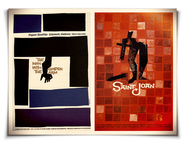
The fun, loose style of Saul Bass.
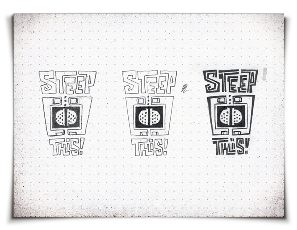
Step 3: Thumbnail Sketches
Once I have become sufficiently inspired, I launch into a thumbnail sketching phase. The objective here is to employ free association mechanics to visually build upon the creative pathways derived from the wordmap exercise. In the thumbnail stage, no idea is a bad idea; no sketch is a bad sketch. It is important to visually explore all avenues; to leave no stone unturned. Selecting solid concepts for further development occurs once all ideas have been exhausted.
Once I have become sufficiently inspired, I launch into a thumbnail sketching phase. The objective here is to employ free association mechanics to visually build upon the creative pathways derived from the wordmap exercise. In the thumbnail stage, no idea is a bad idea; no sketch is a bad sketch. It is important to visually explore all avenues; to leave no stone unturned. Selecting solid concepts for further development occurs once all ideas have been exhausted.
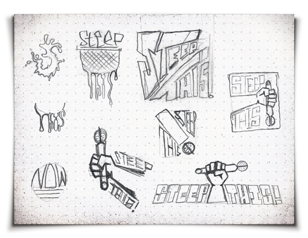


Exploring themes of: onomatopoeia; Solidarity Fist iconography; exclamation point doubled as a tea infuser.

Exploring whimsical typographic solutions that express excitement.


Exploring typographic treatments that combine an exclamation point with a tea infuser.


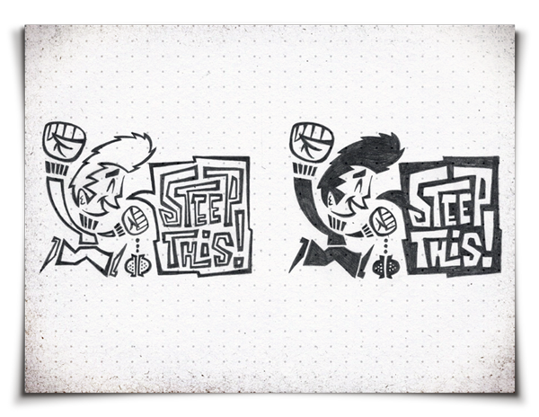
Exploring themes of: incorporating hands cradling tea/tea infusers; character-based design.
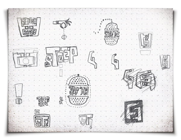
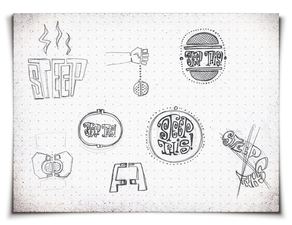
Exploring themes of tea infusers revealing type reminiscent of loose leaf tea sprigs.


Exploring character-driven designs.
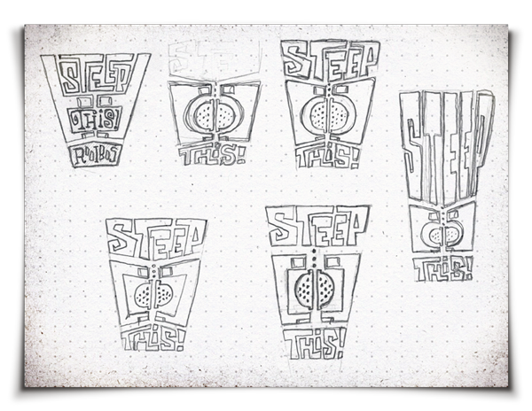
Step 4: Refining Ideas
After exhausting the thumbnail stage, the next step is to pick the standout concepts, and develop them further. Often, some concepts that may seem worthy to explore ultimately end up going nowhere, and are abandoned in lieu of pursuing only the absolute strongest of ideas.
Concept 01: Typographic Infuser


While this type is whimsical, fun, bold, and definitely inspired by the era, I thought the chain infuser/exclamation point dot compound imagery was a little gimmicky and a bit too passive.

While I thought this one had tremendous branding potential, again, I thought it was too passive for this audience. It aligns visually with the tone of the brief, but does not communicate any of the Steep This! core values. It would be perfect for a tea company marketing to a tea-drinking crowd with no need for any specific call to action.
These ideas were not strong enough, and were abandoned.
These ideas were not strong enough, and were abandoned.
Concept 02: Loose Leaf Tea Sprig Type


Inspired by the shape of dried tea sprigs, this type fits snugly into a unit, and is visually interesting. However, people may not get the dried tea sprig inspiration, nor would it really matter if they did. So what? The letters being inspired by tea is not necessarily a motivator for this audience, nor does it really communicate anything about the company's values or messaging.
Concept 03: Solidarity Fist

Iconic imagery that came to mind very early in my thought process, and has resonated throughout the development phase. Bold, arresting, and inspires an energetic call to action.
Concept 04: Onomatopoeia!

The term 'onomatopoeia' refers to a word that imitates or suggests the source of the sound that it describes. One thing I detected early on was that the name of the company has a certain expressive voice associated with it, as if it were a whimsical euphemism, expletive, or a call-to-action that would be shouted out. Thus, I found value in exploring the development of a wordmark that visually captures this excitement and energy.
Concept 05: Hands
Another strong idea that took root was the depiction of the personal relationship one has with tea.
Concept 06: Characters


The idea of exploring a character-based concept did not occur to me until late in the initial sketching phase. A late-night departure from the other initial ideas, once this one took root, it quickly evolved and became a top contender.
Step 5: First Drafts
After developing the standout concepts, and weeding out those that don't work, it's time to move ahead with the electronic refinement and presentation of 3-4 of the absolute best concepts.
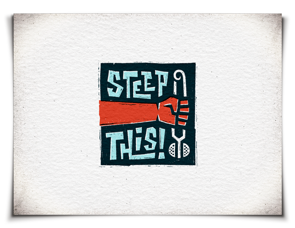
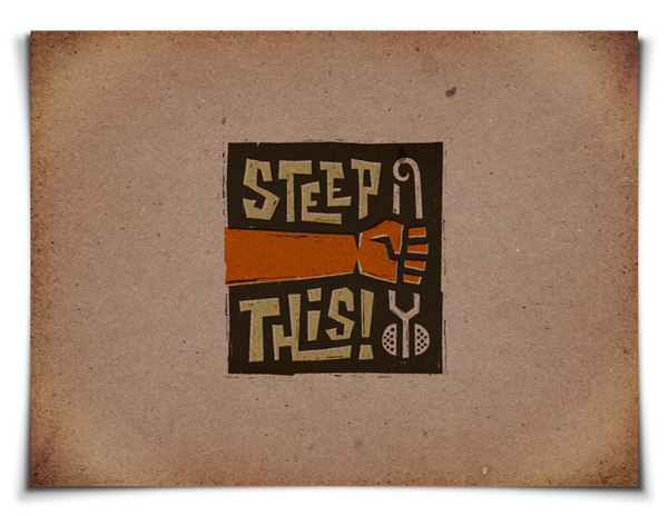
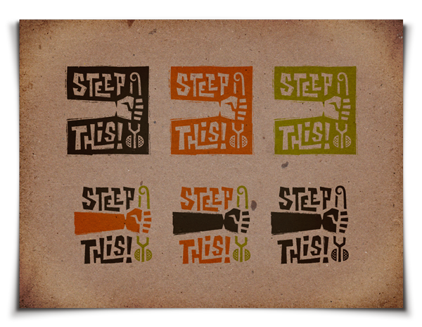
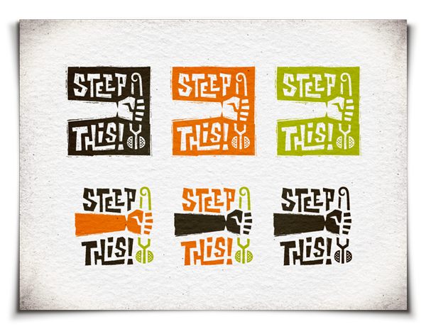
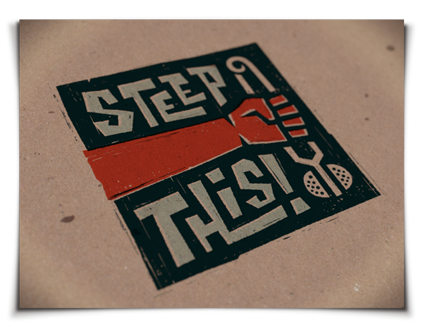
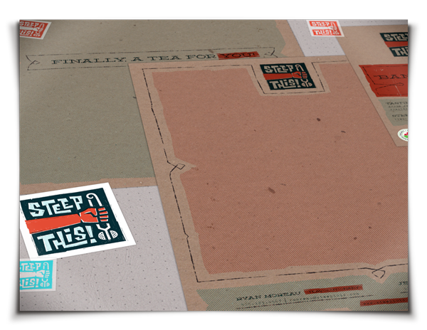
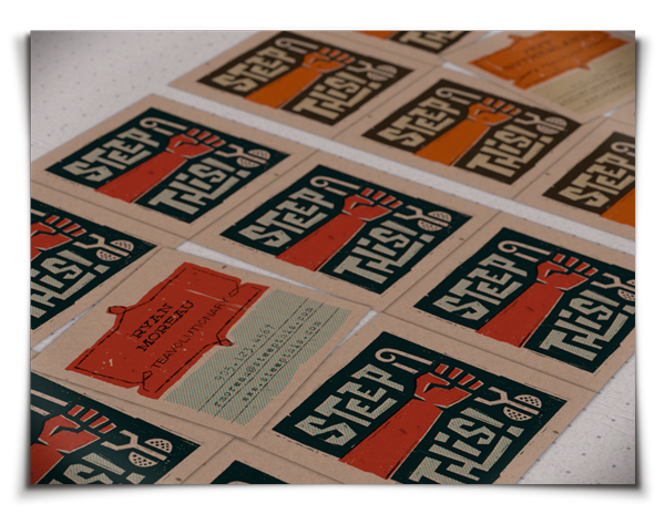
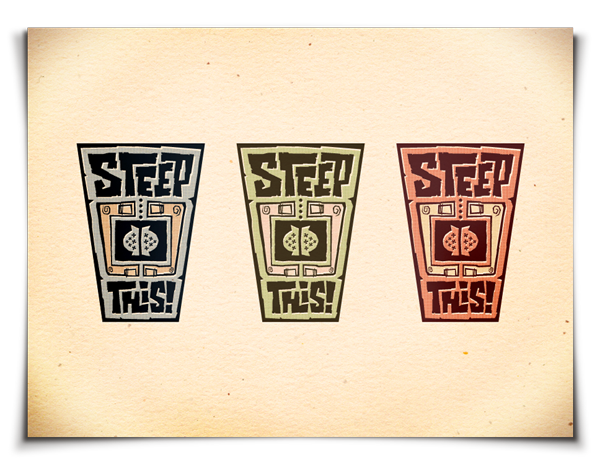
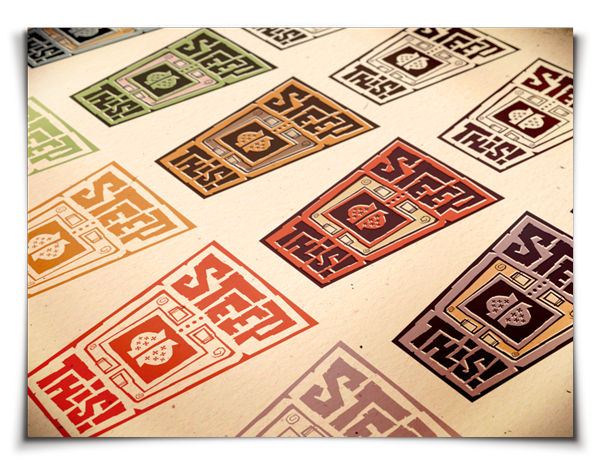
Concept 01: Solidarity Fist
Inspired by an iconic hand gesture which has been used to symbolize strength and solidarity throughout the civil rights era and beyond. This imagery of the fist clutching a tea infuser is bold, assertive, and inspires a powerful call to action. Intentionally gritty and homemade, I liken this imagery to that of protest signs and political literature which would be screen printed and hand drawn in some grassroots, basement field office. The use of rough, brown Kraft paper and toothy, off-white cotton paper adds to the homemade feel.
The logo itself is rendered as if it were a linocut print, and I would pursue this handcrafted process for the development of t-shirts, posters, or other large-format printed material.
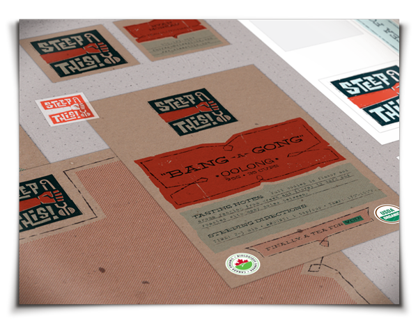
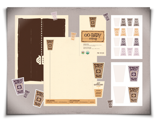
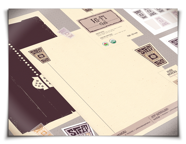
Visuals depict the various logo color combinations as well as branding concepts including tea packaging labels, letterhead, business cards, and sticker sets.
Client indicated that future packaging labels would feature a creative moniker for each tea flavor, so for the purposes of this presentation, I showed examples of how this might look, by providing catchy names inspired by references and vernacular popular in the '60s and '70s. In this concept, I depict "Groovy Guy" Chai, and "Bang A Gong" Oolong, a name inspired by the 1971 song, (Bang A Gong) Get It On, by T. Rex.
After developing the standout concepts, and weeding out those that don't work, it's time to move ahead with the electronic refinement and presentation of 3-4 of the absolute best concepts.
Concept 01: Solidarity Fist
Inspired by an iconic hand gesture which has been used to symbolize strength and solidarity throughout the civil rights era and beyond. This imagery of the fist clutching a tea infuser is bold, assertive, and inspires a powerful call to action. Intentionally gritty and homemade, I liken this imagery to that of protest signs and political literature which would be screen printed and hand drawn in some grassroots, basement field office. The use of rough, brown Kraft paper and toothy, off-white cotton paper adds to the homemade feel.
The logo itself is rendered as if it were a linocut print, and I would pursue this handcrafted process for the development of t-shirts, posters, or other large-format printed material.
Visuals depict the various logo color combinations as well as branding concepts including tea packaging labels, letterhead, business cards, and sticker sets.
Client indicated that future packaging labels would feature a creative moniker for each tea flavor, so for the purposes of this presentation, I showed examples of how this might look, by providing catchy names inspired by references and vernacular popular in the '60s and '70s. In this concept, I depict "Groovy Guy" Chai, and "Bang A Gong" Oolong, a name inspired by the 1971 song, (Bang A Gong) Get It On, by T. Rex.


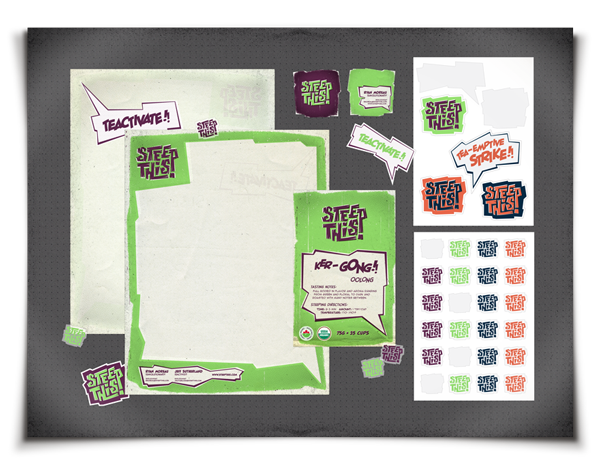
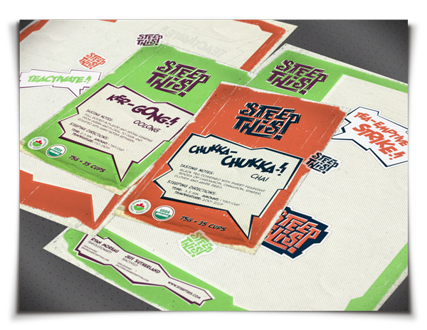
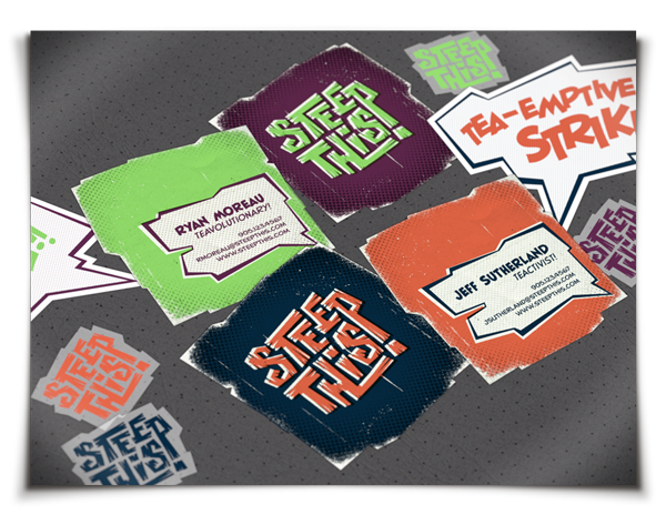
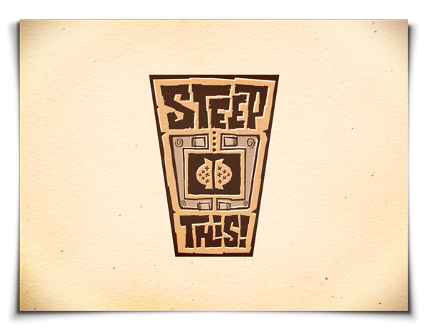
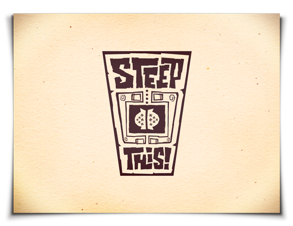
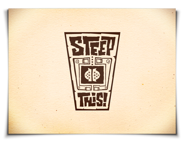
Concept 02: Onomatopoeia!
The term 'onomatopoeia' refers to a word that imitates or suggests the source of the sound that it describes. One thing I noticed about the name 'Steep This!' is that it possesses a certain expressive, resonating voice, almost as if it were a whimsical euphemism or an expletive shouted to someone: "Hey buddy, Steep THIS!"
I wanted to capture this expressive energy in a typographic mark that visually depicts the onomatopoeia I was detecting. Directly inspired by the dynamic visual sound effects found in comic books, I developed a brand image that nicely ties in the client-provided 1960s-era comic book artwork inspiration.
While one might not immediately make the connection between tea and comic books, one thing to remember is the protest era-inspired messaging and core values of Steep This!. Comics have historically been used as a platform for addressing social and political concerns through subtext woven into the stories. This was especially true during the '60s and '70s. War, political unrest, and social injustices were all themes that were addressed in comic books, and tales of heroic figures battling the evil forces of injustice were written to inspire hope.
So, too, do these themes emerge in the messaging of this concept.
Referencing weather-beaten old comic books, this concept uses heavily saturated colors and excitable phrases to incite action, and is made to look like it was printed on old, cheap newsprint, the print substrate of choice for vintage comics.
Visuals depict the various logo color combinations as well as branding concepts including tea packaging labels, letterhead, business cards, and sticker sets.
Client indicated that future packaging labels would feature a creative moniker for each tea flavor, so for the purposes of this presentation, I showed examples of how this might look, by providing catchy names inspired by comic book sound effect onomatopoeia. In this concept, I depict "Ker-GONG" Oolong, and "Chukka-Chukka" Chai.


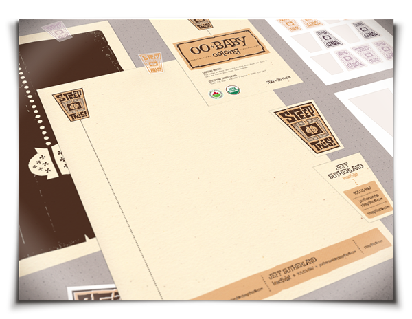
Concept 03: Hands
Definitely inspired by the loosely-rendered, whimsical artwork of Saul Bass and Paul Rand, this one depicts two hands cradling a tea vessel with a chain tea infuser in it.
This concept is a lot more introspective than the others, as it depicts the personal relationship one has with tea. True tea lovers enjoy all aspects of tea drinking, from the selection of responsibly sourced organic teas, to the paraphernalia, to the rituals. This idea suggests the nurturing and fostering of one's very own quality tea experience, found in a company the target audience can finally relate to.
The loosely-interpreted forms and cheerful, yet faded colors, directly relate back to the playful aesthetics of the '60s and '70s, specifically many of Saul Bass' movie title sequences and the title sequences of the old Pink Panther movies.
The forms fit nicely together as a unit, making it a perfect translation into custom die-cut business cards or stickers. Visuals depict the various logo color combinations as well as branding concepts including tea packaging labels, letterhead, business cards, and sticker sets.
Client indicated that future packaging labels would feature a creative moniker for each tea flavor, so for the purposes of this presentation, I showed examples of how this might look, by providing catchy names inspired by references and vernacular popular in the '60s and '70s. In this concept, I depict "Hi-Fi" Chai, and "Oo-Baby" Oolong.


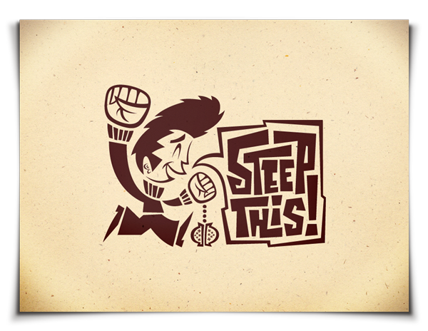
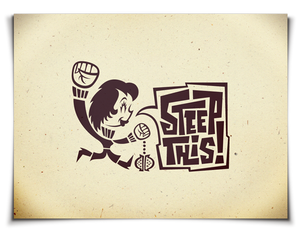
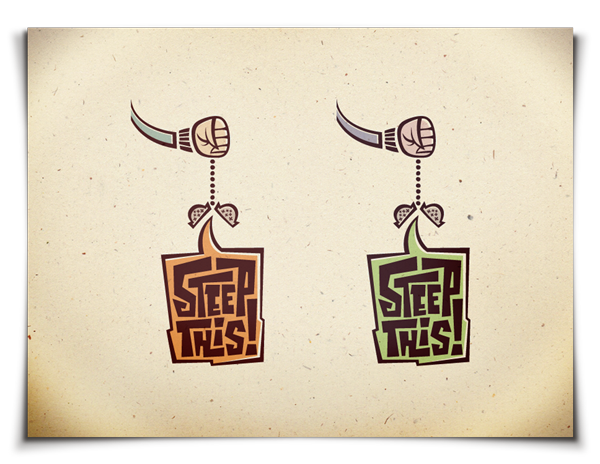
Concept 04: Characters
Quite a departure from the rest, this character-based design is fun and energetic, and alludes to the solidarity Power Fist without using it as literally as Concept 01.
The characters clutch chain infusers, and with fists raised triumphantly overhead, shout the Steep This! call to action.
While the male character was initially quite static, Hipsterish, and somewhat devoid of defining characteristics in early sketches, initial helpful feedback from the client proved instrumental in pushing the character's style. He is now dynamic, fun, and full of energy. A client suggestion was to explore a type of over-exaggerated James Dean quaffed hairdo, and I think it really adds a whole new level of personality to the character.
His female counterpart is inspired by Jane Fonda's mug shot (complete with era-appropriate Shag haircut) from one of the client-provided inspiration photos.
Unique, stylish characters are pivotal to this concept. If this were the chosen direction, I would propose that each tea offering be accompanied by a different character.
This concept also proves extremely versatile and expandable, as various secondary marks, icons, and graphic elements can be extracted and used throughout the branding suite.
Visuals depict the various logo color combinations and secondary visuals, as well as branding concepts including tea packaging labels, letterhead, business cards, and sticker sets.