Capwell Partners Logo and Identity
Final Logo
Work developed through Bodnar Design Consultancy; creative direction: Paula Bodnar.
Capwell Partners, a capital financing company focused on developing health, wellness, and nutrition companies, chose this logo to represent their business. Their experience is evinced in the traditional serif type; their fun and accessible approach finds form in the contemporary san-serif, which also emphasizes the word "well."

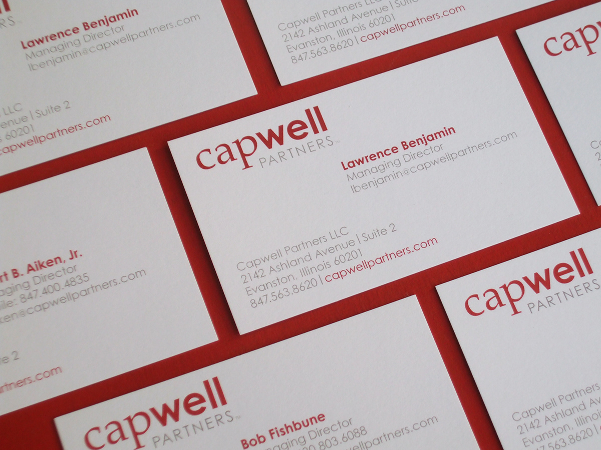
Business Cards
With their clean aesthetic, these business cards began to build out the clear, crisp Capwell identity.
With their clean aesthetic, these business cards began to build out the clear, crisp Capwell identity.
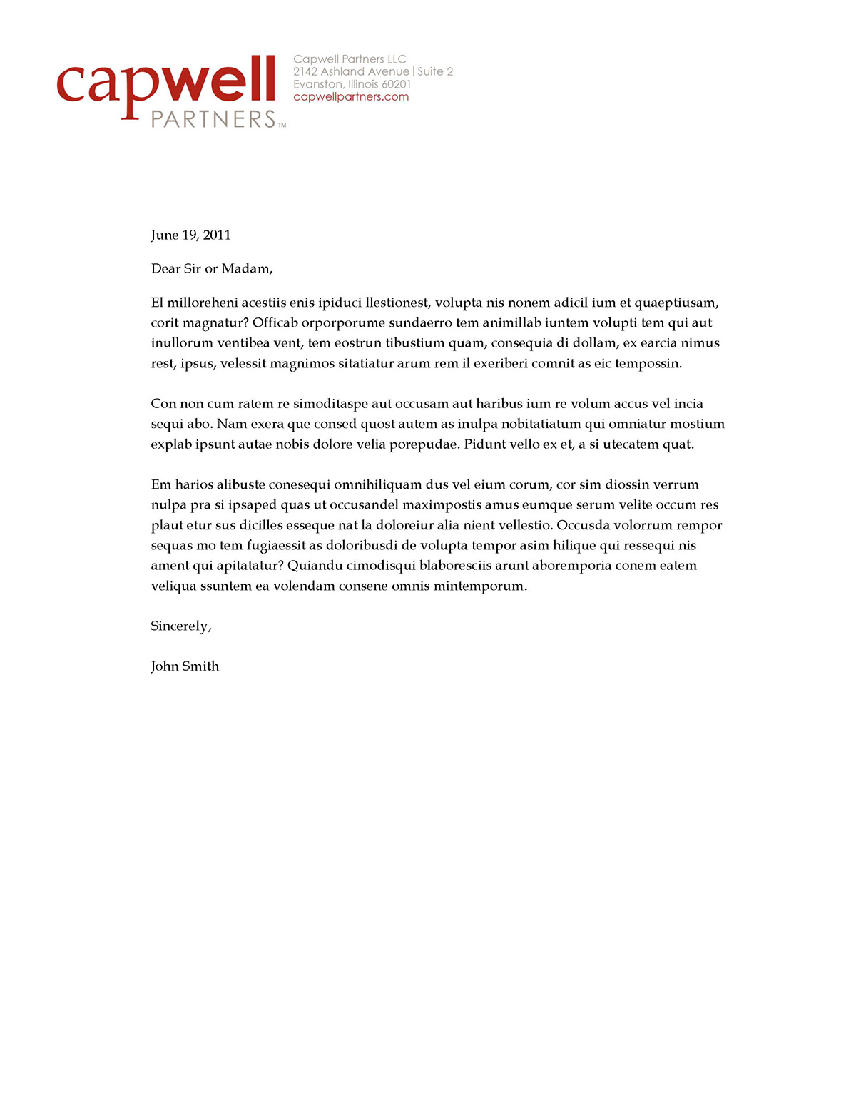
Electronic Letterhead
This letterhead template provided the partners with instant stationery for word processing, eliminating the need for printed business papers.
Alternate Logos
These proposed logo concepts also relay Capwell's mission of developing wellness companies. Some draw upon ancient symbols of wellness, such as the trikaya or lotus. The golden egg-inspired logo references their capital means, and the two typography-based solutions are inspired by armillary spheres, pointing their would-be companies and investors in a positive direction.

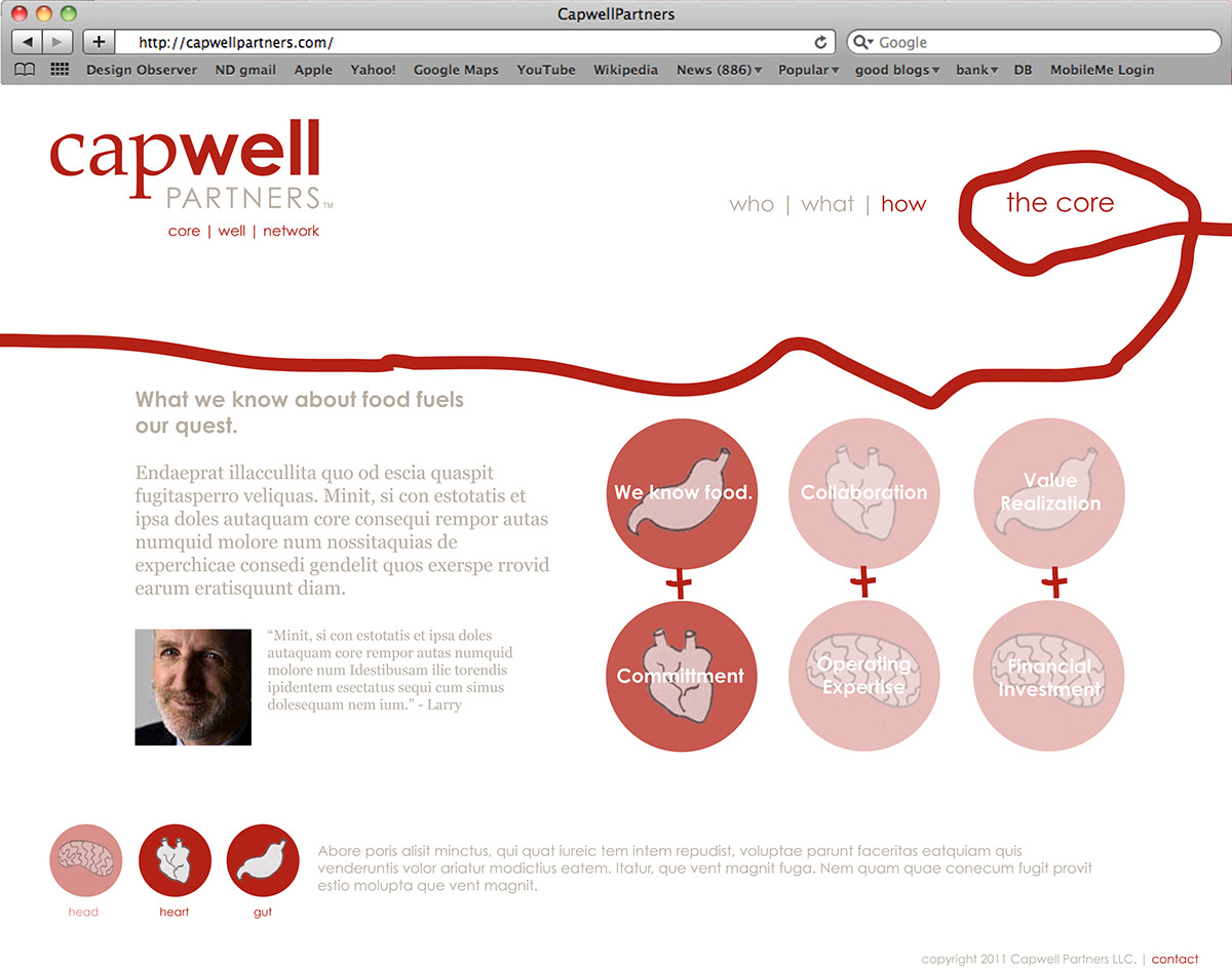
Proposed Website
This concept for a website draws upon health imagery to give Capwell a website that evokes their left brain/right brain approach toward business. The circulatory system imagery serves as a reference point thoughout the navigation, and the brain, heart, and stomach icons point out the Capwell Partners' guiding forces: "Head, Heart, and Gut."


Produced Website
I served as a project manager for our clients and the web developer for this site, as well as created some simple graphics (seen below) and conducted much of the research for the photos.


