

Corvus
Year: 2006 // Client: Cantine Tortora
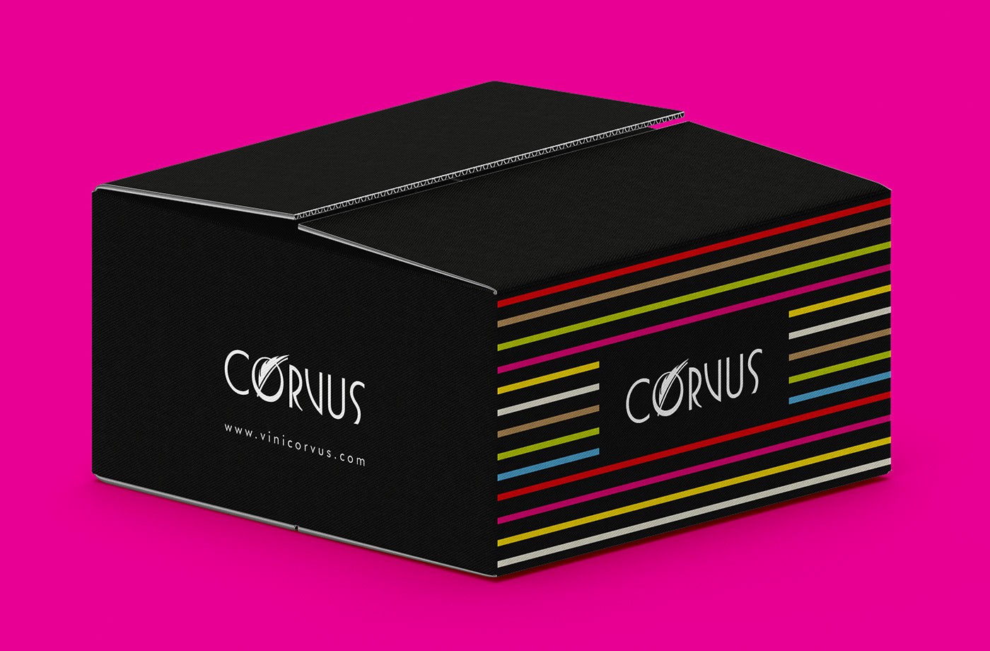
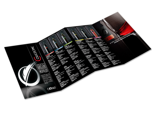
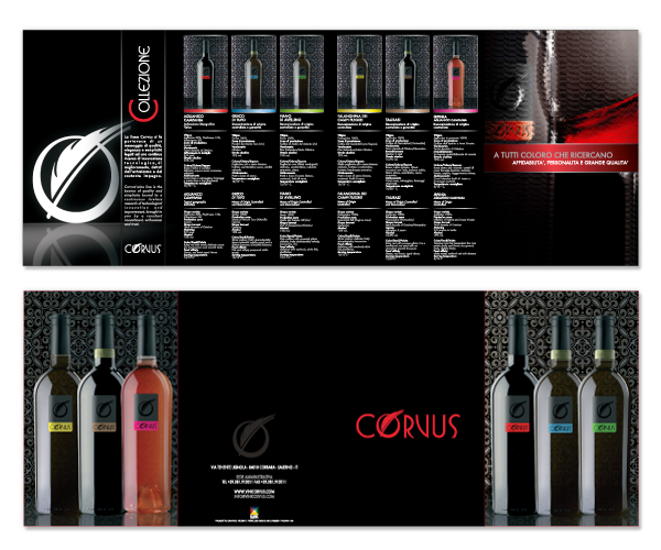
Tasks: Logo Design, Visual Identity, Web Design, Packaging
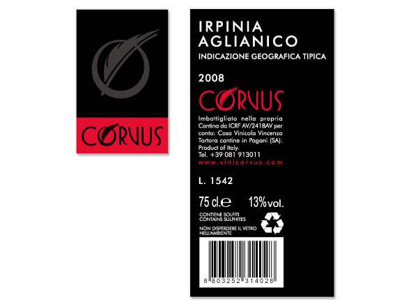
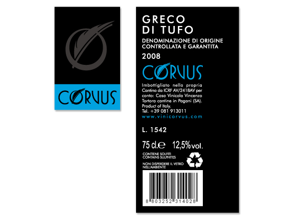
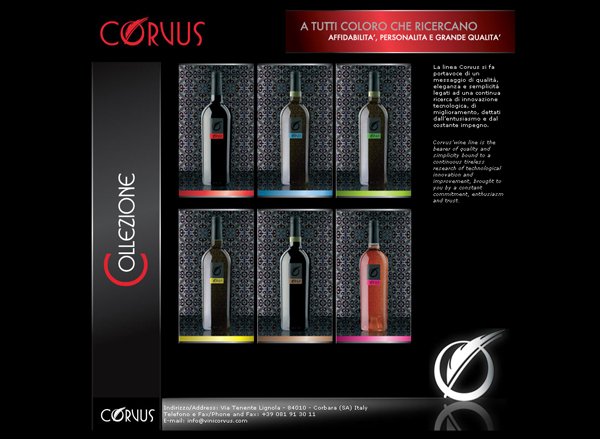
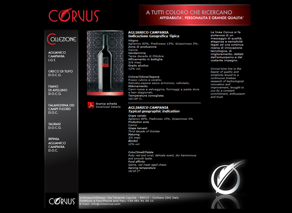
Corvus, a selection of white and red wines, demanded a comprehensive branding strategy, ranging from the creation of the logo to the visual identity, from the wine labels to the website, and even encompassing printed brochures and box packaging.
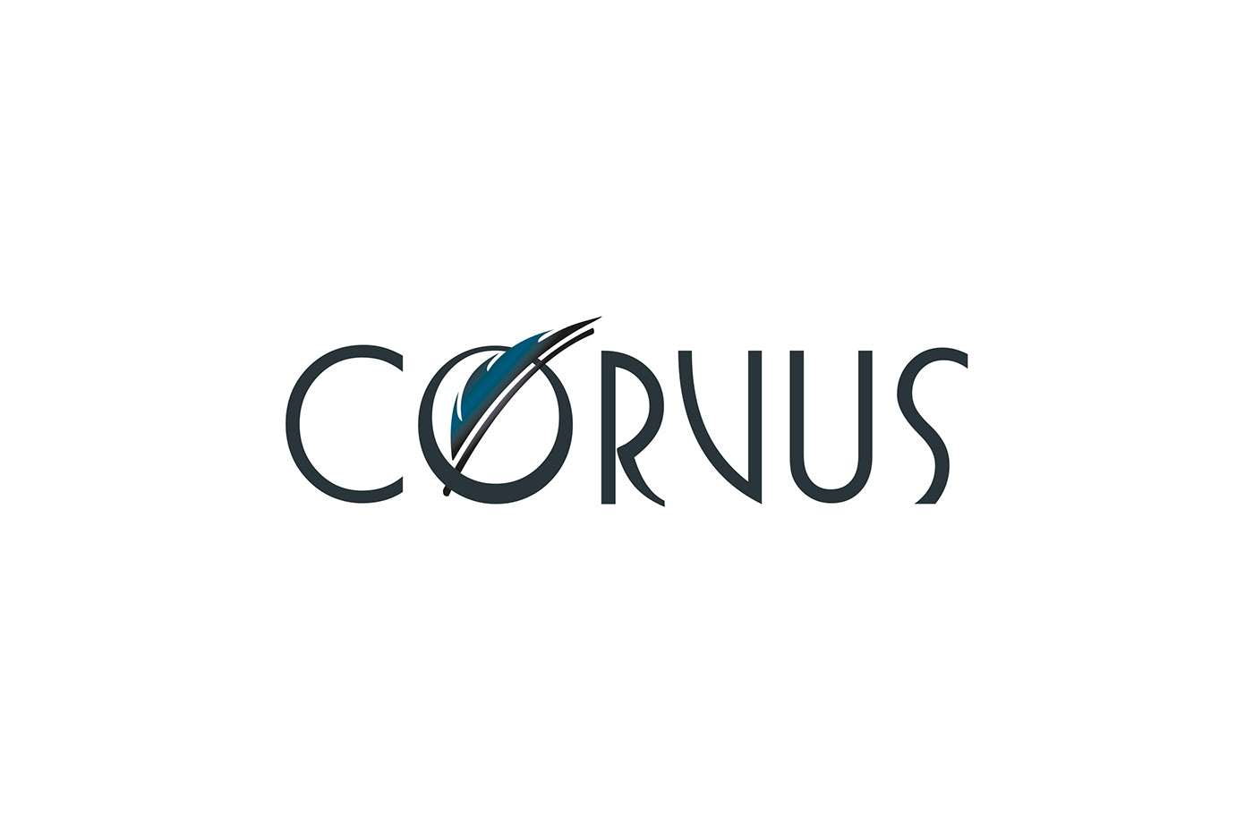
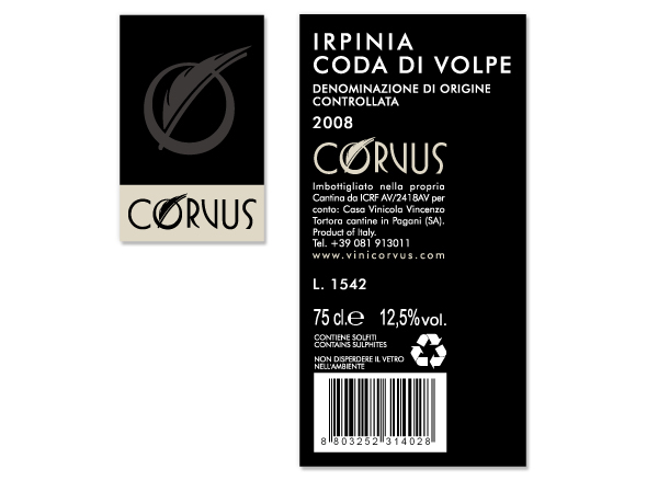
The starting point was the need to develop a distinctive brand that could represent the wines presented under the name Corvus. This name recalls the Corvus bird genus of the Corvidae family and evokes the town of Corbara, located in the province of Salerno, which housed the wine bottling facility.
To capture the essence of Corvus, I crafted a logo that blends recognizable elements. A stylized crow feather conveys both strength and lightness, much like the wine that flows within the bottles.
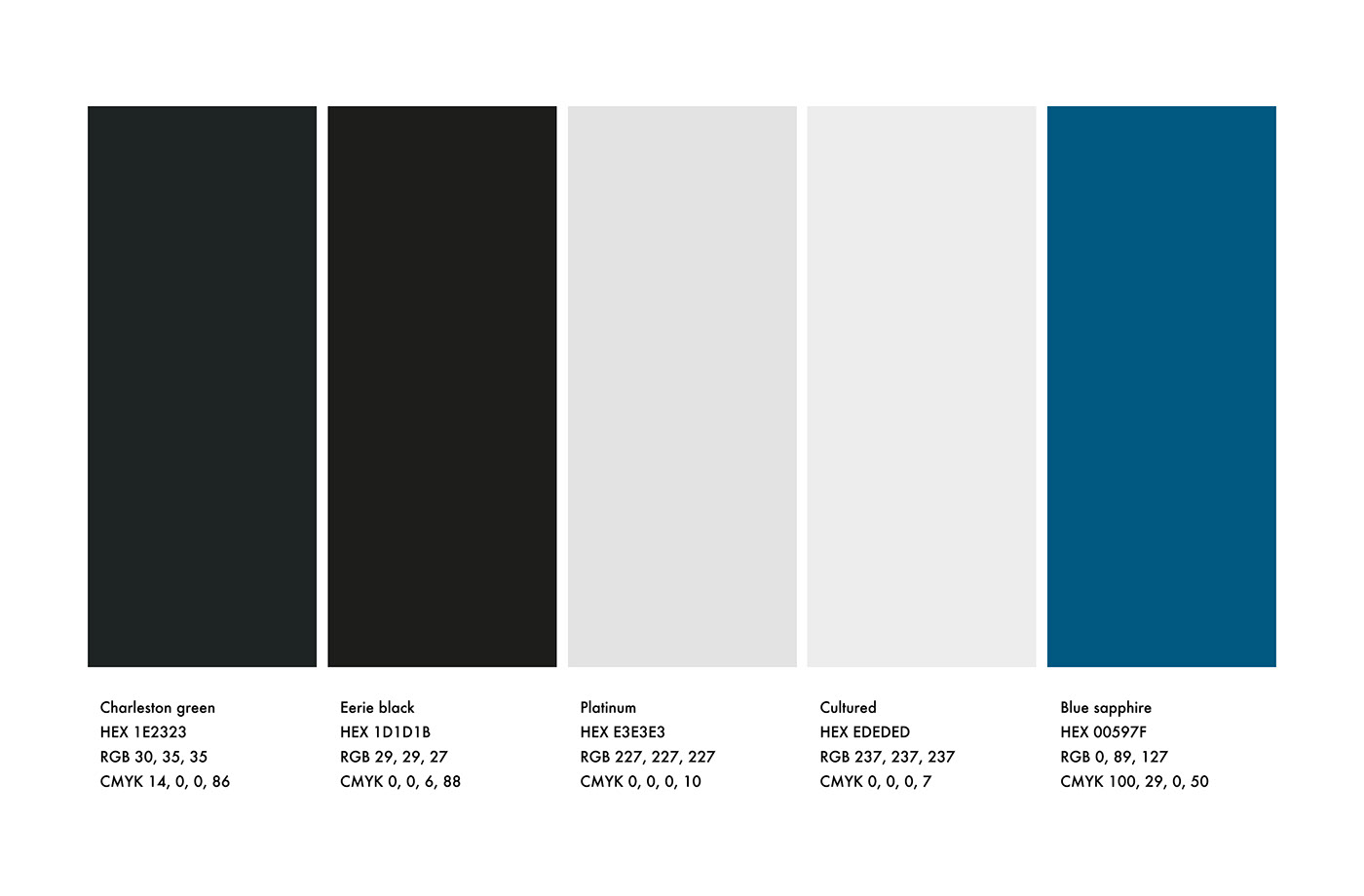
The visual identity is imbued with elegance and sophistication, reflecting the care in the selection of wines offered by Corvus. The colors chosen for labels, brochures, and box packaging were meticulously selected to create distinctive visual impact. Each wine is associated with a unique color, printed in UV on a black background, enhancing the sense of luxury and making each bottle recognizable at first glance.
The labels and boxes were created in collaboration with Pierluigi Giglio.
As for the website, I developed a comprehensive platform that provided users with an informative and engaging experience, enhanced by animations.