
Today's crafts are not the same as yesterday. Though their nature is the same and still alive - responding to a particular need with functionality, aesthetics and quality - the needs have changed and the professions have had to adapt and evolve. CERCA is born from the belief that tradition and progress are not contrary concepts, by recovering and recycling the knowledge of old professions and giving them a future in our society and economy.
NAMING
CERCA is a double meaning name: it means closeness and it's also an acronym for "Culture and Education for the Renewal of the Arts&Crafts Knowledge". The concept of closeness has the value of tradition but mainly it has the strength of identity. In addition, the name directly communicates the intention of the school: to make arts&crafts closer to society by giving it more visibility and focusing on current needs and unexplored markets.


CONCEPT
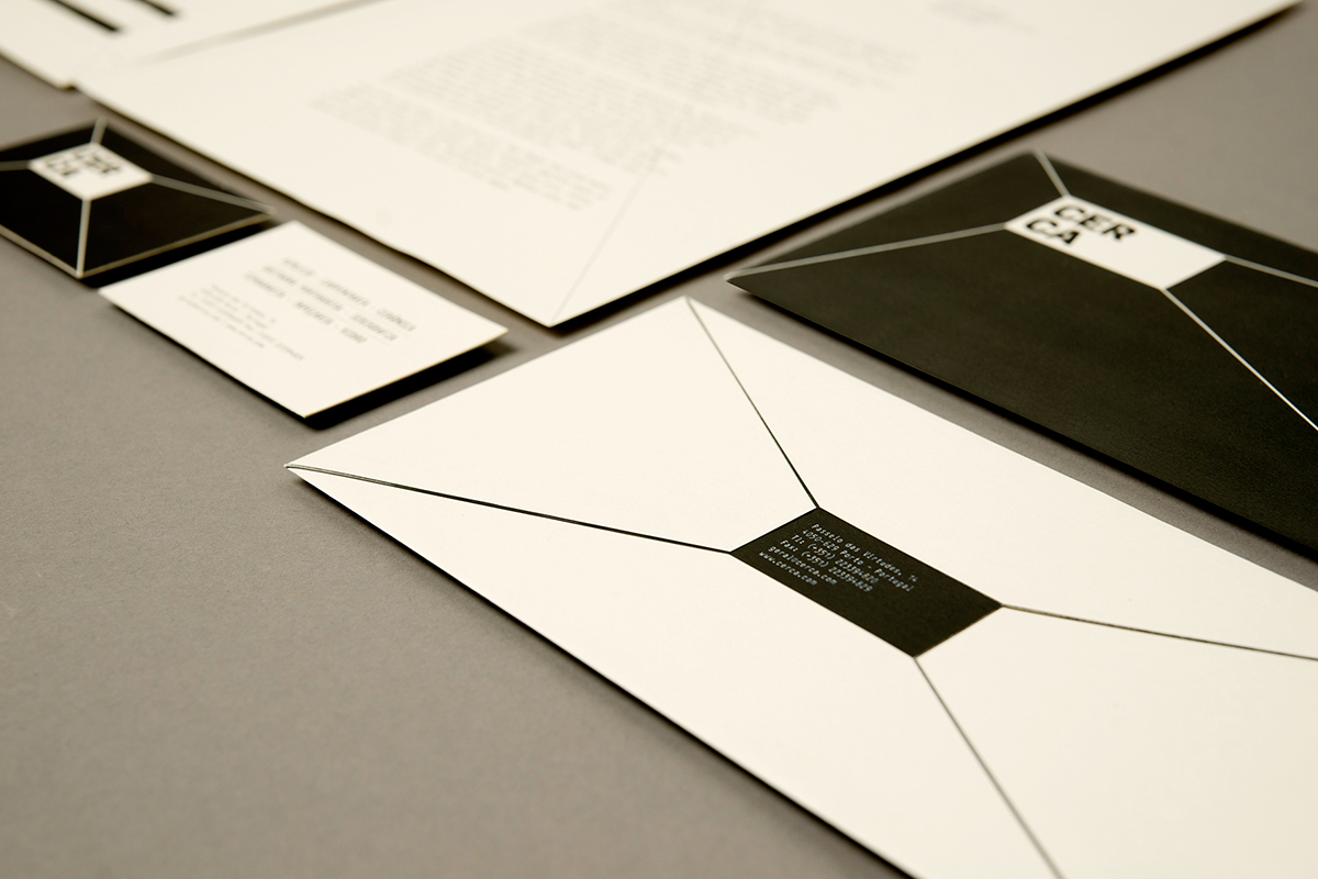
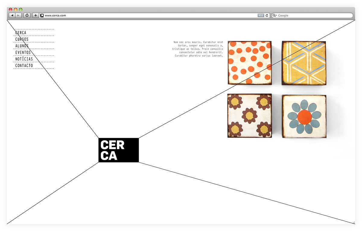
The vanishing point and the grid structure are the two principles of the visual identity, that combined create endless representations of the brand. Therefore, the concept for the brand and its visual identity is the same: adaptation to its environment. Therefore, the logo is always proportional to the support where it is applied.


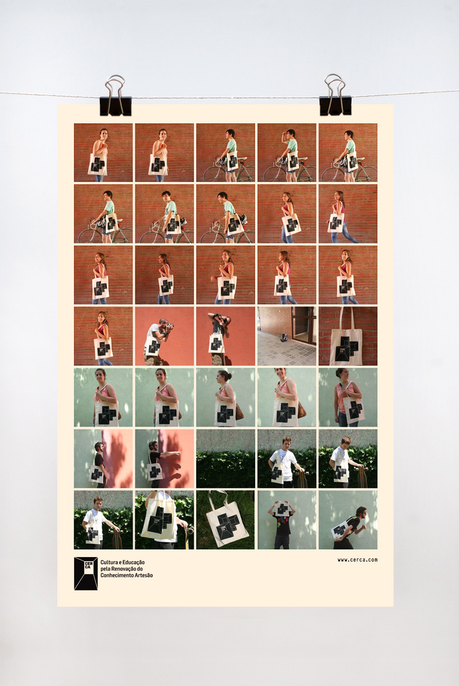

Welcome pack for new students containing a series of common objects and also some specific to the course in which they signed for.


ADG-FAD Laus Bronze Award 2013


