

C T I R
CTIR stands for Colors Typography Images and Rectangles. CTIR is my personal project on experimenting typefaces characteristics to introduces people on certain typeface with detailed-large-pantone colored type/glyph specially for people who has little awareness on typography as well as colors. Hopefully this work will help raise people's typography and color awareness.

Recomposition of Art & Copy by Doug Pray (2005), Baskerville Semibold and PantoneSolid Coated 213 C, 2012

Recomposing Michael Alexander’s workspace (2011), Baskerville Semibold Type andPantone Solid Coat Orange 021C, a2012

Recomposing Zebaoth’s Cathedral (1920) on Bogor, Andrade Pro Bold Typeface and(#FFFFFF) White, 2012.

Recomposition of Bogor’s DEKRANASDA (2008), Bauhaus 93 Typeface and PantoneSolid Coated Cyan 801 C, 2012
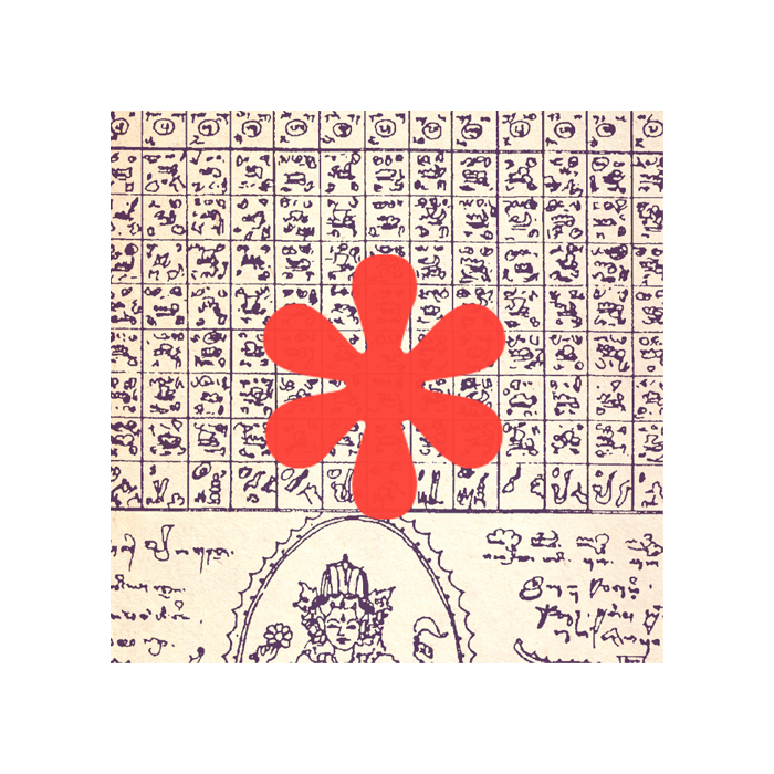
Recomposition of a Balinese Calendar (210 days), American Typewriter Typeface andPantone Solid Coated Warm Red C, 2012
Recomposition of Tisna Sanjaya’s Newest Installation Artwork (February, 17th 2012),TW Cen MT Typeface and Pantone Solid Coated 375 C, 2012
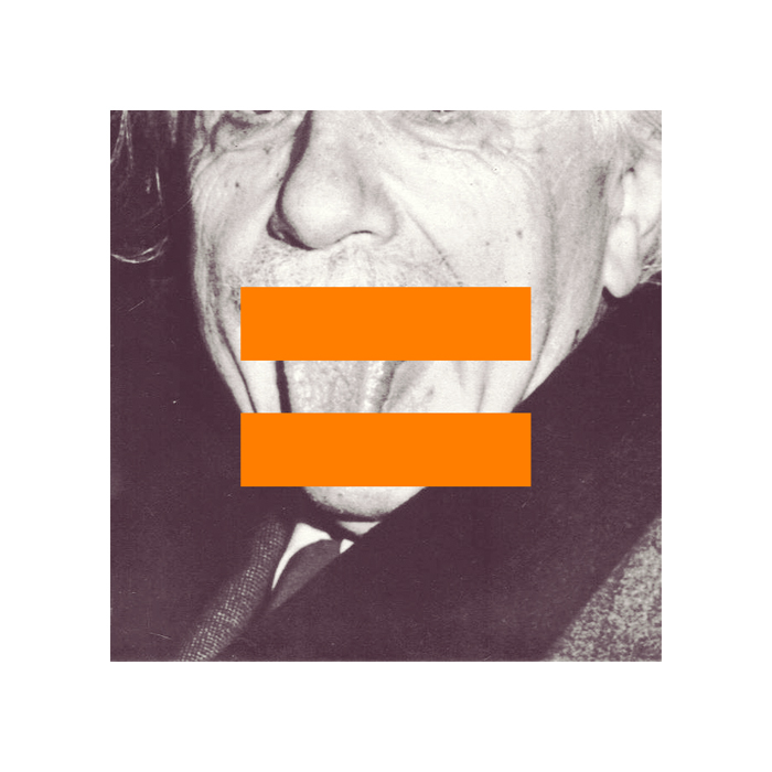
Recomposition of Einstein’s Tounge (Arthur Sasse, 1951), Arial Bold Typeface andPantone Solid Coated Hexachrome Orange C, 2012

Recomposition of Bogor (1966), Didot Bold Typeface and Pantone Solid 3255 C, 2012

Recomposition of Bogor (1987), Andrade Bold Typeface and Pantone Solid Coated812 C, 2012

Recomposition of Natalia Rina & Rico Siregar’s Wedding in Indonesia (2010),Geogrotesque Bold Typeface and Pantone Solid Coated 7547 C, 2012
Check for more updates on CTIR's tumblr


